In today’s digital age, businesses are continually seeking effective ways to connect and convert their audiences. One powerful tool in this arsenal is the landing page. When correctly designed, landing pages inform visitors about the benefits and features of a product or service and prompt them to take a specific action, whether it’s signing up for a newsletter or making a purchase. Urban Geko understands the intricacies of designing an impactful landing page, and in this guide, we dive deeper into creating one that resonates with your audience.
Things to Consider When Designing the Perfect Landing Page
Designing the perfect landing page requires a comprehensive understanding of your audience’s needs and an efficient and aesthetically pleasing design. Here are some crucial considerations to take into account:
- Clearly Defined Objective
Every landing page should have a specific purpose, whether to capture emails, sell a product, or drive traffic to a particular content. Before beginning your design, ask:- What action do I want visitors to take?
- How does this action benefit both the user and my business?
- Engaging Headline
Your headline is the first thing visitors will see. Ensure it’s:- Relevant to the content or product.
- Concise yet engaging.
- Reflective of the value or benefit to the user.
- Compelling Visuals
Visual elements can grab attention and convey messages quickly. Ensure:- Images and videos are high quality.
- Visuals resonate with your target audience and support the page’s objective.
- Avoid stock images that appear generic.
- Trust Indicators
Visitors need to trust before taking any action. Boost your credibility by:- Displaying testimonials or reviews.
- Highlighting endorsements, certifications, or partnerships.
- Showing user-generated content, if applicable.
- Strong Call to Action (CTA)
Your CTA button or link should be clear, compelling, and easy to find. Consider:- Button color and size.
- Actionable text that conveys a benefit (e.g., “Get Started” or “Download Now”).
- Placement in multiple strategic locations if the landing page is lengthy.
- Minimal Distractions
You want users to focus on the main action. To keep them on track:- Limit the number of links leading away from the page.
- Use a simple, clean design.
- Avoid excessive information or content that doesn’t support the main objective.
- Mobile Responsiveness
A significant portion of users will access your landing page via mobile devices. Ensure:- The design adapts seamlessly to different screen sizes.
- Touch-friendly navigation.
- Optimized load times for mobile.
- Social Proof
Show that others are benefiting from what you’re offering. Consider:- Showcasing user testimonials.
- Displaying counters (e.g., “10,000+ downloads”).
- Featuring client logos or partner endorsements.
- Easy Navigation
If your landing page has multiple sections, ensure users can navigate them easily by:- Using anchored links.
- Providing a sticky menu for longer pages.
- Clearly labeling sections.
- Analytics Integration
For ongoing improvement, integrate analytics to track:- Conversion rates.
- User behavior on the page.
- Traffic sources and demographics.
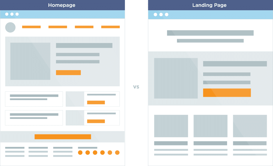
How to Create the Perfect Landing Page?
- Begin with a Mock-Up
- Before embarking on the final design, starting with a blueprint or mock-up is essential. The process is analogous to sketching a painting before diving into the final artwork. Utilizing graphic applications like Adobe Experience Design allows designers to visualize the final result and make swift changes without diving into code. Two significant benefits of starting with a mock-up include:
- Speed and simplicity in laying out the initial design.
- Provision of a structured vision, helping designers and stakeholders align on what the final page will look like.
- Before embarking on the final design, starting with a blueprint or mock-up is essential. The process is analogous to sketching a painting before diving into the final artwork. Utilizing graphic applications like Adobe Experience Design allows designers to visualize the final result and make swift changes without diving into code. Two significant benefits of starting with a mock-up include:
- Choosing the Right Background
- While there’s no one-size-fits-all rule for selecting a landing page background, several principles can guide your choice:
- Refrain from using large graphic files, ensuring faster load times.
- Opt for high contrast between the background and foreground content to boost readability.
- Steer clear of distracting elements that detract from the primary content.
- While there’s no one-size-fits-all rule for selecting a landing page background, several principles can guide your choice:
- Crafting Impactful Headlines and Sub-headlines
- A headline’s job is to captivate users instantly. It sets the stage, drawing visitors in and compelling them to read further. Following the headline, the sub-headline offers additional details, enhancing the narrative set by the headline. When designing a landing page:
- Ensure the headline is magnetic, prompting users to delve deeper.
- The sub-headline should complement the headline, clarifying details or reinforcing the primary message.
- A headline’s job is to captivate users instantly. It sets the stage, drawing visitors in and compelling them to read further. Following the headline, the sub-headline offers additional details, enhancing the narrative set by the headline. When designing a landing page:
- Prioritizing the Call-to-Action (CTA): Directing User Interaction
- The crux of any landing page is its CTA – the primary driver that prompts users to interact with your brand. While there’s no one-size-fits-all approach to crafting the perfect CTA, certain principles can enhance its effectiveness.
- Visibility and Positioning: Ensure your CTA stands out through contrasting colors or by its sheer size.
- Clear Message: The wording should be action-oriented and indicate what users can expect upon clicking.
- Optimal Placement: While the best position can vary, common spots include adjacent to the main headline or prominently at the top.
- The crux of any landing page is its CTA – the primary driver that prompts users to interact with your brand. While there’s no one-size-fits-all approach to crafting the perfect CTA, certain principles can enhance its effectiveness.
- Trust Signals and Social Proof: Bolstering Your Credibility
- In the digital world, trust is paramount. A potential customer needs assurance that they are making the right decision. By integrating trust signals and showcasing social proof on your landing page, you can build credibility and assuage any concerns.
- Customer Testimonials: Displaying positive feedback from satisfied customers can boost confidence in your offerings. It’s the word-of-mouth for the digital age.
- Badges and Certifications: If you’ve been featured in prominent publications or have industry-specific certifications, showcase them. These badges act as endorsements of your expertise.
- Counters: Highlight how many satisfied customers you’ve served or how many products have been sold. Numbers have a psychological impact, offering tangible proof of your product’s value.
- In the digital world, trust is paramount. A potential customer needs assurance that they are making the right decision. By integrating trust signals and showcasing social proof on your landing page, you can build credibility and assuage any concerns.
Hire a Web Design Company You Can Trust
The digital realm is ever-evolving. To remain relevant and effective, businesses must adapt, and a well-crafted landing page is a testament to a brand’s commitment to its audience. Whether you’re just starting or looking to refine your existing landing pages, partnering with experts like Urban Geko can set you on the path to conversion success. With our expertise, your landing pages will be more than just digital real estate; they’ll be conversion powerhouses. Contact us for more information, and let’s boost your website together.