
Most med spas in a given market offer the same injectables, lasers, facials, and body treatments. The practices that stay booked are not the ones with the longest menu. They are the ones a prospective patient can understand, trust, and book in a few minutes, on a phone, before they ever call. That understanding is built by the website, the brand, the videos, and even the printed menu at the front desk, and it is lost just as quickly when those pieces contradict each other.
This guide is for med spa owners, medical directors, practice managers, and the clinicians whose calendars depend on new consultations. It connects five areas of design and brand work that are usually handled by different vendors at different times, and it links to a detailed article on each. Every linked article ends each section with a short quick check you can run on your own practice today, so you can find your gaps before you decide what to fix.
How the Five Pieces Fit Together
A prospective patient rarely experiences your practice in a straight line. They might see a provider video on social media, search your name, land on a treatment page, compare your pricing with two competitors, and then walk in and pick up a brochure while waiting. If the brand on the video, the website, and the brochure all feel like the same practice, each touchpoint reinforces the last. If they do not, the patient has to rebuild trust at every step.
That is why this guide treats branding as the foundation, the website as the main decision tool, and video and print as the extensions that carry the same message into channels the website cannot reach on its own. Read the sections in the order that matches your biggest problem, but keep the whole system in mind.
1. Website Design That Turns Visitors into Booked Consultations
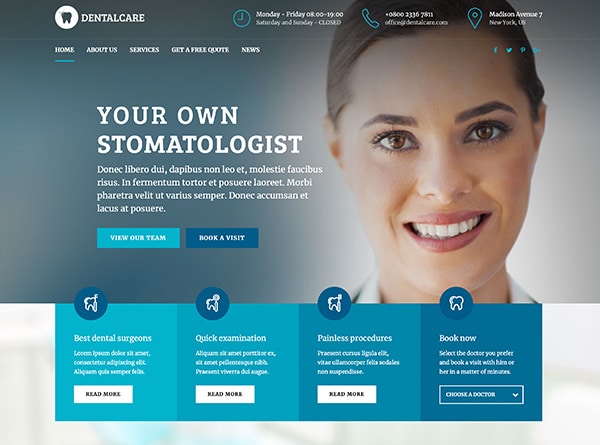
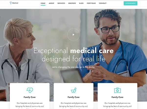
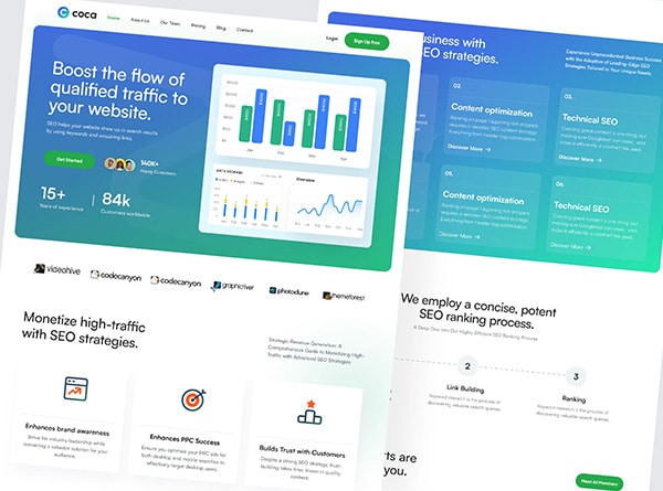
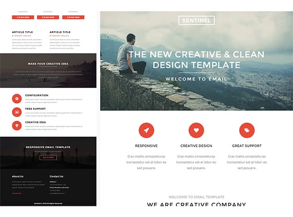
A polished homepage can still lose consultations. The usual causes are structural rather than visual: a vague hero section, a layout designed for desktop and squeezed onto phones, a single catch-all services page, thin treatment pages, and a booking flow that stalls after the click. The most important fixes are to put one clear call to action, a named medical overseer, and one piece of proof above the fold; organize services the way patients decide rather than the way the menu is written; give every major treatment its own page with candidacy, process, downtime, pricing context, and questions answered; and surface provider credentials and social proof next to the booking button instead of on separate pages.
The article also covers pricing transparency, booking paths that match the decision size, HIPAA-aware form tooling, local search, accessibility, and tracking which pages produce consultations. Read the full guide to med spa website design, with nine elements and a quick check for each.
2. Dermatology Website Design for Practices That Offer Medical and Cosmetic Care
A dermatology practice that offers both medical care and cosmetic services has a harder design problem than a med spa. One visitor needs a same-week appointment for a skin concern and wants reassurance about insurance and credentials. Another is comparing injectable providers and wants pricing, before-and-after results, and a sense of the experience. Serving both from one undifferentiated menu confuses everyone. The answer is one website with two clearly separated pathways: a homepage that routes rather than summarizes, navigation built around visitor intent instead of internal departments, medical condition pages and cosmetic treatment pages designed differently, calls to action matched to readiness, and visual proof and cost guidance placed only where they support a cosmetic decision.
If your practice runs cosmetic dermatology alongside medical care, read the full guide to dermatology website design, with eight structural decisions and a method for turning failed checks into a priority list.
3. Branding That Sets the Practice Apart
When every competitor offers the same treatments, the brand is what a patient chooses between. Strong med spa branding starts with a specific position: who the practice is for, what it wants to be known for, and why that claim is believable. That position should be shaped by evidence from real patients rather than internal taste, then carried through a reusable messaging system, visual identity choices that signal audience fit, visible proof such as provider credentials and consented before-and-after galleries, and a website and booking path that feel like the same practice on every screen. The article also gives a simple governance model to stop brand drift after launch and explains when a refresh is enough and when a full rebrand is warranted.
Read the full guide to med spa branding, with seven areas to evaluate and a quick check for each.
4. Video That Builds Trust Before the First Visit
Before-and-after reels get attention, but they leave the prospective patient’s real questions unanswered: who will treat me, what will the visit feel like, and what happens next. Video answers those questions better than any other format. The seven videos that do the most work are a provider introduction, a single-objection video that addresses the fear behind the search, a facility walk-through, a treatment expectations video, results content with context, a patient story that follows the decision rather than just the praise, and a next-step video that bridges interest to booking. Each should cover one treatment, one provider voice, and one viewer question, and one long cut can be reused across the website, email, social, and paid channels.
The article also explains how to keep before-and-after footage labeled and comparable, how patient consent and advertising rules apply, and why views are the wrong success metric. Read the full guide to med spa video marketing.
5. Print and In-Office Materials That Keep Selling After the Consultation
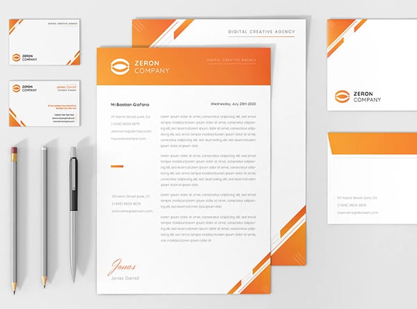
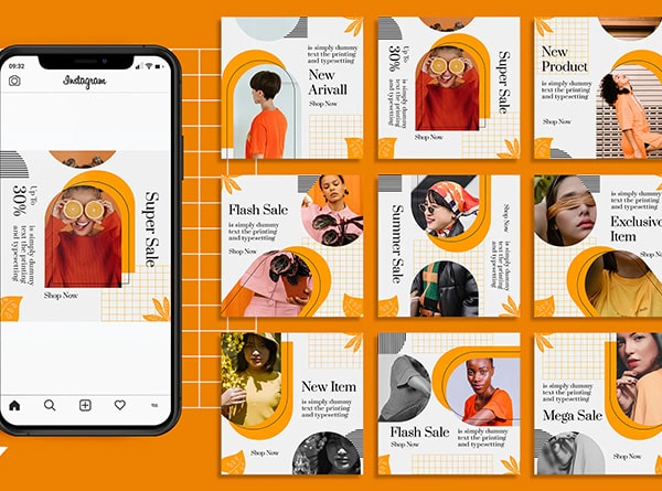
Inconsistent printed materials quietly undo the trust the website built. A menu with last year’s prices, a brochure with a different logo, and a handwritten aftercare note all tell the patient that the practice is not paying attention. The fix is to standardize seven pieces around one approved source of truth: the treatment menu as the master reference, single-focus brochures, personalized post-consultation handouts, package and membership comparison sheets, a consented before-and-after lookbook, aftercare cards that state exact rebooking windows, and in-practice signage with a defined job for each location. Keep digital as the live source of truth, give every printed piece one next action and a QR code, and label and consent every patient image.
Read the full guide to med spa marketing materials, with a quick check for each piece.
Where to Start
Few practices need all five areas rebuilt at once. Run the quick checks in each linked article and note where your practice falls short. If the misses cluster in one area, start there. If they are spread across the website, the brand, and the printed materials, the underlying problem is usually that no single source of truth exists for how the practice presents itself, and a visual refresh of any one piece will not fix that.
That is the point where a conversation helps. Urban Geko designs and builds websites, brands, video, and print for medical and aesthetic practices, and treats them as one system rather than separate projects. If you would like a second set of eyes on your current site and brand, reach out and we will walk through where they stand against the checks in these guides and what a sensible next step looks like. Once the foundation is in place, the companion guide to med spa marketing covers how to get found and booked through search, advertising, social media, and email.
Frequently Asked Questions About Med Spa Website Design and Branding
Should I fix the brand or the website first?
If the brand position is unclear, fix that first, even if it is a short exercise. A website built on an unclear position produces generic copy and generic design, and it will need to be revised once the position is settled. If the position is sound and the website is the problem, start with the website and let it carry the existing brand.
How do I know whether my website needs a refresh or a redesign?
A refresh works when the structure, the booking flow, and the brand are sound and only the visual layer feels dated. If the quick checks reveal structural problems such as a catch-all services page, poor mobile usability, slow load times, or a booking tool that does not connect to operations, those issues live beneath the template, and a redesign is the honest answer.
Do I need all seven videos and all seven print pieces?
No. Start with the pieces closest to the booking decision: a provider introduction video and a treatment expectations video, and a current treatment menu and aftercare card. Add the others as the practice grows. The point is that every piece you do produce matches the website and the brand.
What should I have ready before talking to a design partner?
Your top treatments by revenue, your providers and who oversees care, your current booking and practice-management software, any existing brand guidelines or logo files, examples of your printed materials, and an honest note on what frustrates you about the current site. A good partner will also ask about consultation volume and no-show rate, because the work should be judged on booked appointments, not on how it looks.
Ready When You Are
Talk With Urban Geko About Your Practice
If you’re weighing up who should handle this, the quickest way into a real conversation is to tell us where your practice stands today, which treatments matter most, and what you need the work to accomplish. Share that with us and we can talk properly about the decisions involved, and whether Urban Geko is the right team for it.