This guide is one part of our complete guide to med spa marketing, which covers the search, advertising and email work that sends patients to the site.

A polished homepage can still lose consultations. When the booking path takes too many taps, treatment pages stay thin, or the layout looks like every other practice in town, visitors leave before they act. The med spa website design looks fine. The path to a booked appointment does not.
This guide is for the people who own that problem: med spa owners, medical directors, practice managers, and the clinicians whose calendars depend on the site. It covers nine elements that make a site clearer, more credible, and easier to book. Each one ends with a quick check you can run on your own site today.
This article is part of our complete guide to med spa website design and branding.
1. The Hero Section Decides Whether Visitors Stay
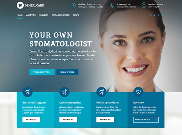
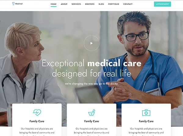
Your first screen has the heaviest job on the site: tell visitors who the practice serves, what results it is known for, and what to do next. Delivered before anyone scrolls, that combination decides whether a prospective patient keeps reading.
Balance Aesthetics with Medical Credibility
Refined typography and a warm palette signal the experience. Provider credentials signal safety. A sterile, clinical look pushes away the wellness-minded visitor, while purely aspirational imagery undercuts the trust a medical practice has to earn.
What Belongs Above the Fold
Three elements earn their place in a high-performing hero:
- One primary call to action that names the action, such as “Book a Consultation” or “Request an Appointment,” rather than a vague “Learn More.”
- One trust cue tied to oversight, such as the medical director’s name and credential or the supervising physician’s specialty.
- One form of proof, such as an aggregate review rating or a before-and-after image. Patient consent and the disclosures your state requires apply whenever real patient images appear.
What to Remove
Vague welcome headlines delay the answer to two questions: why this practice, and what should I do next? Several competing buttons split attention. Generic stock photography makes the practice look interchangeable.
Quick check: Load your homepage on a phone. Without scrolling, can you tell who the practice is for, who oversees care, and how to book?
2. Design for the Phone First
Most people researching treatments or comparing providers are doing it on a phone. If your med spa website design started on a wide monitor and was squeezed down for mobile, visitors feel it: text too small to scan, buttons too close together, and a booking path buried behind several taps.
A conversion-focused layout starts with the smallest screen: readable body text, buttons sized for a thumb, and a booking button that stays visible as the visitor scrolls. Top treatments, provider credentials, and scheduling should be reachable without digging through a menu.
Keep the Homepage Focused
On a phone, a focused homepage lets visitors identify services, see proof, and find scheduling in one natural scroll. Every element that does not support one of those goals competes for limited screen space.
Speed Is a Business Decision
A slow page on a cellular connection loses visitors before they see the design. Compressed images, fewer heavy scripts, and fast-loading treatment and booking pages protect the first impression.
Quick check: On a phone, can a visitor reach the right treatment page or the consultation request in two or three taps?
3. Organize Services the Way Visitors Decide
A single services page that lists every treatment forces visitors to do the sorting. That effort costs bookings, especially on mobile.
Group by Decision, Not by Menu
Structure should reflect how someone narrows a choice. A visitor concerned about volume loss thinks in terms of injectables, not an alphabetical list of product names. Someone exploring texture or tone looks for a skin rejuvenation category before comparing specific devices.
The right grouping depends on the service mix. A dermatology-led clinic needs a different structure than a large med spa with dozens of treatments.
Map a Clear Path Through the Site
Good med spa website design moves visitors through predictable layers: homepage to service category, category to treatment page, treatment page to provider or location, and then to a booking action. Practices with multiple providers or locations also need routing so visitors reach the right person or office.
Avoid the Template Trap
A single “Services” label with one catch-all page buries the information visitors need. Defined category pages and focused treatment pages give each service room to answer real questions.
Quick check: Pick your three most profitable treatments. Can a new visitor find each one from the homepage in two clicks?
4. Build Treatment Pages That Answer Questions Before Staff Have To
A treatment page that names the service and adds one paragraph leaves most questions unanswered. Visitors either leave or call the front desk with questions the page could have handled.
What a Complete Treatment Page Covers
Strong treatment pages do pre-consultation work. Each one should address the predictable decision points:
- Candidacy: who tends to be a good fit and which concerns the treatment addresses.
- Process: what the visit generally involves, from arrival to aftercare.
- Timing and downtime: practical detail for someone planning around work or an event.
- Pricing context: a starting price, a package mention, or a clear consultation prompt.
- Frequently asked questions: common questions answered on the page, marked up so search engines can read them.
- One clear next step: a single call to action matched to the service.
Add Decision Support
Two additions help visitors self-select and strengthen search visibility:
- Related-treatment links for someone comparing options, such as linking between neurotoxin and filler pages.
- Comparison blocks that explain the difference between similar treatments and reduce “which one is right for me?” calls.
Quick check: Read your busiest treatment page as a first-time visitor. Does it answer who it is for, what happens, how long recovery takes, and roughly what it costs?
5. Put Social Proof Where Decisions Happen
Proof works harder in context, next to the treatment detail or the booking button, where doubt surfaces. A testimonials page nobody visits does little.
Match the Format to the Job
- Before-and-after imagery shows results on real patients.
- Review excerpts speak to the experience: wait times, staff warmth, comfort, and follow-up.
- Short testimonials help a visitor picture themselves making the same choice.
- Brief video or mini case stories combine outcome and experience in a format that is harder to fake.
Set Standards for Before-and-After Content
Credibility depends on presentation. Real patients, written consent on file, consistent lighting and framing, clear provider credit, and visible disclosure language separate trustworthy proof from content that reads like an ad. Rules on patient imagery and testimonials vary by state, so confirm what applies to you.
Proof That Pre-Qualifies
Specific, well-presented proof helps visitors judge fit and set realistic expectations before they book. A visitor who has already seen relevant results arrives at the consultation closer to a yes.
Quick check: Is there at least one piece of relevant proof on each major treatment page, or does it all live on one separate page?
6. Give Providers Their Own Visibility
Someone considering injectables or laser treatment is choosing a provider as much as a procedure. When provider information lives only on a generic About page, it rarely reaches visitors when it matters.
Surface Credentials Where Visitors Are Already Looking
Provider names, credentials, and treatment focus belong on the homepage, on the relevant treatment pages, and on dedicated provider profiles. A one-line credential on a treatment page reinforces medical oversight without asking for another click.
What a Provider Profile Should Include
- Role and credentials: license type, board certifications, and relevant training.
- Treatment focus: which services this provider performs or oversees.
- A real, current photo rather than a stock image.
- Availability: which office or which days, if the practice has more than one location.
- A direct path to booking: one button that leads to a consultation with that provider.
Practices with physician oversight and several injectors should say, in a sentence, who supervises and who performs each treatment.
Avoid Trust Inflation
A team grid with no treatment context tells visitors very little. Vague credential language erodes credibility faster than an honest, concise profile builds it. Every claim should be specific and verifiable.
Quick check: From any treatment page, can a visitor see who performs it and book with that person?
7. Show Pricing That Builds Trust
Hiding every fee behind “Contact us for pricing” adds friction just as a visitor is deciding whether your practice is worth a call.
A Practical Framework
- Fixed-fee services, such as a specific facial or a defined package, can carry an exact price.
- Variable treatments, such as injectables dosed by area or laser sessions tailored to skin type, work better with a starting price or a realistic range.
- Consultation fees deserve a clear mention, including whether the fee applies toward treatment.
Present memberships or bundled packages as ongoing value rather than urgency-driven discounts.
Pair the Number with Context
A price without explanation invites sticker shock or false comparisons. A short note on what influences cost, such as treatment area, number of units, or skin condition, helps visitors self-qualify. For range-based services, the next step is a consultation; for straightforward bookings, a direct scheduling link. When financing is available, mention it as a practical option, not a sales lever.
Quick check: Can a visitor get a sense of cost for your top five treatments without calling?
8. Design the Path After the Click
Getting a visitor to tap “Book Now” is not the finish line. What happens next decides whether that intent becomes an appointment.
Match the Path to the Decision
Not every service warrants the same next step. A straightforward facial can go directly to online scheduling with minimal fields. A higher-consideration treatment, such as a multi-session laser plan, often needs a request form routed to staff for provider matching. Some visitors simply want to call or text. Offering all three paths meets visitors where they are.
Protect the Calendar and the Patient’s Data
A booking flow that works for visitors should also work for operations. Provider assignment by service, location routing, deposit collection, and automated reminders reduce no-shows and keep staff out of manual scheduling loops. Because booking and intake forms collect health information, the form, scheduling, and messaging tools behind them should handle that data securely and, where HIPAA applies to your practice, under a business associate agreement with each vendor that touches it. Confirm your obligations with your compliance advisor.
Recover the Ones Who Don’t Finish
A visitor who opens a booking form, enters partial information, and leaves is one of the highest-intent leads the practice will see. An automated email or text follow-up gives the practice a second chance, and routing those leads into a CRM keeps them visible.
Quick check: Book a test appointment on your own site. How many fields and screens did it take, and did a confirmation arrive?
9. Treat Local Search, Accessibility, and Measurement as Part of the Design
Making a med spa website findable, usable by everyone, and measurable is a design decision, not an add-on after launch.
Local Discovery Starts in the Build
Local search is supported by consistent name, address, and phone details on every page, a dedicated page for each office with a map and hours, and treatment pages written in the language visitors use. Schema markup for the organization, providers, and FAQs helps search engines interpret the content correctly.
Accessibility Is a Conversion Issue
Readable contrast, captioned video, meaningful alt text, keyboard-navigable menus, and forms that work with assistive technology remove barriers. A visitor who cannot complete a booking form with a screen reader is lost revenue, and accessibility complaints against medical websites are not rare.
Track What Earns Consultations
Calls, form completions, and confirmed bookings should be tracked by source and page, so the practice can see which treatment pages produce consultations. Without that, design improvements stay disconnected from results.
Quick check: Can you say, with data, which three pages on your site produced the most consultations last month?
Where to Start
Few practices need all nine elements rebuilt at once. Run the quick checks above and note where your site falls short. Three or more misses usually point to structural problems in the architecture, booking flow, or mobile experience that a visual refresh will not fix.
That is the point where a conversation helps. Urban Geko designs and builds websites for medical and aesthetic practices, connecting brand, content, search, and booking into one site rather than treating them as separate projects. If you would like a second set of eyes on your current site, reach out and we will walk through where it stands against these nine elements and what a sensible next step looks like.
Frequently Asked Questions About Med Spa Website Design
When is a refresh enough, and when does a practice need a full redesign?
A refresh works when the brand, the site structure, and the booking flow are sound and only the visual layer feels dated. If the real problems are structural, such as service pages lumped together, poor mobile usability, slow load times, or a booking tool that does not connect to operations, those issues live beneath the template. Reskinning a broken structure produces a better-looking site with the same conversion gaps.
Do I need a separate page for every treatment, provider, and location?
Dedicated pages help when a treatment has distinct candidacy criteria, pricing, and search demand. Closely related services, such as two similar chemical peels, can share a page with clear comparison content rather than two thin pages. Individual provider profiles matter most when visitors are choosing who performs their treatment, and each office needs its own page with accurate contact details. The goal is clear visitor paths, not duplicated filler.
Should a med spa website show prices online?
It depends on how variable the service is. Fixed-fee offerings can carry an exact price. Treatments dosed by area or customized by skin type work better with a starting price or a realistic range. Consultation fees should always be stated. Pricing transparency generally reduces friction and helps visitors self-qualify, but the key is pairing whatever you show with enough context that the number makes sense.
What technical basics matter most before spending more on ads or content?
Start with mobile speed, booking usability, and accessible forms. If the site is slow on a phone or drops visitors during scheduling, more ad spend sends more traffic into a broken funnel. Local SEO foundations and conversion tracking for calls, forms, and bookings tie every later improvement to measurable results.
What should I have ready before talking to a web design partner?
A short list goes a long way: your top treatments by revenue, your providers and who oversees care, your current booking and practice-management software, any brand guidelines, and an honest note on what frustrates you about the current site. A good partner will also ask about your consultation volume and no-show rate, because the site should be judged on booked appointments, not on how it looks.
Ready When You Are
Talk With Urban Geko About Your Practice
If you’re weighing up who should handle this, the quickest way into a real conversation is to tell us where your practice stands today, which treatments matter most, and what you need the work to accomplish. Share that with us and we can talk properly about the decisions involved, and whether Urban Geko is the right team for it.