This guide is one part of our complete guide to med spa marketing, which covers the channels that bring cosmetic patients in once the website is working.

When one practice website needs to serve someone seeking urgent acne treatment and someone researching a luxury facial, the wrong layout sends both visitors to the wrong place. That tension sits at the core of effective dermatology website design for practices offering both medical and cosmetic services. These eight decisions separate those pathways without splitting your practice identity.
This article is part of our complete guide to med spa website design and branding.
1. Treat the Homepage as a Routing Decision, Not a Summary of Everything You Offer
A homepage that gives equal weight to every service line asks visitors to do the sorting themselves. Most won’t. They’ll scan, feel uncertain, and leave. The homepage’s primary job is to help someone decide, within seconds, whether they need a medical dermatology path or a cosmetic consultation path, then move them forward.
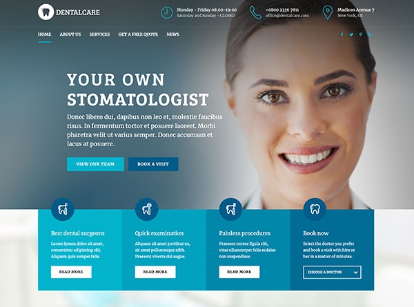
What Belongs in the First Screen
Three elements earn their place above the fold:
- One concise practice description that communicates who you are and the breadth of what you offer, without trying to list it all.
- Two distinct entry points that visually separate the medical and cosmetic pathways. These need to feel like real choices rather than decoration.
- One shared trust cue that applies to both sides, such as board-certified physician oversight or provider depth.
Full treatment menus, provider bios, and galleries belong deeper in the site where each pathway can present them in context.
Quick check: Pull up your homepage on your phone. Can you identify two distinct pathways and understand the practice’s scope before you scroll?
2. Structure Navigation Around Visitor Intent, Not Internal Departments
A visitor arriving at a dual-service dermatology site already has a general sense of what they need. Your navigation should meet that sense of direction before asking anyone to choose a specific treatment.
The temptation is a single, expansive services dropdown mixing medical conditions, cosmetic treatments, and branded device names into one long list. That structure forces visitors to understand your internal organization before they can find what they came for.
A more effective pattern starts with clear top-level choices reflecting how visitors think. Medical visitors orient around conditions, providers, and getting care. Cosmetic visitors lean toward concern-led paths and consultations.
Where Labels Go Wrong
Mixed labels create friction quickly. “Advanced Skin Services” could mean clinical treatment for a chronic condition or a premium aesthetic procedure. If visitors have to guess, they hesitate. Plain language reflecting each visitor’s intent outperforms internal terminology.
Keep the top level lean. Two to four clearly differentiated entry points outperform a flat list of fifteen treatments every time.
Quick check: Can a first-time visitor tell which top-level path is medical and which is cosmetic without clicking?
3. Map a Page Hierarchy That Visitors and Search Engines Can Follow
A clear navigation label means little if the pages behind it are a flat collection of loosely connected URLs. The site’s page hierarchy determines whether visitors move logically from broad interest to a specific treatment, and whether search engines understand which pages carry the most authority.
The Practical Structure Most Practices Need
Effective dermatology website design starts with defined page types:
- Homepage routes visitors into medical or cosmetic pathways.
- Hub pages introduce each service line and link to individual treatments or conditions.
- Treatment and condition pages cover specific services generating real search interest.
- Provider pages give each clinician unique credentials and links to supported service lines.
- Location pages serve each office with unique content about services, hours, and the surrounding area.
- Booking or consultation endpoint provides the single action every pathway ultimately reaches.
Hub pages link to their treatments. Treatment pages link back to the hub and forward to the relevant provider or booking step. This pattern helps both visitors and search engines understand page relationships.
Multi-Location Practices Need Unique Pages, Not Copied Shells
Each location page needs genuinely unique content. Duplicating a template with only the address swapped creates pages with no distinct value. A lean hierarchy with substantive pages outperforms an inflated one full of thin content.
4. Build Each Service Page for Its Visitor’s Actual Decision
Separate pages for medical conditions and cosmetic treatments aren’t just a search optimization rule. They reflect two distinct visitor mindsets requiring different information, structures, and next steps.
A medical condition page serves someone trying to understand a problem. It needs a condition-led explanation in accessible language, diagnosis and treatment details, which providers handle it, and a clear path to scheduling.
A cosmetic treatment page serves someone weighing a decision. That visitor needs to understand what concern the treatment addresses, candidacy details, recovery expectations, and proof of quality results. The next step is typically a consultation request, not direct booking.
When both page types follow the same template, neither audience gets what it needs. Good dermatology website design builds these distinctions into page structure and content modules, not just navigation labels.
Thin pages with generic copy do more structural harm than having no page at all.
Quick check: Pick one medical condition page and one cosmetic treatment page from your site. Beyond the headline, do they differ in structure, content depth, and the specific next step they offer?
5. Give Each Provider a Page That Answers “Who Treats This, and How Do I Reach Them?”
A headshot and three-line bio tell visitors a provider exists. They don’t help someone figure out whether that provider is the right fit. When a visitor has narrowed their interest to a treatment or condition, the provider page becomes a decision page: does this clinician’s focus match my goal, and can I get to them easily?
The page should clarify which services or conditions the provider actively treats, whether their focus leans medical or cosmetic, and which locations they practice from. A visitor comparing two providers should be able to distinguish their clinical interests without decoding fellowship abbreviations.
Individual Expertise Within a Shared Brand
Provider pages work best when they highlight what makes each clinician distinctive while reinforcing the practice’s overall identity. Consistent layout, photography style, and tone keep the brand cohesive. The variable content (areas of focus, treatment interests, scheduling path) gives each page its practical value.
Link directly to the relevant booking step for that provider. If scheduling routes differ by service type or location, make that visible on the page.
Quick check: Can a visitor identify each provider’s focus and book with them without leaving their page?
6. Match the Call to Action to the Visitor’s Readiness, Not a Universal Button
A single “Book Now” button on every page assumes every visitor is ready to schedule. Medical pages serve visitors with an identified problem who want fast access to care. Cosmetic pages serve visitors still evaluating a decision; a consultation request or results gallery may need to come before any booking step.
Map Page Type to CTA Type
- Medical condition pages: appointment booking widget or click-to-call with office hours visible.
- Cosmetic treatment pages: short consultation request form that reduces drop-off.
- Provider pages: scheduling path specific to that clinician’s location and service type.
- Hub or comparison pages: softer entry such as a brief inquiry form or guided next step.
Form length matters. A medical form collecting insurance and preferred location serves its visitor. That same form on a cosmetic page adds friction that costs inquiries.
If any form or chat widget collects information that could identify a patient, the workflow needs HIPAA-aware handling. Secure transmission and proper data storage are not optional.
Quick check: Do three different page types on your site each offer a next step matching how that visitor is thinking?
7. Place Visual Proof and Cost Guidance Where They Support a Cosmetic Decision
Before-and-after photos, curated reviews, and results galleries belong on cosmetic treatment pages, where a visitor is actively weighing an elective decision. Embedding that same content across the site dilutes the clinical credibility your medical pages need.
Real practice photography matters more than stock imagery. A visitor comparing injectable providers or laser resurfacing options wants evidence specific to your team’s work. Place galleries and relevant patient reviews on treatment and provider pages where they answer the visitor’s actual question.
A compliance note: before-and-after images typically require documented written patient consent, and testimonial claims may be subject to state-level rules. Review these requirements with your attorney or compliance advisor.
If you share cost guidance, the cosmetic treatment path is the right place. Placing fee ranges on a treatment page sets realistic expectations before a consultation request. That same information on a medical condition page can confuse visitors focused on getting care.
Quick check: Is your strongest visual proof on the cosmetic pages where it informs a decision, or scattered across the site?
8. Build for the Phone First, Because Structure Fails When the Screen Does
A well-organized dual-pathway site still loses visitors if the experience breaks down on a phone. Slow load times, cramped tap targets, tiny type, and buried navigation collapse the careful separation between medical and cosmetic pathways into one frustrating encounter. The visitor who can’t find the menu or waits too long doesn’t distinguish between a bad structure and a bad experience. They leave.
Most dermatology website design decisions covered earlier depend on mobile execution.
Priorities worth testing on your own phone:
- Navigation reachable without hunting
- Image galleries that load quickly without layout shifts
- Form fields sized for thumbs with minimal required inputs
- Sufficient contrast and spacing for comfortable reading
- Tap targets that don’t overlap or require precision
No visual redesign alone resolves HIPAA or accessibility compliance. Forms, integrations, and data flows behind them still require dedicated review.
Quick check: Complete your consultation request form on your phone, start to finish. Count every tap, every scroll, and every moment you wait. That’s the experience your visitor is measuring you by.
Turning Eight Checks Into a Clear Priority List
Run each of the eight checks above and mark every fail. Then group repeated misses into structural buckets: architecture, page hierarchy, booking flow, mobile execution, or content depth. Several misses clustered in the same bucket usually point to a structural problem that surface-level dermatology website design changes will not resolve. That pattern is your priority list.
If those patterns suggest your site needs more than a patch, Urban Geko partners with medical and aesthetic practices on website strategy, design and development, and search-ready content structure.
Frequently Asked Questions About Dual-Pathway Dermatology Website Design
Do medical and cosmetic dermatology need separate websites?
Usually not. A single site under one cohesive brand serves most practices better than maintaining two domains. What matters is building separate pathways within that site: distinct hub pages, page goals, content structures, and calls to action for each service line. The right answer depends on your specific service mix, location count, and how different the booking workflows are between medical visits and cosmetic consultations.
Which pages should a dual-service practice build first?
Start with the pages that carry the most structural weight: your medical and cosmetic hub pages, the conditions and treatments generating real search volume or appointment demand, individual provider pages, and unique location pages. Not every condition, device brand, or surrounding city needs its own page on day one. Thin pages with recycled copy create confusion for visitors and signal low value to search engines. Build fewer pages with genuine depth, then expand based on demand.
How should booking differ between medical visits and cosmetic consultations?
Medical pages benefit from the fastest route to care: a scheduling widget, click-to-call, or short appointment form. Cosmetic pages usually need consultation framing first, with proof of results, expectation setting, and a lower-commitment request form before any booking ask. One important boundary: HIPAA compliance depends on the form itself, the integration behind it, the messaging path, and how patient data flows and is stored. Page layout alone doesn’t determine compliance.
What should we have ready before talking to a design or marketing partner?
A short preparation list saves time on both sides:
- Current sitemap or main navigation structure
- Top medical conditions and cosmetic treatments by priority
- Provider and location matrix showing who practices where
- Present booking workflow for each service type
- Analytics baseline or a rough count of booked consultations per month
- Any internal rules governing patient images, testimonials, or marketing claims
The most important framing: judge the project on whether it produces more booked consultations and clearer visitor routing, not on appearance alone. If you’re ready to start that conversation, reach out to Urban Geko to discuss your practice’s website strategy.
Ready When You Are
Talk With Urban Geko About Your Practice
If you’re weighing up who should handle this, the quickest way into a real conversation is to tell us where your practice stands today, which treatments matter most, and what you need the work to accomplish. Share that with us and we can talk properly about the decisions involved, and whether Urban Geko is the right team for it.