
In today’s digital age, having an aesthetically pleasing website is not enough to attract and retain visitors. Website navigation plays a crucial role in enhancing user experience and driving engagement. A well-designed navigation system can make it easy for users to find the information they need quickly, efficiently, and intuitively.
In this blog post, our Orange County wordpress design team will discuss some best practices for website navigation that can help you create a seamless browsing experience for your users while also improving your SEO rankings. So, whether you are designing a new website or revamping an existing one, read on to discover how you can optimize your website navigation for better user experience and web design!
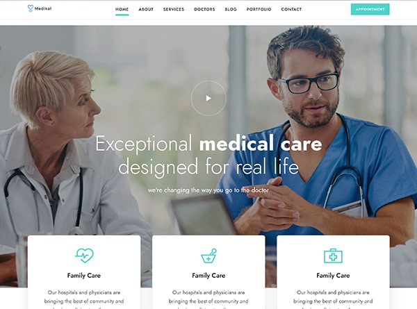
1. Keep it Simple and Consistent
The first and foremost rule of website navigation is to keep it simple and consistent. Users should be able to understand the layout of your site without having to put in too much effort. A cluttered or confusing interface can drive visitors away, resulting in higher bounce rates.
To simplify your website’s navigation, consider using a minimalist design approach that focuses on essential elements only. Use straightforward language for menu labels, subheadings, and button texts instead of complex technical jargon.
Consistency is equally important as simplicity when it comes to website navigation. Maintain uniformity across all pages by placing similar items in the same position throughout your site. This consistency will help users develop a sense of familiarity with your site’s structure and can enable them to navigate quickly between different sections.
Another way to ensure consistency is using visual cues such as color coding or iconography for different categories or menu items. This method makes navigating the site more intuitive for users who have come back repeatedly since they will know which colors correspond with what section!
By keeping it simple and consistent, you can create an efficient browsing experience that keeps visitors engaged with your content while boosting web design!
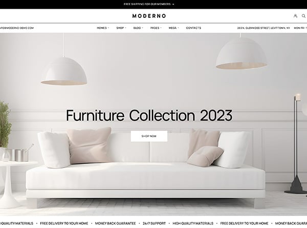
2. Use Clear Labels and Descriptions
Clear labels and descriptions are crucial for website navigation to enhance user experience. When designing your website, our web design Orange County team believes it’s essential to keep in mind that visitors should be able to easily identify what they’re looking for without any confusion.
Using generic or ambiguous labels can result in frustration and a negative user experience. Instead, use clear and descriptive language that accurately reflects the content of each page. Avoid using technical jargon or industry terminology that may not be familiar to all users.
In addition, it’s important to ensure consistency throughout your website when labeling pages and sections. This helps users understand where they are on the site at all times and how to navigate back and forth between different sections.
One way to test if your labels are effective is by conducting usability testing with a sample group of users. Ask them specific questions about their understanding of the website structure, labelling system, and overall navigation process.
Remember, clarity is key when it comes to label and description usage on websites. By implementing clear language consistently throughout your site, you’ll improve the user experience while also boosting SEO rankings through keyword-rich text descriptions.
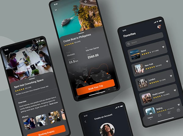
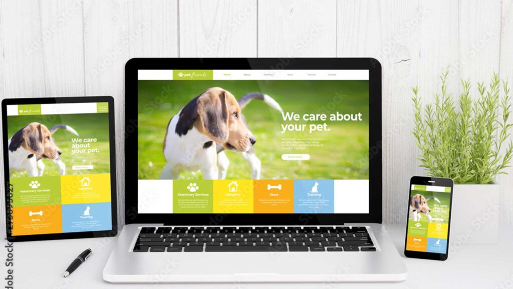
3. Optimize for Mobile Devices
In today’s digital age, mobile devices have become ubiquitous. Therefore, it goes without saying that your website should be Mobile responsive. It is vital for websites to optimize their navigation for these devices to improve user experience. Here are some best practices for optimizing website navigation on mobile:
Firstly, minimize the number of clicks required to access important content or sections by creating a clear and concise menu. A hamburger icon can also be used as a drop-down menu button.
Secondly, ensure that your website loads quickly on all mobile devices by optimizing images and reducing unnecessary code. Slow load times can lead to high bounce rates and lower engagement.
Use responsive design techniques that adapt your website layout based on the screen size of each device used to access it. This ensures that users can easily navigate through your site no matter what type of device they’re using.
By following these best practices in optimizing websites for mobile devices, businesses can enhance user experience and increase engagement with potential customers.
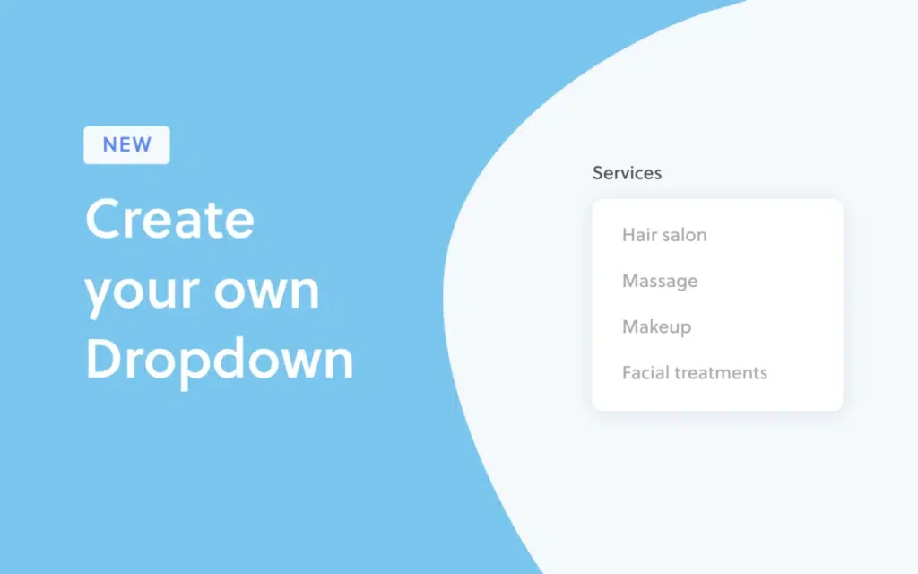
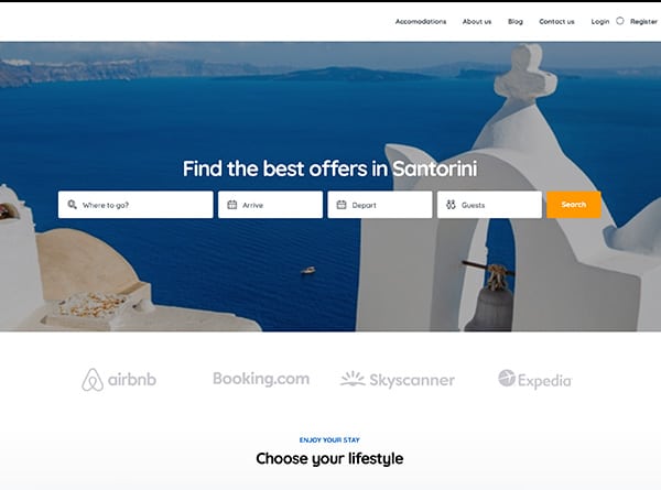
4. Use Dropdown Menus Sparingly
Dropdown menus can be useful for organizing a lot of information on a website, but it’s important to use them sparingly. If you have too many dropdowns, it can become overwhelming and confusing for users.
One reason why dropdown menus should be used sparingly is that they can slow down the user experience. When there are too many options in a dropdown menu, it takes longer for users to find what they’re looking for.
Another issue with using too many dropdowns is that they may not work well on mobile devices. Dropdown menus often require hovering over items with a mouse cursor, which isn’t possible on touchscreens.
If you do decide to use dropdown menus, make sure they are easy to navigate and clearly labeled. Group similar items together and avoid nesting multiple levels of submenus within each other.
While dropdown menus can be helpful in certain situations, it’s important to consider their potential drawbacks and use them sparingly to enhance rather than hinder the user experience.
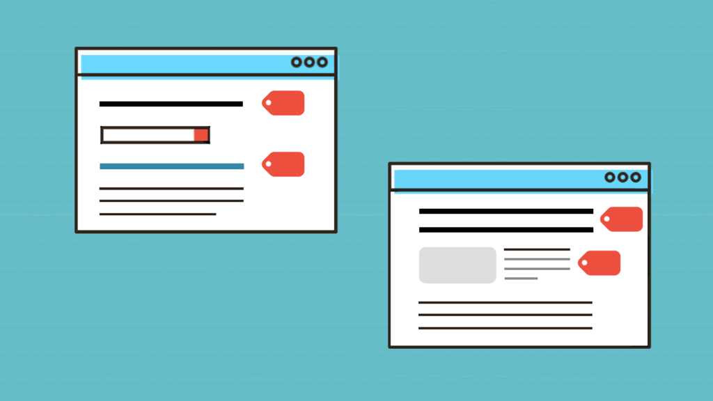
5. Use Breadcrumbs
Breadcrumbs are a useful navigation feature that can enhance the user experience on your website. These navigational tools allow users to easily understand their location within your site and navigate back to previous pages.
Breadcrumbs typically appear towards the top of each page and display the path a user has taken to arrive at their current location. They usually include clickable links, making it easy for users to retrace their steps or jump directly to a specific section of the site.
By providing clear breadcrumbs, you can help reduce bounce rates and improve engagement by allowing users to quickly find what they’re looking for without getting lost in your site’s hierarchy. Additionally, breadcrumbs can also assist search engines in understanding how your content is organized, potentially improving your SEO rankings.
However, it’s important not to overuse them – only use breadcrumbs when necessary and ensure they don’t clutter up or distract from other important elements on the page. Utilizing breadcrumbs as part of your website navigation strategy can greatly benefit both users and search engine optimization efforts.
6. Test Your Navigation
By following these best practices for website navigation, you can enhance user experience and make your website easy to use for everyone. Keeping it simple and consistent, using clear labels and descriptions, optimizing for mobile devices, using dropdown menus sparingly, and including breadcrumbs are all effective strategies to improve your navigation.
However, even after implementing these best practices, it’s important to test your navigation regularly. Conducting usability testing with real users can help identify any issues or areas of confusion within your navigation. By continuously iterating on the design based on user feedback, you can ensure that your website is always optimized for ease of use.
Remember that good website design goes hand in hand with good website navigation. By prioritizing the user experience through thoughtful and intentional design choices, you can create a website that stands out from the competition while also helping visitors accomplish their goals quickly and easily.
In conclusion, website navigation is a crucial component of user experience. By following these best practices, you can create a website that is easy to navigate, organized, and user-friendly. Remember to keep it simple, use clear labels and descriptions, optimize for mobile devices, use dropdown menus sparingly, use breadcrumbs, and test your navigation regularly.
Related Posts


