
In today’s digital age, it is increasingly important for businesses to have a presence online. Of course, there are many facets to this presence, from social media and email marketing campaigns to content pieces and website design.
However, one element that often gets overlooked is the mobile-friendliness of a website. As an Orange County business owner, you need to understand why having a mobile-friendly website is so important.
In this blog post, we will discuss why your business needs a mobile-friendly website and how you can go about creating one for your business.

1. More people are accessing the internet on their mobile devices than ever before
In recent years, there has been a dramatic shift in the way people access the internet. More and more people are using their mobile devices to go online, and this trend is only expected to continue.
This means that if your business doesn’t have a mobile-friendly website, you could be missing out on a lot of potential customers.
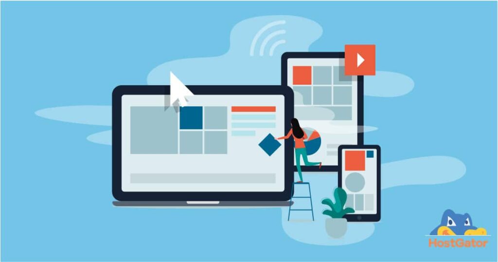
A mobile-friendly website is designed to be easy to use on a smaller screen. This can include features such as larger text and buttons, as well as a simplified layout.
If your website isn’t mobile-friendly, it can be difficult for users to navigate and may even deter them from doing business with you.
In today’s digital world, it’s essential for businesses to have a strong online presence. A mobile-friendly website is one important piece of that puzzle. If you don’t have one, now is the time to make the switch. Your customers will thank you for it!
2. Mobile users expect a seamless browsing experience
If your website is not mobile friendly, you’re likely losing out on a lot of business. Mobile users expect a seamless browsing experience, and if they can’t get it from your site, they’ll go to one of your competitors’.
It’s important to note that mobile users are not just limited to those who are using their smartphones; tablets and other mobile devices are increasingly being used to surf the web.
In fact, according to Google, more searches are now conducted on mobile devices than on computers. This trend is only going to continue, so it’s crucial that your website is optimized for mobile users.
There are a few things you can do to make sure your site provides a good experience for mobile users.
First, make sure the design of your site is responsive, meaning it will adjust to fit any screen size.
Second, keep your content concise and easy to read; mobile users are typically looking for quick answers or information on the go. And finally, make sure your site loads quickly; no one wants to wait around for a slow-loading page.
If you take these steps, you’ll be well on your way to providing a great experience for all of your visitors, regardless of how they’re accessing your site.
3. A mobile-friendly website can improve your search engine rankings
If you want your business to rank higher in search engine results, it’s time to make sure your website is mobile-friendly.
More and more people are using their phones and tablets to access the internet, and if your site isn’t designed for mobile devices, you’re missing out on potential customers.
A mobile-friendly website is easy to read and navigate on a small screen, and it loads quickly. Google prefers sites that are mobile-friendly, so if you want to improve your search engine ranking, making your site mobile-friendly is a good place to start.
If you’re not sure how to make your site mobile-friendly, there are plenty of resources available to help you.
You can hire a web designer or developer who specializes in responsive design, or use a responsive theme or plugin for your content management system. Once your site is optimized for mobile devices, you’ll see an improvement in your search engine rankings.
4. Mobile optimization can improve your website’s overall user experience
Mobile optimization is the process of making your website more user-friendly for visitors who are using mobile devices.
This can be done in a number of ways, such as by ensuring that your website’s content is easy to read and navigate on a small screen, by designing your website specifically for mobile devices, or by creating a responsive design that automatically adjusts to fit any screen size.
Mobile optimization is important because it can improve your website’s overall user experience.
Visitors who have a positive experience on your website are more likely to return, and they may also be more likely to recommend your site to others.
In addition, mobile optimization can help you attract new visitors, as more and more people are using mobile devices to access the internet.
If you want to ensure that your website provides a good user experience for all visitors, regardless of how they are accessing your site, then you need to make sure that it is optimized for mobile devices.

5. A mobile-friendly website can help you reach a wider audience
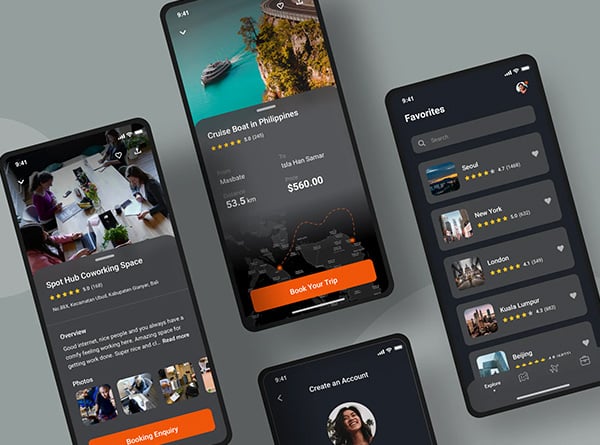
A responsive is a website that is designed to be easy to use on a mobile device. This can be anything from a smartphone to a tablet.
Such websites usually have a simplified design and layout, making it easy to navigate and use on a small screen.
Mobile devices are becoming increasingly popular, and as a result, more and more people are using them to access the internet.
This means that if your website is not mobile-friendly, you could be missing out on a lot of potential customers.
A well designed website can help you reach a wider audience by making it easier for people to use your site on their mobile devices. This can lead to increased traffic and more customers for your business.
6. Your competitors are likely already optimizing their websites for mobile devices
As more and more people use mobile devices to access the internet, it’s becoming increasingly important for businesses to have a website that is optimized for these devices.
Your competitors are likely already taking advantage of this and ensuring that their website is mobile-friendly. If you don’t have a mobile-friendly website, you could be at a disadvantage when it comes to attracting and retaining customers.
A mobile-friendly website is one that is designed to be easy to use on a smaller screen. This means that the layout is simplified, the text is easy to read, and the buttons and links are easy to click on.
Mobile users are often looking for quick answers to their questions, so it’s important that your website provides them with the information they need in an easily accessible format.
If you’re not sure whether your website is optimized for mobile devices, take a look at it yourself on your phone or tablet. If it’s difficult to navigate or doesn’t display correctly, then it’s time to make some changes.
You can either hire a web designer to create a new mobile-friendly site for you, or you can use a responsive design template that will automatically adjust your existing site to fit different screen sizes. Whichever option you choose, making your site mobile-friendly will help you stay ahead of the competition and attract more customers.
Related Posts


