Fintech Authentication UX: Biometrics, Step-Up Verification, and Building Security Confidence
Picture this: A user opens their banking app to quickly check their balance before a meeting. Instead of a one-glance Face ID login, they’re met with a full password entry screen, a CAPTCHA, and a one-time code sent to an email they’re not currently monitoring. By the time they’re in, the meeting has started.
We’ve seen this described in support tickets, app store reviews, and user research more times than we can count. And every one of those moments chips away at trust — not because the security is wrong, but because it’s applied indiscriminately. Great authentication doesn’t just secure accounts. It *communicates* security, and it scales its demands to match the actual risk of what the user is trying to do.
The Core Problem: One-Size-Fits-All Authentication
Walk through your app and honestly ask: what is the real risk if an unauthorised person performs this action right now?
Checking a balance? Low. Transferring $500 to a new payee? High. Changing the account email address? Very high.
Most fintech apps apply the same barrier to all three. That’s a security model that doesn’t match the actual threat model — and it frustrates users by applying maximum friction to low-stakes moments. Our studio’s solution is risk-proportionate authentication: light barriers for low-risk actions, escalating challenges for high-risk ones.
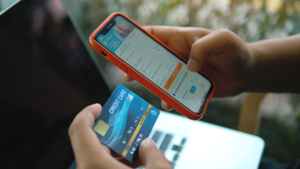
Making Biometrics the Default
System biometrics – Face ID, Touch ID, or their Android equivalents, should be the default login for any supported device. But getting this right is more specific than it sounds.
*Always use the platform’s native prompt.* Never build a custom biometric modal. Users have been conditioned to recognise exactly what a legitimate authentication request looks like on their platform. A non-native prompt raises a subtle but real hesitation — exactly the wrong signal for a financial app.
*Put the fallback on the same screen.* The PIN or password alternative should be immediately visible, never tucked behind a small “Try another method” link. Biometrics fail, wet fingers, poor lighting, Face ID after a dramatic haircut. Make the alternative easy to find.
*Size your PIN pad touch targets generously.* Repeated wrong entries can trigger lockout flows. Touch targets on digit keys should be large enough that an imprecise tap always registers correctly.
Step-Up Authentication: When to Ask for More
Step-up authentication is one of the highest-value security UX patterns in fintech, and one of the most underused. The principle: the strength of the challenge should match the potential impact of the action.
Actions that warrant step-up: transferring above a defined threshold to a new payee, changing credentials, adding or removing a linked account, accessing full account numbers, disabling fraud alerts.
What step-up should feel like: a brief, clearly explained challenge proportionate to the action. “For your security, we need to confirm it’s really you before sending this transfer” lands intuitively because it sounds like something a thoughtful bank would say.
What it should not feel like: a full re-login that forces users to re-enter credentials they used five minutes ago. That’s friction theatre, not security.
Device Trust and Smart Session Management
A user logging in on their personal iPhone on their home network is a very different risk profile from the same account accessed from a new device in a foreign city. Building that context in means trusted sessions get streamlined access while anomalous ones get additional scrutiny — automatically, without the user doing anything.
Session timeouts are where many apps frustrate loyal users unnecessarily. Show a countdown warning before expiry and provide a single tap to extend. If the session does expire, pre-populate the username so users jump straight to the credential step.
One small addition our studio loves: a single line near the authentication screen, “We will never ask for your password via text or email” — reinforces security awareness passively. Small addition, genuine trust signal.
Handling Authentication Failures
Error states in authentication are where most apps reveal how little thought went into the non-happy path. Our framework for every failure state: be specific (“Face ID didn’t recognise you” beats “Biometric failed”), be actionable (give the next step immediately), stay calm (the language should defuse anxiety, not amplify it), and be accurate about account status (if an account is locked, say why, for how long, and how to recover).
Ready to Rethink Your Authentication Experience?
Our studio specialises in authentication flows that make users feel genuinely protected, not interrogated. We’d love to show you what risk-proportionate authentication looks like for your product.
Reach out for a FREE 15-minute consultation today.
For the full fintech mobile UX playbook — including KYC onboarding, payment flows, dashboard design, card controls, and accessibility — visit: Fintech Mobile App UX/UI Design: The Complete Guide to Patterns That Build Trust.
Urban Geko Design is an award-winning digital design and development agency based in Newport Beach, Orange County, CA. We specialise in UI/UX design, web development, branding, and digital marketing for fintech, financial services, healthcare, and growth-stage businesses.
Related Posts