The Complete Guide to Patterns That Build Trust
Picture this: Your fintech app launches to rave reviews. Downloads are climbing, your acquisition spend is paying off — and then the numbers plateau. Users are coming in, but they’re not staying. Onboarding completion is lower than it should be. Your support queue is flooded with questions the interface should have already answered.
Sound familiar? Our team has seen this story across dozens of fintech products, and the culprit is almost always the same: the design isn’t building trust fast enough.
Here’s what we’ve learned from years of designing financial interfaces: speed and security are a balancing act, not a binary choice. Strip away too much friction and money movement feels reckless. Layer on too much and users abandon before they ever fund an account. The magic lives in between — and that’s exactly what this guide is about.
Why Trust Is the Real Design Brief in Fintech
In most industries, great UX means fast and intuitive. In fintech, that’s not enough. Every tap, every confirmation screen, every error message carries an implicit message: *this company can be trusted with my money.*
Our clients in financial services say the same thing time and again — the friction that frustrates users on a food delivery app is sometimes the very friction that reassures them on a banking app. Finding that sweet spot is what separates fintech products people love from ones they merely tolerate.
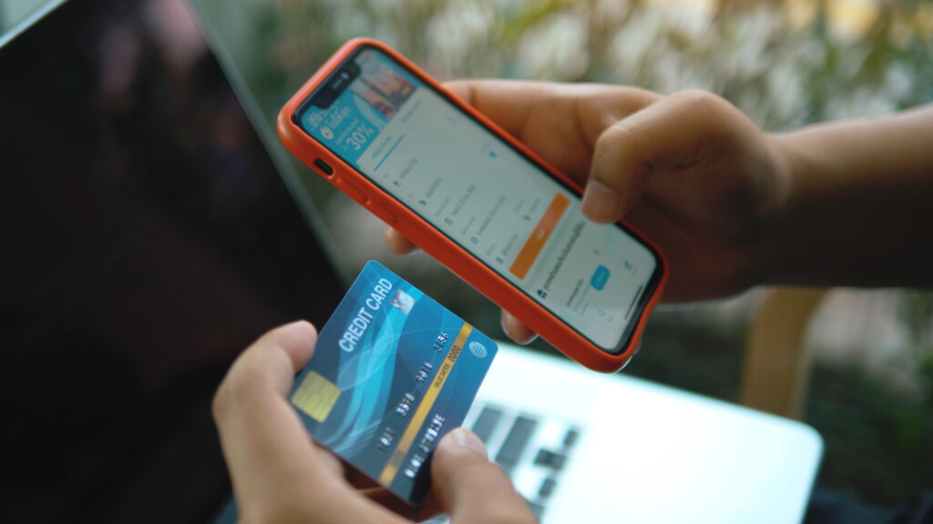
1. Progressive Onboarding and KYC That Doesn’t Punish New Users
Asking for a government ID, a selfie, and a Social Security number before a user has seen a single screen of your product is a trust deficit most apps never recover from. The winning pattern is progressive disclosure — let users into a restricted version of the app before the heavy identity checks begin. KYC becomes a logical next step rather than an interrogation.
When you do ask for documents, explain why at the exact point of request. Break document capture into guided steps with real-time quality cues. Our studio has seen well-designed KYC flows double completion rates compared to front-loaded verification.
For a deep dive, check out our guide on how to design a frictionless KYC onboarding flow for fintech apps.
2. Authentication That Feels Like Security, Not Bureaucracy
System biometrics should be the default login on any supported device. But the real strategy is step-up verification — extra scrutiny for genuinely high-risk actions like transferring above a threshold, while keeping low-stakes actions (checking a balance, browsing history) frictionless. Users understand this instinctively because it mirrors how they expect a bank to behave.
Our full breakdown of biometric authentication and security UX in fintech apps covers the full approach, including the accessibility requirements most teams skip.
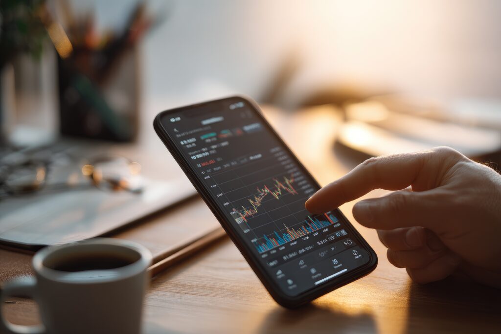
3. Dashboard Design That Answers the First Question First
Most people open a fintech app to answer one question: *How much do I have?* The speed at which your first screen answers that question determines whether the experience feels like control or like work.
Above the fold: primary balance prominently displayed, the last three to five transactions, and a compact action bar for common moves. That’s it. Everything else fights for attention at the exact moment your user needs clarity.
We go much deeper in our guide on fintech dashboard design.
4. Navigation That Keeps High-Frequency Actions Within Thumb’s Reach
If users have to hunt for payments or card controls, the app feels unsafe — even if every backend system is working perfectly. Our studio’s rule: a bottom tab bar with four to five clearly labelled destinations, most-used items where a thumb naturally rests. Predictable back behaviour and deep links from notifications that land in context, not on the home screen. These sound elementary, and yet the number of fintech apps that break them is remarkable.
5. Payment Flows That Eliminate Doubt Before They Eliminate Taps
The goal isn’t fewer taps — it’s fewer moments of doubt. Sequence payments naturally: recipient first (highest-stakes decision), amount second, review last. The final screen must show recipient name, exact amount, fees listed separately, funding source, and estimated arrival time. If any of these are missing, the user fills the gap with anxiety.
After the payment leaves, silence feels like danger. Success, pending, and failure each deserve their own screen with clear language and a next action.
The full sequencing logic is in our guide on fintech payment flow UX.
6. Card Controls and Fraud Response That Work Under Pressure
Nobody reaches for card controls when they’re relaxed. The freeze toggle needs to be reachable within two taps from any screen, visually unambiguous, and immediately followed by a clear answer to “What happens now?” A freeze button that works perfectly but dumps the user back to the home screen with no next steps is only half a system.
Everything you need to design this flow is in our guide on card controls and fraud response UX for fintech apps.
7. Accessibility as a Design Standard, Not a Compliance Afterthought
In financial services, an inaccessible interface isn’t a minor oversight — it’s exclusion at the moment someone is trying to make a decision about their money. The practical requirements start with touch targets sized at 44×44 pixels minimum, WCAG AA contrast ratios, and screen-reader labels specific enough to tell a user exactly what action they’re about to take.
The quiet truth: accessibility improvements almost always make the product better for everyone. Our full guide on accessibility in fintech app design makes the case for why this is a competitive advantage, not just a legal requirement.
Putting It All Together
No single pattern on this list operates in isolation. KYC completion depends on authentication design. Dashboard trust depends on transaction history reliability. Payment confidence rests on confirmation states being airtight. Fraud response only works if card controls are reachable before the panic sets in.
The fintech teams that get mobile UX right treat it as a coordinated system. That’s the kind of multi-discipline orchestration our studio specialises in — and it’s the difference between an app that filters users out and one that earns their long-term loyalty.
Ready to Build a Fintech App Your Users Actually Trust?
Our studio has helped fintech companies at every stage — from seed-stage startups redesigning their first onboarding flow to established players tackling a full-product UX overhaul. We’d love to hear what you’re building.
Reach out for a FREE 15-minute consultation today.
—
Urban Geko Design is an award-winning digital design and development agency based in Newport Beach, Orange County, CA. We specialise in UI/UX design, web development, branding, and digital marketing for fintech, financial services, healthcare, and growth-stage businesses.
Related Posts