Card Controls and Fraud Response UX: Designing for the Moment That Matters
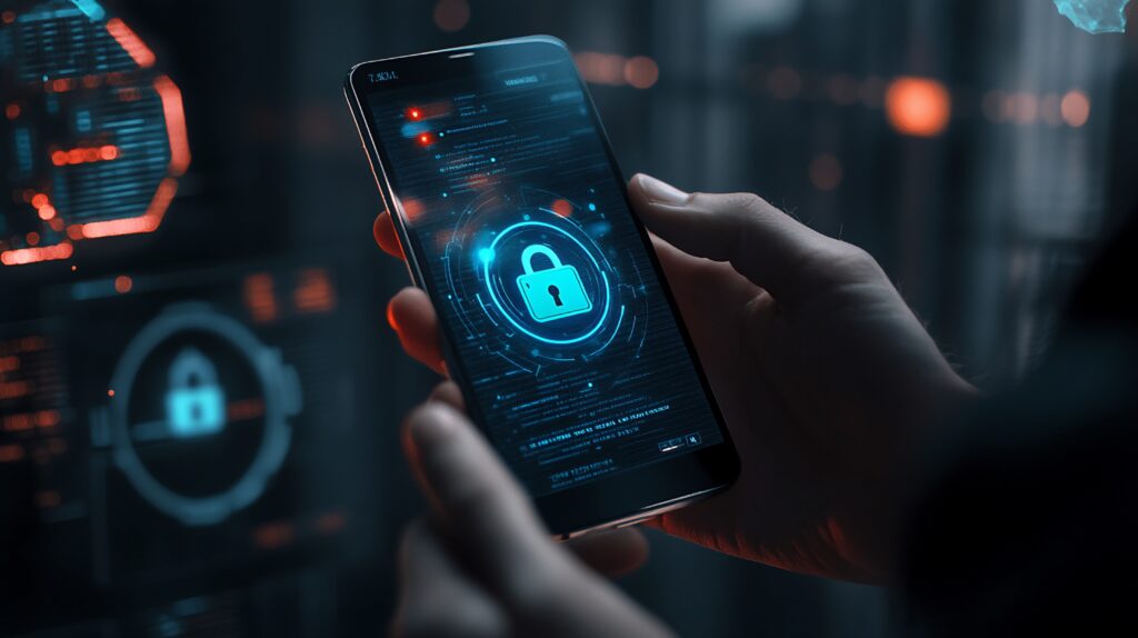
Picture this: You’re at a restaurant, your server hands back your card, and your phone buzzes. A charge you don’t recognise. A merchant you’ve never heard of, in a city you’re not in. You open your banking app, and the freeze toggle is buried somewhere in Settings > Account Management > Card Services > Manage Card.
By the time you find it, you’ve tapped through four menus, gotten turned around twice, and your adrenaline is doing the navigation.
Our studio hears versions of this story from fintech users constantly. And every time we do, the frustration isn’t with the security system — it’s with a design built for calm, exploratory browsing that’s being asked to perform under genuine pressure. Here’s what we’ve learned: the emotional context of these moments must drive every single design decision.
The Freeze Toggle: Accessibility Above Everything Else
The most important requirement for a card freeze feature is reachability. Within two taps from any screen in the app. No exceptions.
If reaching the freeze toggle requires Settings > Cards > Card Management > Freeze Card, your user will be doing that navigation while panicking — taking wrong turns, backtracking, possibly giving up. Every tap beyond two is a design failure when urgency is the context.
The toggle itself must communicate its state without ambiguity. “Frozen” and “Active” should look different enough that a panicked glance in dim restaurant lighting confirms the current status in under one second. State change feedback must be immediate. “Your card is now frozen. Transactions will be declined.” is the gold standard, it confirms the action, explains what it means, and closes the uncertainty loop.
Fraud Reporting: Keep It on the Same Screen
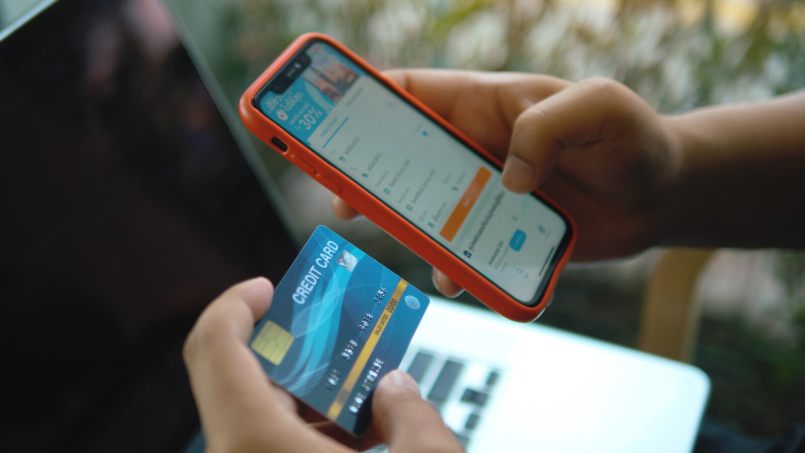
A user who discovers a suspicious charge does not want to freeze their card, navigate elsewhere to report it, then navigate elsewhere again to dispute it. In their mind, these are one event. Your design must reflect that.
From a transaction detail screen, a user should be able to: flag the transaction as suspicious in one tap, immediately receive a plain-language explanation of what happens next, choose whether to freeze the card from the same screen, and initiate a formal dispute if they’re ready to. Separating these actions forces someone in crisis to navigate instead of act.
Granular Card Controls: Useful Without Overwhelming
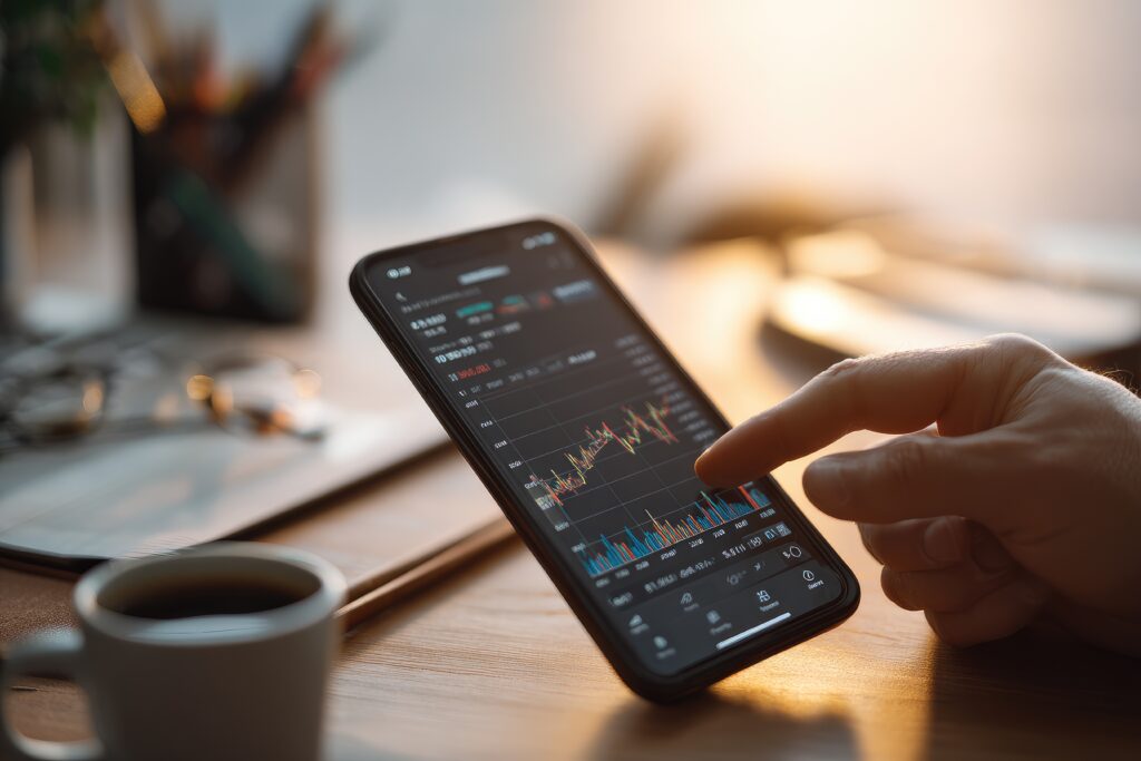
Beyond the emergency freeze, controls like spending limits, merchant category restrictions, and online payment toggles serve a different need. The design challenge is that these two categories should never compete visually, emergency actions and routine configuration at the same hierarchy suggest they’re equivalent in urgency. They’re not.
Our studio’s approach is a tiered structure: emergency actions (freeze/report fraud) most prominent, ongoing protection controls (online toggle, contactless, international usage) in the middle, and advanced configuration (merchant restrictions, per-transaction limits) available but not in the way. A user in crisis hits what they need immediately. A user doing thoughtful security setup finds everything without it cluttering their emergency access.
The Recovery Layer: What Happens After the Freeze
Here’s where most fintech apps stop, and where genuine, lasting trust is built or lost.
After a user freezes a card or reports fraud, the immediate threat is resolved but the situation isn’t over. The next question is completely predictable: What happens now?
Every fraud response interaction should immediately transition into a clear answer to that question: how to request a replacement card and the exact timeline (not “soon” — “3–5 business days”), how to formally dispute flagged transactions with those charges pre-loaded, and direct access to live support with account context pre-attached so the user never has to re-explain a situation your system already has on record.
A freeze button that works perfectly and then returns the user to the home screen with no next step is only half a design.
Notifications as Your First Line of Defense
Card controls and fraud response doesn’t start when the user opens the app. It starts when something suspicious happens.
Real-time transaction notifications for every charge serve as passive fraud monitoring. Anomaly alerts for unusual patterns — unfamiliar merchant category, unusual geography, amounts well outside the user’s norms — give proactive heads-up without creating alarm.
The detail our studio always emphasises: a fraud alert that opens the app’s home screen is a missed opportunity. That notification should deep-link directly to the flagged transaction, with dispute and freeze options immediately accessible. The user tapped the notification because they want to act. Remove every tap between that intent and the action.
Ready to Design Fraud Response That Actually Builds Trust?
Our studio specialises in card control and fraud response flows that show up for users at exactly the right moment, turning a stressful situation into proof that your product has their back.
Reach out for a FREE 15-minute consultation today.
For the full fintech mobile UX playbook — including KYC onboarding, payment flows, dashboard design, card controls, and accessibility — visit: Fintech Mobile App UX/UI Design: The Complete Guide to Patterns That Build Trust.
Urban Geko Design is an award-winning digital design and development agency based in Newport Beach, Orange County, CA. We specialise in UI/UX design, web development, branding, and digital marketing for fintech, financial services, healthcare, and growth-stage businesses.
Related Posts