
It is hard to imagine running a business in today’s time without having a responsive website that displays everything about your business in a systematic manner. People surf the internet everyday to look for the products or services they need. However what’s ironic in this whole process is that although there are tons of businesses that have what the customer needs, but, unfortunately their websites don’t!
Despite all the website tools and resources available easily on the internet, there are still some sites which are in a pitiable shape. There are websites that are still relying on old ways to lure their customers in. As a business we need to understand that a website is not a mere string of codes tied together it is your online brand. Most people don’t go beyond a website to form an impression about a business.
From poor visuals to disjointed navigation, unattractive content, and lack of clear call to actions – all these help in keeping money out of the door for your business. All these are signs that cry out loud for a redesign of the website.
Web design is meant to combine form and function in a way that makes a website enjoyable, navigable, and interesting. This is what all good Orange County Web Design companies do. Web design is a form of art. When you get your Website design you should aim for giving your users the best visual experience. It should be clear, clean and in style with current trends. To achieve this, there are certain rules web designers must follow.
So here I am going to list down some common web design mistakes that businesses make all the time.
1. Poor Visuals
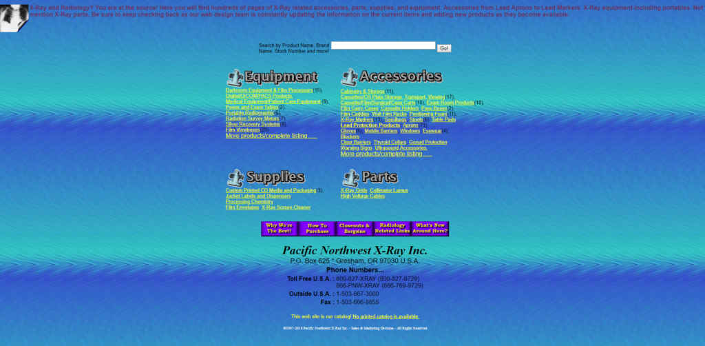
Your website is your chief branding tool, it is your first impression of business on your prospective clients and if it looks anything that is unprepared then your business is sure to be doomed. It will not only lose out on the customers who are there scrolling your website but also on the customers that these customers will be talking to. Everyone today prefers to check brand reputation online by going through their reviews. String of poor reviews are bound to bring your website rankings down.
The important thing to remember is that crowded websites are never a good thing. Websites with hundreds of images and text take ages to load and confuse the visitors. Such websites have the highest bounce rates and zero conversions. se images where necessary and as a way to enhance the messaging. Stay away from blinking images, as they tend to make the site look cluttered.
Visuals are more effective than words. A crafty web designer can narrate an entire story using smart graphics and images. Therefore you need to make sure that your website is neatly presented when it comes to the visual side of it.
Another thing to remember here is that just adding images to the website isn’t enough. You need to make sure that those images are well optimized. A poorly optimize image is only going to eat up on the loading time, which will make your site slow, resulting in loss of customers.
So make sure that you are always going for Visual delight but in a well organized manner.
2. Unstructured Call To Action

Call to Action (CTA) is the gateway to your business. Rather it is the single most important function on your website. It directs your visitors to do something. Click here! Buy now! Or Contact us.
You only have a few seconds to grab a user’s attention. If they do not know what your website design is about in a matter of seconds, they are more likely to leave your site and never return. Right away your site should tell someone the nature of your business. This information needs to be clear and obvious. This includes explaining what your business is and directing them to a call to action.
Big brands like Amazon.com spend millions to research and track user’s behaviour that will give them better insights on what turns users off from clicking that all elusive button. What’s important is to tell them to act right away! But along with that there should be enough information for the visitors on the website so that they know what result their action would yield. Also you need to make sure that your Call to action doesn’t look pushy. You need to give your customers right information and then leave it on them, let them decide if they want to purchase in on your offer.
Some websites make a mistake of pushing their customers off through their aggressive strategies. Don’t fall in that trap. A common mistake which most web designers make is to add obscure call to action buttons. That is totally unnecessary! One should make sure to keep their CTA precise, on-point and easy to find. This is your website’s golden chance to capture a customer. Don’t blow it.
One of the top reasons users will visit a website is to find out how to contact the company. If your contact information is not listed or is in a place that is difficult to find, the user is more likely to get frustrated and leave your site. It is best to have your contact information on several areas of your site so it is easy for users to find it.
Another thing to keep in mind is that most users visit websites to find information about your company. If you keep outdated information up on your website, users can become confused and annoyed. Make sure to review and update the information on your website on a regular basis.
Make sure to have clear navigation between pages. If users go from one page to another and don’t know how to return to the homepage, they are more likely to exit out and not return. Make sure to have clear navigation that is consistent on every page. If your menu bar is at the top on the home page, it should stay on the top on every other page as well.
3. Quality of Content

Content is king when it comes to online business or rather it has always been king. Only its definition has changed with time but consumers have always bought into good content.
Now most businesses just want to go live in the market once their structure is ready, which is not a bad thing, only if they are not disregarding their contents. At times to push the matter fast, they try to settle in for low quality, duplicated content, which can ruin your investment on online marketing.
Content is what puts your services into words. It informs the audience of your business. You need to make sure that you appropriately lay out your content on the web page and pick a legible and attractive font for the same. Not only that well written content packed with good keywords give your website a good SEO score. After all this what all businesses aim at, good organic score. A good organic reach of a business online means that customers come looking for you and not the other way round.
Always make sure that you keep adding to your content and keep it fresh. An outdated website is a sign of poor or no business. It would simply reflect that you may have gone out of business. And remember to make good use of the white space.
Part of keeping your website fresh also means making sure you don’t have broken links on your site. Broken links frustrate and confuse a user. You should check your links on a regular basis to see if there are any problems or if any changes have been made. If you notice that a link is broken, fix it right away.
Trust me this is not something we are making up, Search bots always sway away from websites that are not regular with their content updates. So make sure that your website doesn’t fall in that category.
4. Imperfect Placements of Ads

This point is relevant to bloggers more than any other businesses. Advertising is an inevitable part of the web design world. It is one of the main income streams for bloggers. However too many ads or flashy ads can be frustrating for the audience and make them close your website. Trust us, we are not trying to discourage you from putting ads on your website but you need to be careful with your choices.
Ads on your website should compliment the flow and structure of the system. Poor placement of these ads are only going to break the flow of the user who is browsing your site. It is an evil that can eat your business alive. You need to be very careful regarding the choice, design and placement of an ad on your website. If you’re bothered by certain ads, the audience will be too. Get rid of them!
5. Ignoring or Not Reading Into Analytics Correctly

This is one of the big mistakes that businesses commit worldwide. No doubt, Designing a website may land you with a good-looking site which works fine but there is a bleak chance that it may possess the required analytics.
You need to collect data on your website otherwise what’s the point of having a website in the first place. Most businesses don’t care about analytics. Now we are not suggesting to go in hard with analytics at the very start but at least make sure that you have the basics covered. Installing analytics into the design is not enough, if you are not able to read them correctly.
Analytic tools help you measure the result of your website and help identify errors for improvement. It provides us with bounce rates and you can see areas that require improvement for improving the results. Constant adjustment, testing, and optimisation is important for your continued success online. We as an Orange County website design firm recommend Google Analytics to all our clients to help them improve usability of their website and making sure that they are ultimately able to turn visitors into customers.
6. Lengthy Forms
Forms are necessary to a website. If done well they do a good job of collecting the information of the user who is browsing your site. However, not every website has got their game ready for forms. In other words, poorly done forms can easily turn away customers from your website.
A greedy contact form is a common web design mistake because it is an appeal to the visitor for ‘way too much’ when it comes to them engaging with your business. As mentioned above, contact forms are a very important part of businesses online. They are a very convenient way to help the customers get in contact with you and simultaneously help the businesses in figuring out the requirements of their customers. But it’s important not to make your form as a begging bowl on your website. You should only ask for the information that is very much necessary and leave all the incessant details for later. You need to capture the attention of the lead and turn him into your customer.
In a recent survey it was revealed people feel a bit uncomfortable with their phone numbers on form. So if your business doesn’t need user phone no# don’t make it mandatory for the user to fill it up on the form. Let the user decide what all information he/she is comfortable with sharing. However, if there is a scenario where Phone no# is mandatory, please mention it on the form that the collected data will not be used for marketing purposes.
Most people fear sharing their details because they think it will result in unnecessary phone calls or marketing gimmicks. So, inform your users and remain true to your words. It is imperative for a business to form a trust with their clients first. Therefore make sure that you only use information only for the details that you have mentioned.
TIP: Never use the word “Submit” at the end of your form. Rather, go for “Request now”. Small things can make a big difference.
7. Website Maintenance and Down Time
It is important to remember that once your website is built you can’t just forget about it. Some might think that an hour or two of downtime in a month is not so bad. But let’s spend a little time talking about what can happen if your site goes down unexpectedly or errors when updating your site.
- Your brand loses its credibility
A business website that crashes all the time will lose credibility. Your website is the place where you can make a positive first impression. Customers will find it difficult to trust a business that can’t even maintain its own website. Trust us, we know it better than anyone.
- Your crawl rate and search ranking suffer
If your server is slow and takes more than two seconds to retrieve a single URL, Google may limit the number of URLs it crawls from your website. Simply put, Google likes to crawl websites that are fast and those that don’t have errors. Also, keep in mind that downtime or a slow server response will result in a higher bounce rate. User experience is one of the many ranking factors Google uses, and a high bounce rate indicates a poor user experience.
When it comes to SEO, everything has an impact on each other in one way or another. If you have extended downtimes, which is not uncommon on shared hosting, your search engine rankings could suffer and you will have to climb back into Google’s good graces to recover. It may take some time.
- Your profits will take a hit.
E-Commerce is definitely something everyone is used to these days, but customers can still be wary of shopping online. If your site is down or slow during peak hours, you are giving visitors an excuse to jump out of the boat and leave the buying market. Worse, if your site goes down when a visitor thinks about buying something, you can almost guarantee that the downtime will reduce your profits by huge margins.
A website can crash or collapse for different reasons. Below we will discuss some of the more common that we see.
- Low quality accommodation
A poor quality web host is one of the most common reasons a site has downtime. There’s no point in investing in your website design, UX, or site speed if your web host isn’t.
The most common of these is shared hosting. Shared hosts include some of the biggest in the industry, like EIG companies like Bluehost and HostGator, as well as providers like SiteGround, GoDaddy, Media Temple, and InMotion Hosting.
The reason “shared” hosting is bad is right in the name itself. These providers tend to overcrowd the servers and even if you don’t know it, your site shares resources with over 200 other people. Any issues that arise with other sites can affect your site. This, in turn, has an impact on the performance and availability of your site.
Shared web hosts rely on upselling and additions to make a profit, not the quality of hosting they provide. If you’re curious to learn more about it, check out this in-depth article from our CFO on The Shocking Truths About How Cheap WordPress Hosting Really Works.
- Updating your website & checking for errors: plugins or theme issues
Easy availability to thousands of themes and plugins is one of WordPress’s strengths, but sometimes it turns into a weakness.
A theme or plugin must be compatible with your WordPress version and the technology used on your hosting. We recommend that you start with our list of the best WordPress plugins.
Unfortunately, no matter how good the plugin is, one bad update can bring down your WordPress site. Common issues include white screen of death and 500 errors. Always check your website immediately after making a change. Most of the time, updates or new installations will go smoothly, but issues can still occur and you don’t want these issues to be discovered by your visitors before you.
Key Takeaways
You need to always put yourself in the shoes of your users and then design your website. You need to keep your target audience and brand image in mind throughout the designing process. As this is the most crucial phase in website designing. This is the stage where you can be proactive with your demands and requests. After all it is your brand that will be competing in the market so you need to be hundred percent sure with what you are submitting on the internet.
Big website design mistakes can cost time, money, resources and most importantly, customers. Designers at Orange County understand that only a customer-centric approach can help in creating a high-performing website. We ensure that you build a website that provides your customers with the support and guidance they need to excel. We believe, Good customer service costs less than bad customer service. So focus on your customers priorities and business will take care of itself!
Want Professional Help Designing Your Website and Building Your Brand?
We would be more than happy to provide you with a quote for website design or answer any of your questions you may have when you contact us. Learn more about our website design here!
Related Posts