
Your financial product is complex. Your users know it. And the moment they land on a page filled with generic stock visuals and templated layouts, they start questioning whether the company behind them is equally generic.
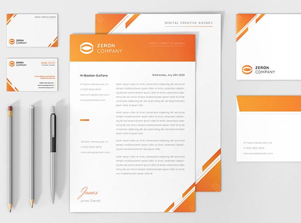
That instinct is expensive. Fintech custom graphics are the branded visual assets purpose-built for financial products: website hero visuals, landing-page UI mockups, product screenshots, ad creative, pitch decks, sales collateral, explainer illustrations, data visualizations, signage, and the identity system tying it all together. Not decoration. Trust infrastructure.
What follows is a channel-by-channel map connecting each asset type to the outcomes that actually matter: trust, clarity, conversion, and visibility in AI-driven search. But before jumping into individual assets, it’s worth grounding in something most production workflows skip entirely: system-level thinking.
1. Define the Full Asset System Before Designing a Single Pixel
Most fintech teams start their graphics work the same way: someone needs a hero image for a landing page, so they brief it. Then someone else needs social ads, so they brief those separately. Then the sales team needs a one-pager, and the investor deck needs updating, and suddenly there are four Figma files, three vendors, and zero consistency.
That’s not a design problem. It’s a scope problem.
Fintech custom graphics aren’t one-off visuals. They’re a reusable asset system built to explain regulated financial products across every channel where your brand shows up: web, app, paid media, sales enablement, events, and physical environments. Treating them as individual projects instead of interconnected components is how brand drift starts. In financial services, visual inconsistency triggers the same suspicion as a phishing email.
Start with a full scope inventory. The asset categories your system needs to account for:
- Website hero graphics and fintech landing page design modules
- App and dashboard UI elements
- Explainer illustrations and data visualizations
- Social and display ad templates
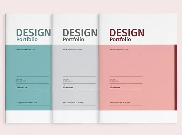
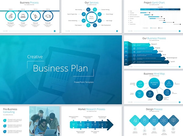
- Investor decks and sales collateral
- Event booth artwork and office signage
- The brand guidelines document governing all of it
That list isn’t aspirational. It’s the baseline for a financial brand operating across acquisition and retention channels simultaneously.
Every asset in that system also needs to pass fintech trust checks: claim accuracy (does the visual imply a return or benefit that requires a disclosure?), disclosure placement (proximate and legible, not buried), accessibility (contrast ratios and color-independent indicators that hold up), color consistency (exact HEX values, not “close enough”), typography standards, and version control so outdated creative doesn’t stay in circulation after a rate change or compliance update.
The outcome isn’t a prettier brand. It’s an asset map clarifying exactly what needs to be created, where each piece gets deployed, and whether it supports acquisition, trust, or both. That map becomes the brief your creative partner actually needs, and it prevents the slow accumulation of mismatched visuals that quietly erodes credibility across every touchpoint.
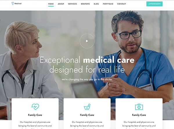
2. Design the Homepage Hero as a Trust Test, Not Just a First Impression
Most homepage redesigns start with the wrong question. Teams ask “What should our hero section look like?” when the real question is “What does a skeptical prospect need to believe within three seconds?”
In fintech, the homepage hero isn’t a branding moment. It’s a trust gate. Visitors arriving from a paid ad, a search result, or a referral link are already running a subconscious evaluation before they’ve read a single line of copy. The visual language of that first viewport either confirms they’re in the right place or triggers the back button. For financial products, where the ask involves handing over money, account credentials, or both, that evaluation is ruthless.
The assets that pass this test share a specific anatomy:
- Clean header visuals with restrained color palettes
- Custom hero illustrations that explain the product concept without requiring paragraphs of text
- Realistic product UI mockups showing actual screens, not aspirational wireframes
- A trust logo row featuring banking partners, security certifications, or recognized clients
- Compliance and security badges (SOC 2, PCI DSS, FDIC where applicable) positioned near the primary value proposition
- Media mention logos or verified review scores
- A single, clear CTA module that answers “What do I do next?” without competing with three other buttons
The execution principle underneath all of this is visual restraint. Fintech homepage design that actually converts doesn’t feel exciting. It feels calm. Precise typography with generous whitespace. Realistic product screens that make complex money movement or risk management feel understandable at a glance. The goal is comprehension speed: how quickly can someone who’s never heard of you understand what the product does, why it feels safe, and what action comes next?
If your homepage hero can’t answer all three within the first scroll, the remaining page content is solving for visitors who’ve already left.
Compliance and accessibility details matter here as much as the aesthetics. Any claim in the hero section (yield percentages, “no fees,” “FDIC insured”) needs its corresponding disclosure within the same visual field, not three scrolls below. Alt text for hero illustrations should describe the product concept being communicated, not just “hero image.” And contrast ratios need mobile verification specifically, because hero sections with light text over product screenshots routinely fail WCAG standards on smaller screens where the underlying image compresses differently.
The brands getting this right treat the homepage hero as a trust module with conversion built in, not a creative canvas with compliance bolted on afterward. When your visual system extends into this first viewport with the same precision and consistency, the hero doesn’t just look credible. It feels like proof that the product behind it operates with the same rigor.
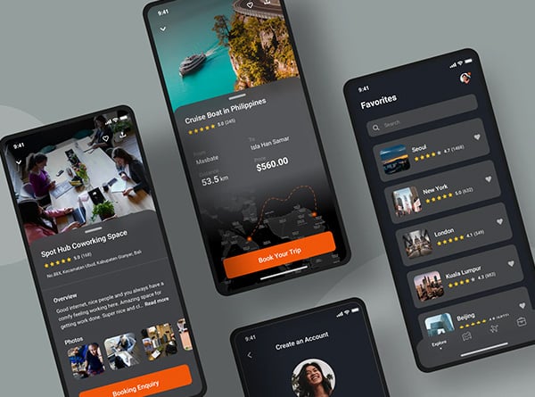
3. Build a Fintech UI Kit That Handles Real Product Workflows, Not Just Dashboard Screenshots
Most fintech UI kits look impressive in a portfolio and fall apart in production.
Scroll through Dribbble or Behance and you’ll find hundreds of beautifully rendered dashboard screens: dark-mode analytics panels, gradient-heavy wallet views, perfectly balanced card layouts. They photograph well. They also represent about 5% of what a real financial product actually needs.
The gap between a polished mockup and a production-ready design system is where teams lose months of development time and watch brand consistency quietly disintegrate. Your product isn’t a dashboard. It’s a connected series of workflows spanning onboarding, identity verification, transactions, permissions, wallet management, card controls, reconciliation, reporting, and multi-role admin operations. A UI kit that only covers the glamour screens leaves your team rebuilding from scratch every time they hit an edge case.
And in fintech, edge cases aren’t edge cases. They’re Tuesday.
What the Kit Actually Needs to Cover
The component inventory extends well beyond buttons, forms, and tables (though those need to be rigorous). The full list includes modals, notification patterns, transaction cards, account-linking screens, OTP verification states, KYC document upload flows, and the states most kits conveniently ignore: loading, empty, error, success, and partial failure. Every one of those needs light and dark mode variants, because any component that looks unfinished in one mode signals exactly the kind of carelessness financial users are trained to distrust.
Fintech-specific requirements are where generic UI kits completely break down. Financial data demands tabular numerals so columns align precisely. Transaction tables need to remain readable at scale, not with five sample rows, but with five hundred. Keyboard focus states must be visible and intentional, not the barely-perceptible browser default. Color contrast must meet WCAG AA standards across every state, including disabled buttons and secondary text that designers love to render in pale gray.
Then there’s the layer most design teams skip entirely: role-based views. A finance team member reviewing settlement reports sees a fundamentally different interface than a support agent investigating a disputed transaction or a risk analyst monitoring flagged accounts. Your UI kit needs to account for these permission-based variations without requiring a parallel design system for each team.
The Signals of Genuine Product Maturity
A UI kit that handles audit logging screens, reconciliation views, and edge-case failure states (partial transaction failures, timeout recoveries, duplicate submission warnings) tells your development team something important: the design system was built by people who understand what production fintech actually looks like.
That maturity translates directly into velocity. Product, marketing, and development teams reuse the same visual language across internal tools and external-facing surfaces without relitigating design decisions on every new screen. Handoff becomes consistent. Components behave predictably. The trust your users feel on the marketing site carries seamlessly into the product experience, because both were built from the same system.
The alternative is what most teams live with: marketing pages that look polished, a product interface that looks like it was designed by a different company, and a growing backlog of design debt tickets nobody has time to address.
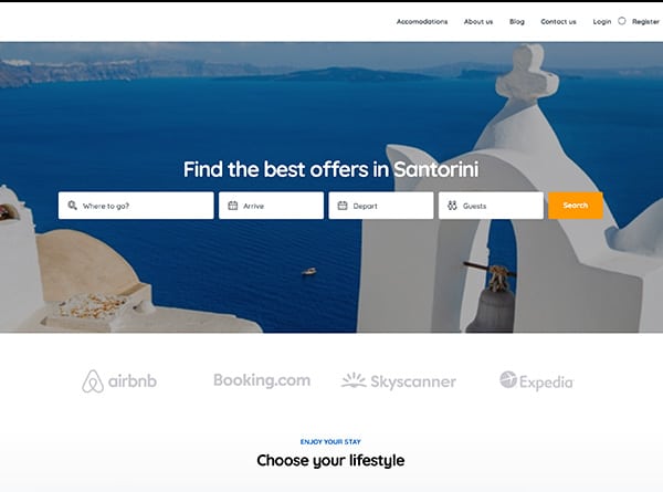
4. Treat Fintech Landing Pages as a Reusable Campaign System, Not a One-Off Design
A fintech landing page has one job: reduce anxiety fast enough to move a qualified visitor toward a single action. That sounds simple. The execution is anything but.
The problem with how most teams build these pages is structural. A designer adapts a generic SaaS template for a paid search campaign, ships it, then builds a completely different page for investor outreach with different spacing, different trust signals, and a mismatched CTA. Six months later, fourteen pages exist across four campaigns with zero shared components and no consistent compliance architecture. That’s not a speed problem. It’s a systems problem, and in fintech, rebuilding from zero each time isn’t just inefficient. It’s risk.
The Module Library That Actually Ships
A landing page system starts with a production-ready module library that campaign teams can assemble without relitigating design decisions or waiting on compliance review for elements already approved.
- Problem statement block: frames the visitor’s pain in specific language. Not “managing your finances is hard,” but the precise frustration your product resolves.
- Product visual module: a realistic UI mockup showing the actual interface, not a lifestyle photo.
- Benefit grid: three to four outcomes with icons and concise labels, scannable in under five seconds.
- Trust proof section: banking partner logos, security certifications, regulatory badges. Above the fold or immediately below the hero, not buried in the footer.
- Fee or pricing clarity block: transparent breakdowns in a dedicated module. Hiding fees behind “contact us” on a conversion page is self-defeating.
- Security block: encryption standards, SOC 2 compliance, data handling commitments. Positioned near any form collecting personal information.
- Short FAQ accordion: two or three objections most likely to stall conversion. Not a knowledge base. Just enough to neutralize hesitation.
- Testimonial module: real quotes from real users or recognizable client logos. Attributed and specific.
- Comparison table (where appropriate): transparent comparison earns more trust than pretending competitors don’t exist.
- CTA section: a single action with microcopy reinforcing security. “Start your application” next to a padlock icon and “256-bit encrypted” text feels fundamentally different from a naked “Submit” button.
Each module gets built once, reviewed by compliance once, and documented with responsive states, image sizes, accessibility requirements, and reusable CTA variants.
Conversion Safeguards That Protect Trust
Fake urgency has no place here. Countdown timers that reset on reload, “only 3 spots left” for a digital product with no capacity constraint: these inflate short-term clicks while training your audience to distrust you.
Qualifying disclosures belong next to the claims they qualify. If your hero copy mentions a yield percentage, the conditions sit within the same visual field, at legible size, with sufficient contrast. Mobile-first spacing is non-negotiable: 44×44 pixel touch targets, adequate form field padding, and forms that feel secure rather than invasive. Request only what the conversion requires, explain why you need each field, and never bundle marketing consent with a product signup checkbox.
The Outcome for Campaign Teams
When the module library exists, a new paid search page gets assembled from approved components in hours instead of weeks. An investor variant swaps the problem statement and trust proof without rebuilding page architecture. Compliance stays consistent because components were reviewed at the system level. Brand consistency holds because every module shares the same typographic standards, color values, and spacing rules. And conversion improves because iterations can be A/B tested at the module level without confounding results by changing everything simultaneously.
The page itself is disposable. The system behind it is the asset.
5. Brand Consistency Across Every Touchpoint Is a Security Signal, Not a Style Preference
In most industries, a slightly off-brand email is a minor annoyance. In financial services, it triggers something more primal: suspicion. Users have been trained through years of phishing warnings to scrutinize visual cues before trusting a financial communication. If an email looks slightly different from the app, or a landing page uses a color palette that doesn’t quite match the product interface, the instinct isn’t “that’s sloppy.” The instinct is “that might not be real.”
That reaction makes brand consistency in fintech a security signal, not a design preference. Maintaining it across web, app, email, collateral, paid media, signage, and partner materials requires more than a PDF style guide sitting in a shared drive nobody opens.
The Brand System That Needs Governing
The full system includes:
- Logo usage: sizing, spacing, background rules, and active purging of retired versions from circulation.
- Color palette: exact HEX, RGB, and CMYK values. “Close enough” blue on a co-branded partner page is how phishing simulations start.
- Typography: primary and secondary typefaces with fallback stacks for email clients where custom fonts don’t render.
- Icon and illustration style: a unified visual language so icons in the app, on the website, and inside sales decks feel like they came from the same hand.
- Motion rules: animation timing and interaction patterns consistent from marketing site to product UI.
- Disclosure modules: pre-approved compliance components with defined sizing, contrast ratios, and proximity rules that campaign teams can deploy without rebuilding.
- Photo direction: guidance on style, lighting, and composition so imagery doesn’t swing between corporate stock and startup casual.
- Chart rules: consistent axis labeling, color coding with accessibility redundancy, and sourcing standards.
- Tone of voice guidance: your brand personality should be recognizable whether someone reads a social post, a support email, or a 404 page.
Every inconsistency, however small, quietly teaches users to question whether what they’re looking at is legitimate.
The Governance Layer That Prevents Improvisation
Having brand elements defined is necessary. Having them enforced is what matters. Under deadline pressure, teams improvise. They pull an old logo from a Google image search. They eyeball a color instead of checking the hex value. None of this is malicious. All of it is corrosive.
- Centralized brand kit: a single, managed digital source with search, previews, and clear version labels.
- Approved templates: pre-built layouts for common use cases (campaign pages, email headers, social cards, one-pagers) with correct typography, spacing, colors, and disclosure components already embedded.
- Version control: system-based versioning that retires outdated assets automatically. When a rate or compliance requirement changes, every affected asset needs to be identifiable and updatable.
- Partner usage rules: external partners need a distributed brand kit with explicit parameters. An affiliate running a banner with your old logo and a non-compliant claim creates regulatory exposure that traces back to you.
- Approval workflows: defined sign-off paths so assets don’t go live without clearance. For enterprise fintech, this means documented approval chains and role-based access. For smaller teams, a checklist before anything ships.
Local and Enterprise Trust Layers
For financial brands serving specific geographies like Los Angeles, Orange County, or broader Southern California, consistency extends into local trust signals: service-area callouts, team bios with real photos, a verifiable address, local testimonials, and visible review management. These elements need the same brand-system treatment as everything else.
For enterprise fintech, the governance layer scales into cross-functional approval paths, department-level asset access controls, and audit-ready documentation proving published materials went through the appropriate review chain.
The Outcome
When the system works, every touchpoint feels like the same regulated, mature brand. Users never pause to wonder whether something is legitimate, because visual and tonal consistency answers that question before it forms. That’s a trust achievement, not a design achievement. And it holds only when there’s a system behind it, maintained by a partner who treats brand governance as infrastructure rather than an afterthought.
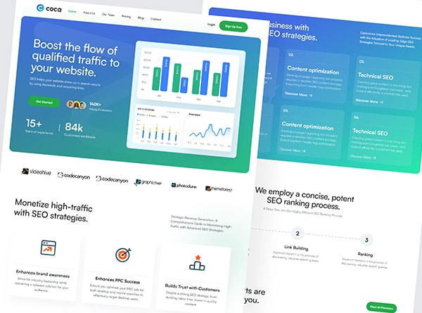
6. Financial Data Visuals That Persuade Without Misleading
A well-crafted chart can compress a quarter’s worth of performance data into a single glance. That compression is what makes data visualization so effective in financial collateral, and precisely what makes it dangerous.
Rate comparisons, savings calculators, fee tables, performance charts, transaction analytics, investor metrics, dashboard widgets, educational infographics: these assets persuade faster than any paragraph of copy. A line moving upward triggers an emotional response before the reader has even checked the axis labels. That speed is useful when the data is honest. When it isn’t, you’ve created a conversion lift today and a trust problem tomorrow. Fintech infographic design channels that persuasive speed into assets built for accuracy, clarity, and regulatory compliance from the start.
The CFPB’s “net impression” standard applies to graphics the same way it applies to headlines. If a reasonable person walks away with a distorted understanding of returns, fees, or risk, the fact that the underlying numbers were technically accurate somewhere on the page doesn’t help.
Design Checks That Protect Accuracy and Readability
Honest scales come first. A truncated y-axis on a performance chart can make a 2% gain look like a 40% surge. Unless there’s a clearly marked break in the axis and a stated reason for the truncation, start at zero. Default to standard timeframes (YTD, one-year, five-year) rather than cherry-picked date ranges that flatter a narrative while hiding volatility.
Beyond the axes, these elements need deliberate attention:
- Tabular numerals: proportional figures cause columns to misalign, making rate and fee comparisons unreliable. Enable tabular (monospaced) figures in every data table and chart label.
- Visible timeframes: every chart includes the date range it represents, displayed within the visual field, not tucked into a footnote.
- Clear labels and legends: axis titles, data series names, and unit labels a non-specialist can parse without hunting.
- Source notes: data attribution directly beneath the visual. “Source: Federal Reserve, Q1 2025” anchored to the chart, not referenced three sections later.
- Accessible contrast and non-color-only indicators: roughly 8% of men have some form of color blindness. Pair color with direction arrows, pattern fills, or explicit “+/−” labels.
Compliance Checks for Every Number on Screen
Every figure in a financial visual requires verification against its source: rates, returns, fees, dates, and the assumptions behind any projection. A savings calculator showing accumulation over ten years is built on assumptions about return rates, contribution frequency, and compounding periods. Those assumptions need to be visible and adjustable, not buried in source code.
Disclaimers belong inside the visual field they qualify. A performance chart showing historical returns needs its “past performance does not guarantee future results” language attached to the chart itself, not separated by a page break or collapsed behind a tooltip. When that principle holds, your brand earns the ability to use data persuasively without creating the misleading impressions that invite regulatory scrutiny or cost users money based on something they misunderstood. Fintech data visualization design applies these principles systematically across every chart, table, and metric display your brand produces.
7. Paid Acquisition Graphics That Scale Without Losing Brand Trust
The wrong visual on a paid ad doesn’t just underperform. It actively damages the credibility you’ve spent months building everywhere else.
Paid fintech creative has to earn attention in a feed full of noise without resorting to gimmicks that make a serious financial product feel unserious. An off-brand color, a vague claim, or a visual metaphor borrowed from a crypto hype campaign can undo the trust signals your homepage and product UI have carefully established. Your audience isn’t scrolling past casually. They’re evaluating whether your product looks like something they’d hand their banking credentials to.
The Asset Types That Need System-Level Treatment
Acquisition creative isn’t one deliverable. It’s a family of formats with distinct specifications, attention windows, and compliance requirements:
- Static ads for paid social and search display
- Social carousels walking through product benefits across multiple frames
- Display banners in standard IAB sizes across programmatic networks
- Retargeting graphics that re-engage visitors who’ve already interacted with your product
- Short video covers (the static or animated thumbnail earning the click-to-play)
- Product mockup ads showing actual UI screens in context
- Landing-page visual variants matching the creative to the destination
Treating each as a standalone design request is how brands end up with a carousel that looks nothing like the display banner running alongside it. In financial services, that visual inconsistency triggers the same suspicion as a mismatched email. Fragmented creative doesn’t just reduce performance. It erodes the perception of legitimacy.
Building the Modular Production System
The solution isn’t designing every ad from scratch. It’s building a campaign-ready system with pre-approved modular components that growth teams can assemble without waiting for a full compliance cycle on every variation:
- Approved headline zones: defined text areas with character limits per format, ensuring copy stays legible and never crowds disclosure space.
- CTA variants: pre-approved call-to-action treatments tested for contrast and touch-target compliance.
- Product screenshot treatments: standardized mockup frames for app screens and dashboards. Real UI, consistent device context.
- Disclosure space: dedicated regions in every template sized for compliance text at legible scale, not crammed into the bottom 5% of the canvas.
- Format-specific templates: master files for each ad size and platform, with safe areas and responsive text scaling built in.
When these components exist, A/B tests happen at the headline or CTA level without confounding results by changing layout and visual treatment simultaneously. Compliance review accelerates because the structural elements were approved at the system level.
Earning Attention Without Looking Gimmicky
The most common failure in fintech paid creative is borrowing visual language from industries with fundamentally different trust dynamics. Random gradients, neon accents, and generic card mockups featuring a card that doesn’t match your actual product: these scream “template” to any prospect who’s evaluated more than two financial products.
A real product screenshot with a single clear benefit line outperforms a heavily stylized graphic that leaves the prospect wondering what they’re looking at. Show the interface. Name the outcome. Make the disclosure visible. That restraint is what separates fintech acquisition creative that scales from creative that burns budget while teaching your audience to scroll past.
8. Sales Collateral That Turns Complex Value Into a Clear, Closeable Conversation
Your product might be brilliant. If the one-pager explaining it reads like an engineering spec translated through a compliance filter, the deal stalls anyway.
Sales collateral is where fintech value propositions either land or get lost. The internal champion who’s already bought in still needs to hand something to a CFO, a risk committee, or a procurement team. What they hand over determines whether the conversation advances or loops back to “send me more information,” which is usually code for “I couldn’t explain this to my boss.”
The Asset Set Your Sales and Leadership Teams Actually Need
Most fintech teams have plenty of material. The problem is it was designed for people who already understand the product. The collateral system that closes deals extends further than most teams scope it:
- One-page handouts that compress the entire value story into a skim-readable format for meetings, conferences, and follow-up emails
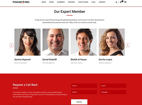
- Branch or team bios with professional headshots and credential highlights, not generic “About Us” prose
- Investor decks with the narrative arc, metric isolation, and visual maturity covered earlier in this playbook
- Sales sheets organized by product line or use case, each with its own proof points and qualifying disclosures
- RFP graphics that make technical responses scannable: process diagrams, integration architecture visuals, compliance framework illustrations
- Comparison visuals positioning your product against alternatives transparently (honest axes, current data, no phantom competitors)
- Implementation diagrams showing onboarding timelines, integration touchpoints, and support escalation paths
- ROI snapshots isolating financial impact with visible assumptions and source attribution
- PDF and email-ready exports optimized for both print fidelity and compressed file sizes that clear inbox filters
Design Priorities That Signal Maturity
Decision-makers scan before they read. If the headers and callout numbers don’t tell the story on their own, the body copy won’t get a chance.
Concise product diagrams replace paragraphs of explanation. Proof points (client logos, performance metrics, case study results) sit where the eye naturally lands, not buried on page three. All claims carry approved language and corresponding disclosures. Typography stays consistent across every asset because a sales sheet using a different font than the investor deck raises the same quiet doubt as a mismatched email. The visual system needs to feel precise and deliberate. A prospect evaluating a fintech partner is looking for operational rigor. Collateral that feels templated or inconsistent tells them the product operations might be, too.
Compliance Handoff and Longevity
Building assets without thinking about their lifecycle is how one-pagers with outdated rates end up circulating six months later. The production workflow should deliver reviewable source files (Figma, InDesign, or equivalent) so compliance and legal teams can audit text layers directly. Print-ready PDFs with proper bleed, crop marks, and CMYK color profiles for physical distribution. Compressed email versions that maintain legibility under 5MB. And editable templates for future campaigns, so the next product launch or rate change doesn’t require a full rebuild.
When the system works, sales walks into every conversation with materials that match the quality of the product behind them. Leadership presents to investors or board members with visual consistency that reinforces credibility. And when the first engagement with a creative partner ends, the templates and source files ensure the brand doesn’t slowly degrade with every new asset someone assembles from memory. Fintech presentation design services bring this same system-level rigor to investor decks and board-level materials that need to close high-stakes conversations.
9. Onboarding, Product Education, and Support Graphics That Reduce Anxiety at Every Step
Fintech onboarding asks users for the most sensitive information they’ll share with any app on their phone: government IDs, Social Security numbers, bank login credentials, biometric data. The visual design surrounding those requests determines whether someone pushes through or abandons the flow entirely.
Every screen in the onboarding sequence is a moment where the user is silently asking “Why do they need this? Is it safe? How much more do I have to give?” If your graphics don’t answer those questions faster than the doubt forms, you lose them.
The Asset Set That Guides Users Through Sensitive Workflows
The graphics required here extend well beyond a welcome screen and a progress bar:
- KYC progress screens with honest step counts and contextual explanations at every stage
- OTP and verification states (sent, waiting, error, success), each visually distinct and clearly labeled
- Bank-linking graphics showing what’s happening during credential exchange, with encryption indicators visible
- Product tours introducing core features after account creation, using annotated UI screenshots rather than abstract illustrations
- Email onboarding sequences with branded, mobile-optimized visuals reinforcing next steps
- Help-center diagrams explaining transfers, fee structures, or account tiers without requiring a support ticket
- In-app tooltips surfaced contextually, not dumped into a tutorial carousel nobody finishes
- Empty states that guide rather than confuse (“No transactions yet. Here’s how to make your first transfer.”)
- Customer education explainers covering fees, risk, reconciliation, and security in plain language
UX Trust Checks for High-Stakes Screens
- Explain the why. “We need your SSN” with no context feels invasive. “Required by federal law to verify your identity and prevent fraud” makes the ask feel necessary rather than extractive.
- Show progress honestly. If there are six steps, say six. A progress bar that jumps from “almost done” to three more screens of document uploads is a betrayal users don’t forgive.
- Design for keyboards on mobile. When a form field appears and the keyboard covers the submit button or security reassurance text, trust evaporates. Every screen needs testing with the keyboard active.
- Build clear error states. “Your photo is too dark. Retake in a well-lit area” keeps users moving. “Upload failed” is a dead end.
- Make secure actions feel intentional. Biometric prompts and encryption indicators should feel like the product protecting the user, not hoops to jump through. A padlock icon near a bank-linking screen isn’t decoration. It’s reassurance doing real work.
Customer Education as a Support Deflection Strategy
Users who don’t understand fees, transfer timelines, or reconciliation workflows generate the same support tickets repeatedly. Branded explainer visuals covering these topics reduce that load while building product confidence.
A diagram showing how ACH settlement timing works, with realistic timeframes and labeled stages, respects the user’s intelligence while filling a genuine knowledge gap. An illustrated fee breakdown mapping each charge to its purpose builds transparency. These aren’t marketing assets. They’re trust assets that happen to reduce operational cost. Fintech Content Marketing amplifies these trust assets by embedding them within the educational content strategy that drives organic discovery and sustained audience confidence.
When this visual layer works, onboarding completion improves not because you removed steps, but because the steps that remain feel secure, clear, and worth completing. Your support team stops answering the same five questions about transfer timing every day, because a well-crafted diagram already handled it.
10. Physical Graphics That Extend Your Digital Trust System Into Real-World Environments
A prospect can spend weeks interacting with your brand digitally: researching your product, reading your content, evaluating your app screenshots. Then they walk into a branch, visit your event booth, or pass your office lobby, and the experience feels like a completely different company.
That disconnect is more damaging than most teams realize. For banks, credit unions, wealth firms, payment companies, and any financial brand with a physical footprint, in-person environments are trust checkpoints evaluated with the same scrutiny as your homepage hero. A banner with the wrong blue, a teller sign in an unrecognizable typeface, a booth backdrop that looks like it was designed by a different organization: these fractures register instantly, even if the visitor can’t articulate what feels off.
Asset Types That Need System-Level Treatment
Physical graphics span a wider range than most teams scope when they think about “signage”:
- Internal wayfinding and directional signs (ATM locations, teller windows, adviser offices)
- Window graphics, wall murals, and branded environmental wraps
- Event assets: booth backdrops, table covers, retractable banners, flags, tents
- Vehicle wraps for mobile banking or branded fleet
- Office reception graphics and conference room branding
Every one of these needs to be produced from the same brand system governing your digital assets. Same color values (converted accurately to CMYK or Pantone for print), same typographic hierarchy, same illustration style. “Close enough” in a physical environment creates the same credibility gap as a mismatched email.
Production Checks That Protect the Investment
- Color matching: request physical proofs for large-format jobs. Digital-to-print color shifts are routine, and a hero brand blue that prints slightly purple undermines every other element on the surface.
- Material selection: outdoor banners need UV-resistant substrates. Window graphics need scratch-resistant lamination. Event tents need weather-durable fabrics. Wrong materials create replacement costs and a worn appearance that signals carelessness.
- Typography at scale: a typeface legible on a mobile screen can become unreadable on a banner viewed from 30 feet. Test viewing distances during design, not after installation.
- Disclosure space: if any physical asset references rates, terms, or regulatory claims, the same proximity and legibility rules from your digital compliance architecture apply. Plan disclosure placement into the layout from the start.
- Installation logistics: wall murals, vehicle wraps, and window graphics require site surveys and professional installation. Factor these early to prevent last-minute compromises.
The Local Trust Layer
For financial brands serving specific communities like Los Angeles or Orange County, physical graphics carry an additional trust dimension. Service-area language on signage, team photos in the lobby, visible office addresses and direct contact information, community partnership callouts: these signals tell the visitor “we’re here and we serve this community specifically.” That localized credibility reinforces everything your digital presence has already communicated. Fintech corporate photography provides the professional team portraits and environmental imagery that make these local trust signals feel genuine rather than generic.
When the system works, a prospect who’s evaluated your website, scrolled your app, and reviewed your materials walks into your branch or event space and feels no discontinuity. The physical environment confirms what the digital experience promised. That seamlessness happens because the same visual system, the same brand governance, and the same production quality extend into every environment where your brand shows up.
11. Optimizing Fintech Graphics for Search Engines, AI Systems, and Answer Engines
An AI answer engine can’t recommend a product it can’t interpret. Most fintech brands produce custom graphics that look great on the page but remain invisible to the systems deciding which brands get surfaced.
Google’s crawlers, large language models powering AI overviews, and answer engines like Perplexity all share a limitation: they can’t see your visuals. They read the textual scaffolding surrounding them. A beautifully crafted KYC onboarding illustration with a vague filename, no alt text, and no structured data might as well not exist for discovery purposes. The graphic earns trust from humans who land on the page. It does nothing to help them find it.
The Textual Context Layer Every Visual Asset Needs
Every fintech custom graphic requires surrounding architecture that makes its purpose machine-readable:
- Descriptive filenames:
kyc-onboarding-document-upload-flow.webptells crawlers what the image depicts.hero-final-v3.pngtells them nothing. - Alt text that describes the fintech use case: not “screenshot of app” but “Mobile KYC onboarding screen showing document upload step with real-time image quality feedback.” Communicate what a sighted user learns from looking at the graphic.
- Captions that add context: “Payment dashboard UI showing reconciliation status across three settlement channels” does more work than the image alone.
- Surrounding copy that reinforces the topic: paragraphs before and after the image should use the same terminology the graphic illustrates. AI systems use proximity text to determine image relevance.
Page Structure That AI Systems Can Parse
The page housing your graphics matters as much as the graphics themselves. AI answer engines extract information from pages with clear semantic hierarchy:
- Answer-first definitions early in the section so AI systems can pull concise responses
- Logical H2 and H3 headings describing what each section covers, not clever but vague labels
- Concise deliverable lists enumerating what’s included or what the graphic depicts
- FAQ blocks addressing questions a prospect or AI system might ask about the visual asset
- Case-study summaries with named clients (where permitted), outcomes, and the specific graphics involved
- Internal links connecting the page to related service pages, building the hub-and-spoke structure that signals topical authority
Structured Data That Connects Everything
Schema markup transforms your page from content into a machine-readable entity map. For fintech brands publishing custom graphics, relevant types include:
- Organization and LocalBusiness (where geographic service applies) to establish brand entity
- Service and FinancialService to classify the page’s offering
- FAQPage for FAQ blocks, making them eligible for rich results
- ImageObject for key graphics, linking filename, caption, and content URL
- BreadcrumbList for site hierarchy signals
- Article or case-study markup when the visible content supports it
The markup must reflect what’s actually on the page. Schema claiming services or FAQs that don’t appear in the content invites manual penalties rather than rich snippets.
The Outcome
When textual context, page structure, and structured data work together, your fintech graphics become discoverable assets rather than decorative ones. Search engines understand what each visual depicts and where it fits in your service offering. AI answer systems can reference your brand when a prospect asks about KYC illustration design, payment dashboard UI, or bank branch signage. And human visitors arriving through those channels find graphics surrounded by the authoritative context that reinforces the trust your visuals were designed to build.
12. Evaluating Quality Beyond Aesthetics: Proof That Custom Graphics Actually Work
Pretty doesn’t close deals. It doesn’t justify a budget request to leadership, and it doesn’t tell you whether the investment in custom fintech graphics is actually improving trust, clarity, or conversion.
This is where most evaluations break down. A creative partner shows you a polished portfolio, the work looks sharp, and you move forward based on visual impression alone. Six months later, you can’t articulate what the engagement changed. “Feels better” isn’t a sentence that survives a quarterly business review.
The proof layer needs to be part of the system from the start, not a retrospective exercise you scramble to assemble when someone asks for ROI.
What Credible Proof Actually Looks Like
Start with the portfolio, but look past the surface. The assets that matter most demonstrate understanding of the problems you’re solving:
- Before-and-after comparisons showing how a landing page or onboarding screen evolved from generic to purpose-built. The visual gap speaks louder than any capability claim.
- Landing-page performance context: conversion improvements, bounce rate reductions, or session depth changes tied to specific redesigns. Even directional data tells you the partner is thinking about outcomes, not just deliverables.
- Brand guideline samples proving the partner builds governance systems, not isolated assets.
- File-format handoff examples demonstrating production maturity: organized source files, print-ready exports with correct color profiles, responsive variants, and editable templates your team can maintain independently.
When Hard Numbers Aren’t Available
Not every engagement produces a clean conversion lift metric. In those cases, process credibility becomes your proxy for quality:
- Named team members with visible credentials on your account, not anonymous output from an unnamed production queue
- A defined revision process with documented stages
- Compliance review checkpoints built into the workflow, proving regulatory awareness isn’t bolted on after creative approval
- Side-by-side visual improvements across real client work demonstrating what “better” looks like in regulated financial contexts, where clarity and trust outweigh aesthetics every time
Building the Case
When you can point to faster internal production cycles (because templates replaced one-off builds), fewer design inconsistencies across channels, and clearer sales conversations backed by polished collateral, the investment justifies itself in language leadership responds to. The proof isn’t a single metric. It’s a pattern of operational improvements visible across your entire brand system.
How to Build a Fintech Custom Graphics Workflow From Asset Map to Measurement
The asset categories are clear. The brand system is defined. The compliance requirements are documented. None of that matters if the production workflow can’t hold all of it together.
Fintech custom graphics require something most creative processes aren’t built for: creative direction, compliance review, file discipline, and post-launch measurement running inside the same pipeline. Separate any of those functions and you get beautiful assets with buried disclosures, or compliant assets that look like they were designed by a legal team. Neither outcome serves the brand.
What follows is the operating workflow that prevents both.
Step 1: Run Discovery Against Business Outcomes
Before anything visual exists, anchor the project in five variables: audience segment, product complexity, primary buyer objections, deployment channel, and the specific business outcome the asset needs to move.
A KYC onboarding illustration for a neobank app targeting first-time investors requires a fundamentally different approach than a settlement reconciliation diagram for a B2B payments pitch deck. Discovery that treats both as “we need some graphics” produces generic output.
Pull the asset map from the system inventory covered in Item 1. Identify which assets are being produced, where they deploy, and what success looks like for each. “Reduce onboarding drop-off at the document upload step by giving users visual confirmation of image quality requirements” is a useful brief. “Improve conversion” is not.
Step 2: Audit Current Brand and Compliance Posture
Review existing visuals against the brand governance system from Item 5 and the compliance requirements from Items 6 and 11. This isn’t a formality. It’s the step that prevents rework.
Check current assets for color drift, outdated logos, inconsistent typography, missing or improperly placed disclosures, accessibility failures (contrast ratios, color-only indicators), and claims that no longer reflect current rates or terms. Document which approval chains exist and which ones need to be created.
Identify who signs off on creative decisions and who signs off on regulatory language. Those are different people with different criteria, and conflating them is how revision cycles spiral.
Step 3: Concept With Fintech Restraint Built In
Visual directions, UI modules, campaign concepts, and signage treatments should all reflect what the earlier sections of this playbook established: clarity over cleverness, trust over trend.
Concepting for fintech means designing disclosure space into the layout from the start, not finding room for it after the creative is approved. It means selecting typography that differentiates characters at financial-data scale. It means testing color choices against dark mode, print substrates, and accessibility standards before anyone falls in love with a palette that fails in production.
Present concepts with enough fidelity to evaluate real-world performance, but not so polished that stakeholders feel the decision has already been made.
Step 4: Separate Creative Review From Compliance Review
This is where most fintech workflows collapse. Creative feedback and legal feedback get merged into a single revision round. A note about headline tone sits next to a note about disclosure font size, and neither gets resolved cleanly.
Run two distinct review tracks:
- Creative stakeholders evaluate visual direction, messaging clarity, and brand alignment.
- Compliance and legal stakeholders evaluate claims accuracy, disclosure placement, accessibility conformance, and regulatory language.
Each track produces its own revision list with clear ownership. Merge the outputs only after both tracks have signed off independently.
Step 5: Production Handoff With Channel-Specific File Discipline
Deliver assets in the formats each channel actually requires. Not a single PDF. Not “let me know what you need.”
- Figma source files with organized layers and component documentation.
- SVG exports for web icons and illustrations.
- PNG and WebP at specified dimensions for digital channels.
- Print-ready PDFs with bleed, crop marks, and CMYK color profiles.
- Compressed email versions under 5MB that maintain legibility.
- Design tokens for development teams integrating components into product UI.
- Alt text notes for every visual asset.
- Schema recommendations for pages where structured data supports discoverability, as covered in Item 11.
Step 6: Coordinate Launch Across Every Downstream Team
Graphics don’t publish themselves. Each team gets the specific deliverables and instructions relevant to their channel, not a shared drive link with no context.
Development needs integration specs. Marketing needs campaign assets loaded into ad platforms with correct dimensions and metadata. Sales needs print-ready files sent to vendors or uploaded to enablement tools. Event teams need production timelines for signage, booth materials, and environmental graphics.
Step 7: Measure What the Graphics Actually Changed
Track conversion rates on pages where new visuals deployed. Monitor clarity indicators like support ticket volume for topics covered by new explainer graphics. Measure campaign performance at the creative-variant level, not just the campaign level. Log production speed improvements as template systems replace one-off builds. Record stakeholder approval time, because a workflow that cut revision cycles from three weeks to five days is a measurable operational gain worth documenting.
The goal across all seven steps is a repeatable graphics system. When the next product launch, rate change, or campaign sprint arrives, your team assembles from approved components, routes through established review tracks, and ships with confidence that brand, compliance, and quality held. No relearning. No renegotiating. No rebuilding trust from scratch on every project.
Frequently Asked Questions
How much do fintech audience research services usually cost?
Most credible firms scope custom statements of work rather than publishing fixed rates, because the variables shift the budget dramatically. Directional ranges run from $25,000 for a focused discovery sprint to $150,000 or more for a multi-method program that includes quantitative validation. The biggest price drivers are recruitment difficulty (executive panels and underbanked fieldwork cost significantly more than general consumer panels), geographic spread, method complexity, and whether the scope includes quant survey validation on top of qualitative findings. Those first two variables, recruiting senior B2B stakeholders and reaching underserved populations, tend to move the budget fastest.
How long should a good fintech audience research project take?
A credible engagement typically runs six to twelve weeks, covering stakeholder alignment, screener development, recruitment, fieldwork, synthesis, and a structured readout. A fast discovery sprint (qualitative interviews with a defined segment) can land in six weeks. Fuller programs involving segmentation, quantitative validation, or multi-market recruitment need the longer runway. Compressing below six weeks usually means cutting corners on recruitment quality or synthesis depth, both of which undermine the entire investment.
What deliverables should I expect from a serious partner?
At minimum: validated personas, a segmentation matrix with priority scoring, journey maps tied to real behavioral data, trust and messaging findings, feature or benefit prioritization outputs, raw data or session clips for internal review, and an implementation roadmap connecting each finding to a business metric. The critical test is whether the deliverables help product, marketing, and leadership make specific decisions. If the final output summarizes interviews without telling anyone what to do differently, the research hasn’t finished its job.
Should we do this in-house or work with a specialist partner?
Internal teams win at continuous listening, existing product analytics, and institutional context. A specialist wins where recruitment is hard (senior executives, underbanked populations), where neutral synthesis prevents internal politics from filtering findings, where cross-functional alignment needs an outside voice to hold, and where compliance-sensitive study design requires specific expertise. The best outcomes usually blend both. The right partner feels like an extension of the team rather than a vendor managing a handoff, which is exactly the model Urban Geko brings to research-to-execution engagements.