
Law Firm Graphic Design Shaped by What You Need to Communicate
A law firm can name the format long before anyone has settled what the piece has to communicate, who has to understand it, and where it will be used. Those answers are what the design depends on, and picking a brochure or a deck doesn’t supply them.
Urban Geko provides graphic design for law firms. We work from what the firm needs to communicate, who has to understand it, how and where the work will be used, and whatever visual direction is already in circulation. Those answers are what let us decide what a reader takes in first, develop a concept the piece can be built on, refine it against the real content, and adapt it for print or screen without losing the thread. It’s the same thinking behind a single report and behind a set of slide layouts or website graphics, and when the website itself is the larger decision, law firm web design covers the broader strategy, design, and development route.
The value of working this way is design that does a specific job in a specific place, and material that still reads as one firm when someone sees several pieces of it. That can be a single, well-defined need or one part of a larger project; a focused brief is enough to work from.
Start with what the work has to communicate
The thing worth pinning down first is what the work has to accomplish once it exists: the point a reader should take away, and what the firm wants that reader to be able to do with it. Defining that early makes the later choices answerable. Layout and emphasis can be argued against a stated purpose rather than settled by preference.
Who the work is for changes those answers. Audiences differ in what they already know about the firm and the subject, and in why they’re reading at all, so a piece may need more groundwork before the specifics register. That’s a design question as much as a writing one: it shapes what carries the emphasis and how much the layout has to do to move someone through the material. We want to know who the work has to reach before making those calls.
Intended use is the other input we press on. Viewing distance and available space set practical limits: how small type can go before it stops working, how much can sit on a page before the structure comes apart. Whether a reader can set their own pace affects how much detail a section can carry and whether a short summary should come first. We’d rather settle that while the design is taking shape than correct it at production.
What the firm already has
Few firms start from nothing. There’s usually a mark, a set of colors, typography that’s been in use long enough to feel like the firm’s own, and previously produced material carrying its own internal logic. Part of our early work is reading that accurately: which parts of the existing direction are strong enough to design within, which have drifted out of step with each other, and what a new piece needs to stay consistent with so it doesn’t read as though it came from somewhere else entirely.
Deciding what a reader takes in first
Legal material tends to be dense, and not all of it can arrive at once. We decide what a reader should register first and what can wait, then build that order into typographic scale and weight, the space around an element, alignment, contrast, and how an image sits against the words beside it. Choosing what dominates means choosing what recedes, which makes hierarchy an editorial judgment as much as a visual one, and it’s how the point that matters most ends up easy to find rather than buried in uniform weight.
A layout that looks considered on its own, but gives its strongest emphasis to a detail nobody needed first, has quietly changed what the piece communicates. That’s why we push on hierarchy early instead of treating it as styling applied once everything else is settled.
Developing a concept and refining it
Concept development is where we set the direction that holds the separate decisions together: how the information is ordered, which typographic treatment carries it, what role imagery plays, how space is used. We develop that against the firm’s real material rather than a placeholder, and keep it specific enough to guide the decisions that follow.
Refinement is where that gets tested. Type is checked at the size it will actually be read, not the size it’s comfortable to design at. Contrast is examined under the conditions the work will meet. When copy comes in longer than anyone planned, either the concept absorbs it or we adjust so the hierarchy still holds. A concept that only works with one ideal headline length isn’t finished yet.
One direction, adapted to where the work is used
Digital and print are different reading conditions, not two versions of the same file. Light on a screen behaves differently from ink on a chosen stock. Screen dimensions vary by device and the reader controls the scale, while a printed piece has fixed dimensions and a fairly predictable reading distance. Color shifts between them. Typography set carefully for print can lose definition at small screen sizes, and a layout that holds up on a wide display can come apart on a phone.
Adapting the work means re-deciding those specifics while keeping the concept intact. Proportion, spacing, and emphasis all have to be re-established under the new constraints, so the work still reads as one coherent piece of thinking wherever someone meets it.
Which contexts a given project covers is something we settle with you at the outset. It isn’t an assumption built into the service, and it’s never a reason to produce material the firm has no use for.
The kinds of work we design for law firms
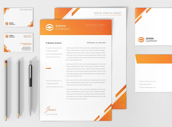
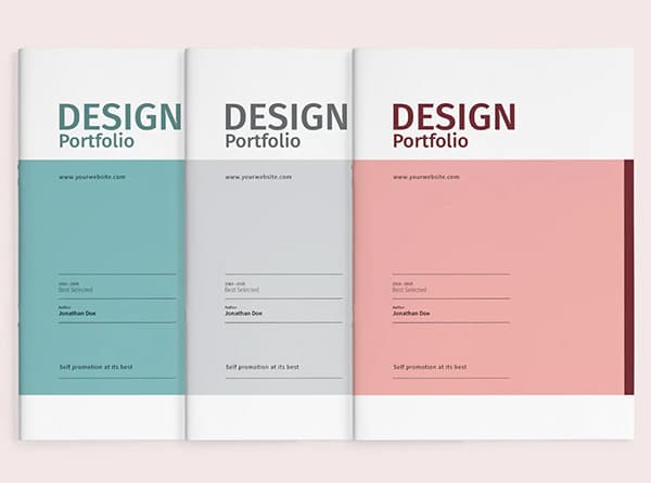
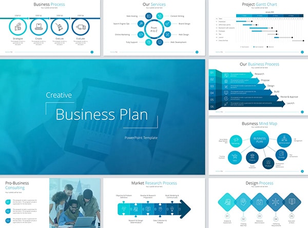
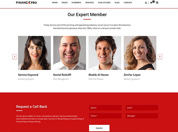
What we design depends on what the firm is communicating and where that piece has to work. These are examples of the work, not a set the firm is expected to order.
Because these are designed against one direction, the firm ends up with coherent materials across touchpoints and less reliance on improvised or mismatched pieces.
Focused projects and larger engagements
Graphic design for lawyers covers a wide range of situations. Some engagements are self-contained: one communication need, one audience, one context, a clear end point. Others sit inside a bigger effort, where the visual decisions have to work alongside development, content, or a marketing program already underway; our wider law firm marketing work is where those broader branches come together. Knowing which of those you’re in changes how we approach the design, so we like to establish it early.
When an engagement calls for it, we coordinate graphic-design decisions with the relevant creative, technical, and marketing work so the visual direction stays consistent as it moves between them.
Urban Geko has spent 25 years on digital design and marketing work. That’s the background we bring to legal graphic design: established design judgment, relevant industry best practices, and the range to take on a narrow assignment or one with several moving parts.
Frequently Asked Questions
Does a law firm need a complete rebrand before starting graphic-design work?
No. A rebrand isn’t a prerequisite. If your firm has an established visual direction, we can design within it and make decisions that stay consistent with what’s already in use. A broader law firm branding engagement is a separate decision, and it belongs on the table when the underlying identity itself is what needs attention rather than the piece of communication currently in front of you. One doesn’t automatically require the other.
Who should review graphic-design work inside the firm?
That depends on the project and how your firm divides responsibility. Useful review covers a few things: what the work has to communicate, whether the substance is accurate, whether it fits the visual direction already in use, and who can approve it. Sometimes those sit with different people, sometimes with one.
Ready When You Are
Talk With Urban Geko About Your Next Project
If you’re weighing up who should handle this, the quickest way into a real conversation is to tell us:
what the work has to communicate, and to whom
where it will be used, on screen, in print, or both
what visual direction the firm already has in place
whether this is a contained piece of work or part of something wider you’re planning
Share that with us and we can talk properly about the design decisions your project involves, and whether Urban Geko is the right team for it.