Fintech Dashboard Design: How to Display Financial Data Users Actually Trust
Picture this: A user opens your fintech app on a Tuesday morning before their commute. They want to know one thing, how much money do they have. Instead of a clear answer, they’re greeted by a hero image, a promotional card for a credit product they’ve already declined twice, and a dashboard so packed with features that the balance is buried in the middle.
They tap out. They open their old bank’s app instead.
Our studio has reviewed hundreds of fintech dashboards, and this pattern shows up more often than you’d believe. Product teams want to surface everything; users want a single clear answer as fast as possible. The teams that resolve this tension correctly build apps users open twelve times a week. Here’s our approach to getting the balance right.
Start With One Question
The most important dashboard design principle has nothing to do with layout grids. It’s this: your dashboard should answer the user’s first question before they finish blinking.
That question, for the vast majority of fintech users, is: How much do I have?
The primary balance should be the most visually prominent element on screen, larger type, more contrast, placed where the eye lands first. This sounds obvious. Our clients are often surprised by how many apps violate it.
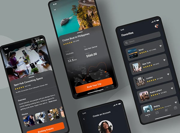
What Belongs Above the Fold
*Primary balance.* Large, immediately legible, the most dominant element on screen. If a user holds multiple accounts, show the one they use most frequently with a quick-switch option.
*Recent transactions.* The last three to five entries with merchant name, amount, and date. Users scan these to confirm expected activity and spot anything unfamiliar — your layout should support that passive fraud-detection habit.
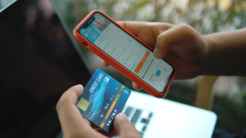
*Compact action bar.* Transfer, pay, add money, freeze card — four to five actions maximum, with text labels under every icon. A paper plane icon could mean “send,” “messages,” or “transfers.” A label removes the guesswork.
**One contextual insight (optional, conditional).** Safe-to-spend after upcoming bills, or a flag that a large payment hits tomorrow. Our test: does this save the user a mental calculation they’d otherwise do themselves? If yes, it earns the space.
What Doesn’t Belong Above the Fold
*Promotional cards that outrank the balance.* When a credit card offer sits above or at the same visual weight as the balance, users notice, not always consciously, but they feel it.
*Charts that require interpretation.* A 30-day sparkline sounds useful. In practice, if a user has to study it to know whether they’re up or down, it’s adding cognitive work before they’ve answered the question they came to ask.
*Stale onboarding prompts.* A nudge to complete profile setup is useful for two weeks. After that, it’s clutter that trains users to ignore your notifications.
Transaction History as a Source of Truth
When transaction history can’t answer basic questions quickly, users stop treating the app as their financial record, and that’s a retention failure, not just a UX one.
The structural basics many apps still miss: no arbitrary date cutoffs, chronological grouping with clear date headers, and genuinely useful search with partial matching. The features that transform history from a ledger into a living record: merchant enrichment that replaces processor strings like “SQ *JOES COFFEE NYC” with clean names and logos, notes and receipt attachments, and visually distinct labels for pending versus completed transactions.
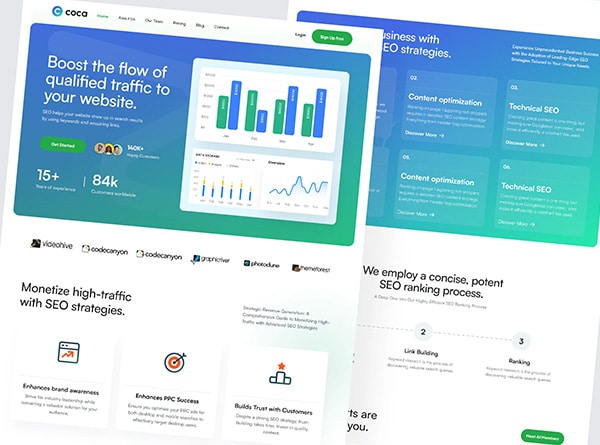
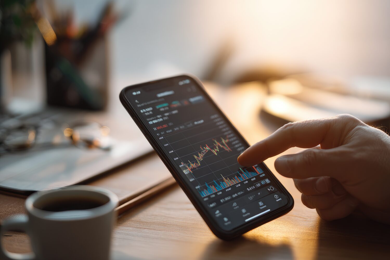
Charts on Small Screens
The mistake our studio sees repeatedly: treating data visualisation as a design showcase. On a mobile screen, every pixel of decoration is a pixel stolen from clarity.
Our golden rule: a good financial chart on mobile answers exactly one question per view, spending pace, savings progress, cash flow direction. The takeaway should be the most dominant element. Strip out decorative gradients, axis labels too small to read at render size, and rounding that sacrifices precision when precision matters.
Loading States and Performance Feel
A fintech dashboard that loads instantly doesn’t just feel fast, it feels *safe*. Our studio’s recommendation: use skeleton screens (structured placeholder layouts that mirror the shape of real content) rather than generic spinners. Cached data with a visible “last updated” timestamp is better than a blank screen. “Balance as of 9:47 AM” gives users context. A spinner does not.
Ready to Redesign Your Fintech Dashboard?
Our studio specialises in financial interfaces that answer the right questions at the right moment — building the kind of quiet confidence that keeps users coming back daily. We’d love to take a look at your current dashboard.
Reach out for a FREE 15-minute consultation today.
For the full fintech mobile UX playbook — including KYC onboarding, payment flows, dashboard design, card controls, and accessibility — visit: Fintech Mobile App UX/UI Design: The Complete Guide to Patterns That Build Trust.
Urban Geko Design is an award-winning digital design and development agency based in Newport Beach, Orange County, CA. We specialise in UI/UX design, web development, branding, and digital marketing for fintech, financial services, healthcare, and growth-stage businesses.
Related Posts


