Ready to Take Your WordPress Website Redesign to the Next Level?
Great news awaits you! Look no further than our top-rated
5-Star WordPress Agency, where we deliver results!

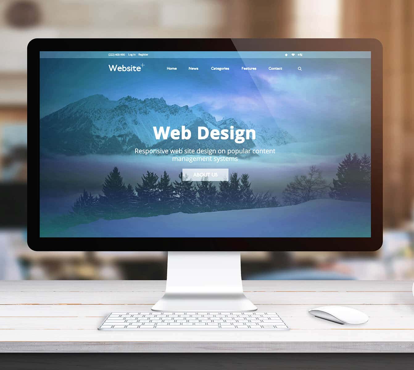
WordPress Design
We Enhance Your WordPress Website as an Extension of Your In-House Team, Using Our WordPress Design Services to Align Functionality and User Experience With Your Brand Vision.
Cutting-Edge Digital Solutions
Transforming Ideas into Engaging WordPress Experiences
Urban Geko’s Orange County WordPress Website Development Services: User-Friendly Interfaces, Compelling Visuals, and High Performance!
 UX/UI Design
 WordPress
 Responsive Design
 SAAS Design
 Custom CMS/Dev
 E-Commerce
 WooCommerce
 Shopify & Shopify Plus
 Big Commerce
 IOS/Android App Dev
 Analytics Integrations
 Accessibility
 ADA Compliance
 Quality Assurance
 API Intergrations
 B2B, B2C, Gov’t Platforms
 Auditing/Consulting
 User Testing
 Stability Testing
 Content Migration
Boost Your Business
Enhance Your Website’s Online Presence with WordPress Web Design.
100%
Boost in Sales: WooCommerce
Transform your WordPress site into a feature-rich online store with WooCommerce. Boost online sales and manage products, inventory, and orders effortlessly. Customize your store with visually appealing themes and extensions to enhance the shopping experience for customers.
3X
Optimized and SEO-Friendly
Enhance online visibility with word press web development and SEO. Its clean code, mobile responsiveness, and user-friendly SEO features make it favored by search engines. Yoast SEO plugin optimizes content for higher search engine rankings, attracting more visitors and boosting sales.
2.5X
Versatile Content Marketing Hub
WordPress enables businesses to regularly update their website with fresh content, establishing brand authority and connecting with their target audience. It serves as a centralized hub that integrates social media, email marketing, and other promotional strategies, driving traffic and increasing sales.
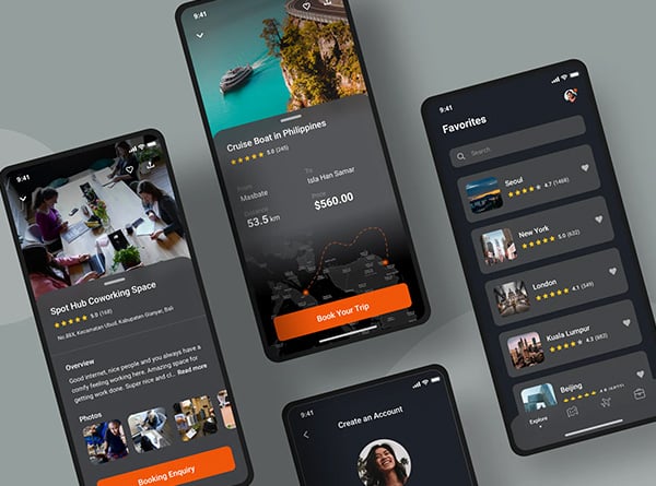
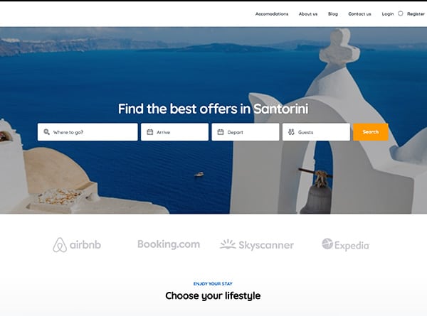
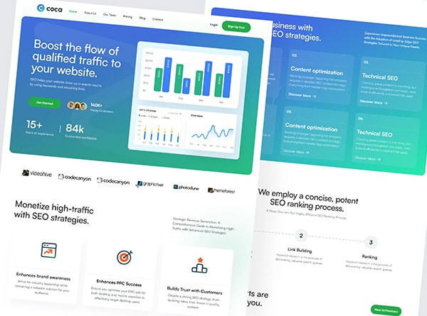
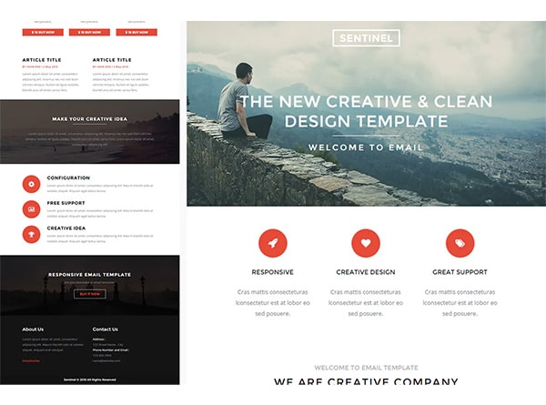
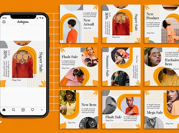
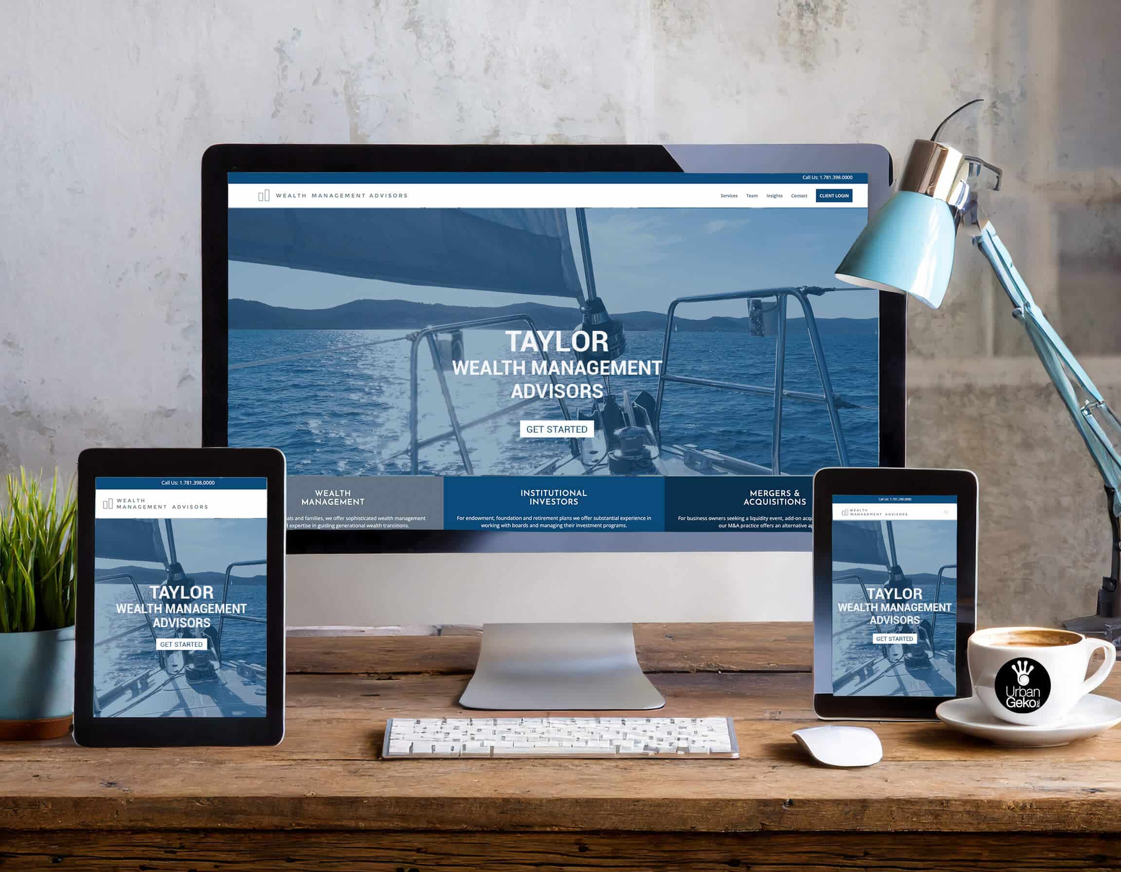
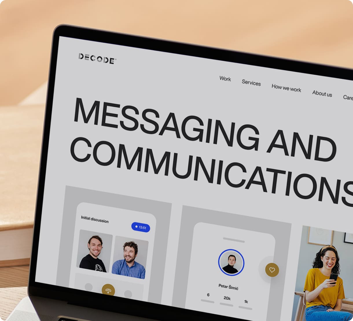
Our Recent Works
WordPress Website Design.


One of Our Highly Valuable Clients
We highly value our clients.
Maddie Freeman

Exceptional Expertise, Outstanding Results!
“We partnered with Urban Geko for a website refresh. Their expertise in UX design, branding, and streamlined website design transformed our online presence. Strategic SEO implementation boosted our search ranking, visibility, and customer acquisition. The user-friendly interface they designed improved customer retention by 400%. Their dedication to understanding our brand and technical know-how exceeded expectations. We highly recommend them to businesses seeking to enhance their online presence.”
Vince Haddid

New Website That Increased Sales!
“We had the pleasure of partnering with Urban Geko for our branding needs, and the results were beyond our expectations. Their expertise in developing a website platform focused on user experience and designing a user interface that seamlessly guided our customers through their journey was remarkable. Web design company in Orange County, Urban Geko, not only improved our brand identity but also delivered concrete results, leading to a notable increase in ROI, conversion rates, and sales.”
Bella Dickenson

Revolutionized Our Brand
“Working with Urban Geko has been a game-changer. They developed our brand identity and guidelines, ensuring consistency across platforms. The highlight was our ecommerce website, optimized for conversions and delivering an enhanced customer journey. We are grateful for their dedication and creativity.”
Edward Stone

Website Geniuses!
“Teaming up with Urban Geko transformed our website design, exceeding our expectations. Their expertise in user experience design and brand revitalization resulted in a visually stunning, user-friendly website. With strategic SEO techniques, profits increased by 350% and customer retention rates improved by 175%. We are grateful to Urban Geko for their dedication, which led to a remarkable 250% increase in brand recognition. Would highly recommend any firm looking for web design in Orange County to hire Urban Geko.”
Christine Swanson

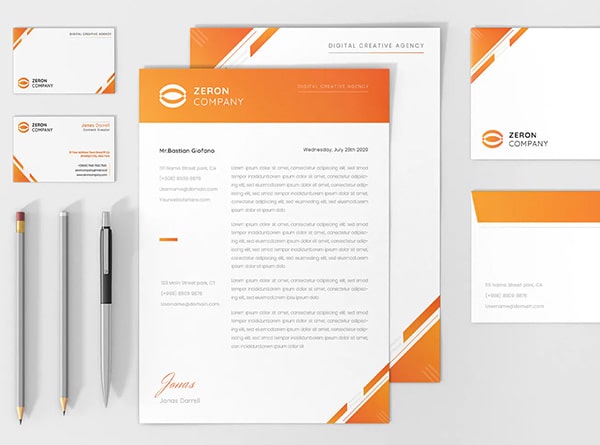
Marketing Collateral Boosts Clients!
“Partnering with Urban Geko was transformative for our company. Their expertise in enhancing our marketing materials had an immediate and profound impact. They elevated our existing materials, resulting in impressive collateral that effectively communicated our brand message. With their revamped materials, our client base grew by 275% and we achieved outstanding brand recognition.”
Cheyanne Thomas

Very Happy with Our Results!
“Collaborating with Urban Geko was an incredible experience! Their team showcased remarkable proficiency in all areas of our project, producing outstanding outcomes that surpassed what we had anticipated. With their creative designs and flawless user interfaces, they brought our vision to life. Would highly recommend Orange County website design firm Urban Geko.”
Sarah Smith

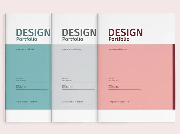
Cutting-Edge Logo Design Services!
“Urban Geko’s cutting-edge logo design services transformed our brand. Their talented team captured our essence, delivering a logo that reflects our vision. They listened to our feedback, providing valuable insights. The result exceeded expectations, impacting brand recognition and perception.”
Heather Johanson

Every Detail was Executed Perfectly from Start to Finish.
“I was overwhelmed, but Urban Geko transformed the process of creating marketing materials for my brand into a delightful experience. Their team promptly addressed my inquiries and patiently explained even the most basic concepts. The end result was exactly what I envisioned. I look forward to continuing my partnership with Urban Geko as my marketing requirements expand. Thank you, Urban Geko!”
Todd Sturgeon

Ahead of Their Game!
“Urban Geko’s creative team brings our vision to life through stunning marketing materials. From flyers to social media ads, posters, brochures, and handouts, their designs capture our brand essence. They consistently deliver high-quality work on time, making them a trusted partner. We highly recommend Urban Geko, a website design Orange County firm for top-notch graphic design services.”
Robin Jacobs

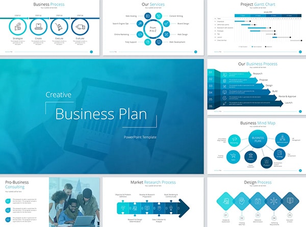
Streamlined Process. Excellent Designs. Quick Turn Around.
“Urban Geko’s pitch deck helped us present our business vision effectively. Their expertise in storytelling and design connected our message with investors, leading to valuable opportunities. The deck showcased our ideas and professionalism, and we highly recommend their services for making a lasting impression.”
Keith Moor

Pleasure to Work With!
“From concept development to filming and editing, they demonstrated a deep understanding of our vision and objectives, delivering videos that exceeded our expectations. Their ability to translate our ideas into engaging visual stories has had a significant impact on our marketing efforts, helping us connect with our audience on a deeper level.”
Greg Lowery

Enjoyed Working Along Side Their Creative Team!
“Their team’s creativity, attention to detail, and dedication to bringing our ideas to life have been truly impressive. From storyboard development to animation production, they demonstrated a deep understanding of our vision and objectives, delivering animations that exceeded our expectations.”
James Kline

Surpassing Expectations at Every Turn.
“Partnering with Urban Geko has transformed our portfolio companies. Their expertise in brand identity and marketing collateral has been key to boosting our ROI and enhancing brand visibility. We rely on their innovative strategies and insights to drive growth and maintain a competitive edge, making them an invaluable partner. Highly recommend!”
Lane Parker

Elevating a Home Goods Brand to New Heights
“Collaborating with Urban Geko proved to be a game-changing venture for our well-established home goods company. They brought a fresh and contemporary touch to our brand image, completely transforming our website to enhance user experience, and implemented powerful SEO tactics to optimize our online visibility. The outcome was remarkable, as we witnessed a significant increase in website visitors, improved rankings on search engines, and greater involvement from local customers.”

Why WordPress
6 Key Reasons to Choose Our WordPress Services
Your website should be a powerful tool, not a source of frustration. If you’re tired of your current site underperforming or struggling to build one that meets your needs, Urban Geko is here to help. Our expert team specializes in affordable, high-quality WordPress design that’s tailored to grow with your business, ensuring your site looks great, performs smoothly, and reaches your audience no matter the device.
Partnering with Urban Geko means enjoying scalable solutions, responsive designs, built-in SEO for better visibility, and expert support to keep things running flawlessly. We make it easy to get a website that works as hard as you do, delivering results without breaking your budget.
4,500
HOURS
Save Hours with Custom Web Development!
Flexibility
Save over 4,500 hours with custom WordPress website development tailored to your vision, whether it’s for a business site, blog, or eCommerce store.
250%
BOOST
Simplify Your Website Management Effortlessly!
Easy to Use
Our CMS platform saves you over 3,000 hours in complex admin tasks. Easily update content, add content and optimize pages using our user-friendly interface.
59,000
PLUGINS
Create a Fully Custom WordPress Website.
Powerful Plugins
The official WordPress Plugin Repository hosts over 59,000 plugins. These plugins cover a wide range of functionalities, from SEO optimization to e-commerce solutions.
29%
IMPROVEMENT
SEO-Optimized Architecture and Plugins.
Site speed and performance
Boosts SEO rankings with features like caching, image optimization, and CDN integration for enhanced performance.
42%
BETTER OPTIMIZED
Drive More Traffic and Leads!
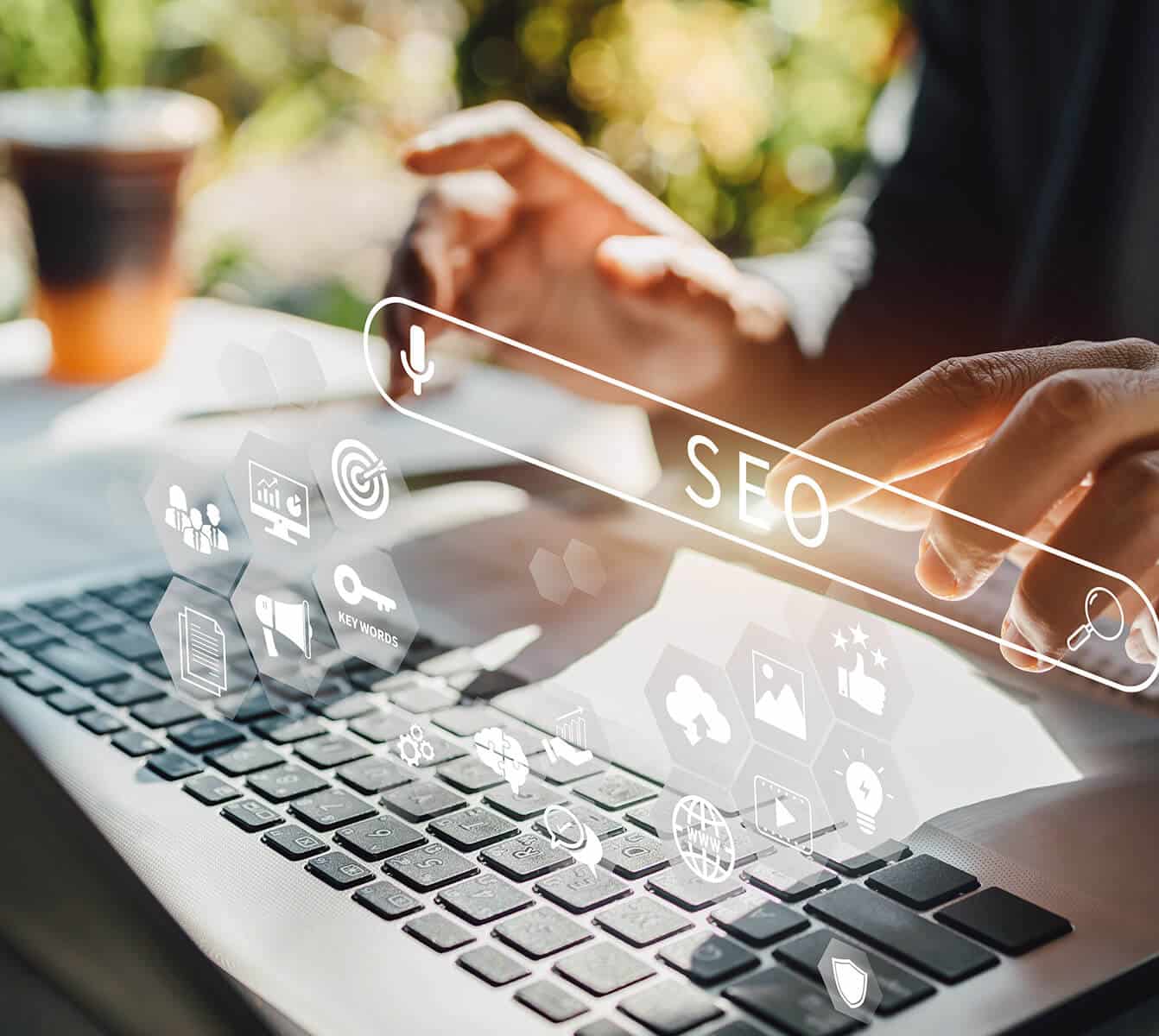
Search Engine Optimization (SEO)
Easily optimize web content for search engines with our user-friendly interface. Add meta descriptions, keywords and alt tags to improve visibility and organization.
2.5X
MORE LEADS
Experience a 2x Boost in Conversions
Responsive and Mobile-Friendly Design
Boost conversions by 2x with a mobile-responsive website. WordPress web design ensures visually stunning design and smooth functionality on any device.
Why Choose Us
Urban Geko - Absolute Powerhouse!
Bringing Your Brand to Life, One Pixel at a Time.
At Urban Geko, we ensure that every website we create is an authentic extension of each of our client's brands. From the colors and typography to the overall design and messaging, we weave the company's identity throughout the entire site. Every element reflects the brand's core values, personality, and vision, creating a cohesive experience that resonates with the target audience.
Our designs are more than just visually appealing—they tell a story, embody the brand's essence, and ensure consistency, leaving a lasting impression on every visitor. Our tailored approach ensures that your custom WordPress website development isn't just a digital brochure but a powerful tool that converts visitors into customers, boosting your bottom line.
01.

02.
Hitting Your Target Audience
With our in-depth understanding of audience psychology and behavior, we craft WordPress web development services that speak directly to your target demographic. By tailoring the user experience to their preferences and needs, we ensure maximum engagement and conversion rates.
Prioritizing User Experience (UX/UI)
At Urban Geko, we lead the way as a premier WordPress website designer by making user experience (UX) our top priority. We create visually stunning websites that not only captivate but also provide a smooth and intuitive journey for users. By understanding your target audience, we tailor layouts, navigation, content, and functionality to meet their specific needs, ensuring each WordPress site is both user-friendly and highly functional.
Our designs go beyond just usability—they reflect your unique brand identity. Through thoughtful choices in color schemes, typography, imagery, and tone of voice, we bring your brand to life in every detail.

03.
04.
SEO Optimized
Your website won't just look good; it'll perform well too. WordPress website designer Urban Geko, specializes in SEO optimization, ensuring that your WordPress site ranks high on search engine results pages. With our expertise, your business will be more visible to potential customers, driving organic traffic and increasing your online presence.
Commitment to Support and Continuous Maintenance
Our relationship doesn't end once your website is live. We provide dedicated support and ongoing maintenance services to ensure that your WordPress site development continues to perform at its best. Whether you need updates, troubleshooting, or guidance, we're here to help every step of the way.

05.
Work Smart. Hire us and Receive. One Smart Looking Website.
