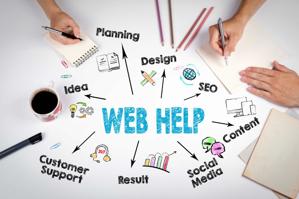
| Vision behind an E-commerce store: Whenever you are setting up an ecommerce store you do it with one intention i.e. to generate more sales. You want visitors to be flocking on to your online store, making purchases and generating revenue for your business. However, not every store that goes online is able to achieve these goals and the primary reason for its failure is its design. So in this content we will be covering some crucial UI elements that you cannot ignore in your e-commerce design. |
Let’s track the important aspect of user’s journey on an E-commerce website:
User enters an E-commerce store
![]()
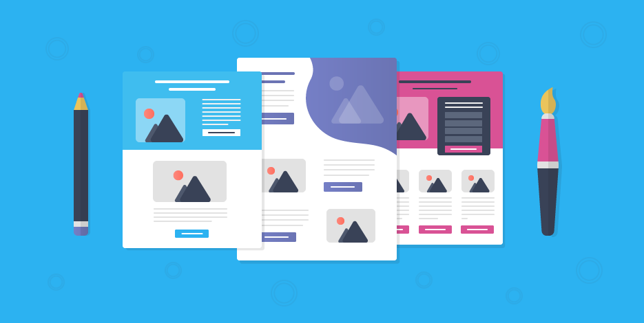
He browse through categories
![]()
He browse through categories
![]()
He browse through products check its reviews and description
![]()
He makes up his mind and click on ‘Buy Now’ button to advance forward
![]()
He moves to ‘Checkout’ page review his product details and click payments
![]()
Payment is done, confirmation mail is sent and users checks out
No doubt there are certain things that are done differently in this pathway but more or less such are the kind of transactions and scenarios every E-commerce store owner wants for their store.
Now, let’s break it down in terms of UI design to see,how this journey can be made simpler for the end user.
To begin with the landing page:
Confusion: Most people still believe that home page of the website is its landing page
Reality:Any page on which the customer first land through search is the landing page.
So to put in perspective every page of your E-commerce store must be properly and completely optimized. You need to make sure that the speed of each page is excellent and the images of the products are supremely clear.
Visuals of the products play a crucial role in influencing the decision of the buyer, so ensure that there is no compromise on the quality there.
Another super important element on an e-com store is the search functionality. Most design agency take this element lightly thereby losing out on crucial business.
Your search functionality is the second go to option for any person who is looking for any particular product or its detail on your website, so make sure that it is smoothly handled.
Make sure when you are giving an information about the products either through words or visuals you are as detailed as possible.
Add whatever little information you can add about the product in its description. This information really helps you grab customer’s attention and if nicely done can shift his focus in your favor.
Whenever a customer is browsing the categories don’t annoy him with useless pop-ups. A person who is searching something is already half invested in your website, so you don’t have to push him further with your additional inputs.
Make sure you have genuine and authentic reviews about the products that are added on to your website.
Few business owners fall into this mal practice of influencing their customer’s choices by adding wrong reviews about a particular product to boost its sale. Make sure that you don’t fall in this trap.
Even the giants like Amazon leaves the review section empty in case there is no review about the product. No doubt you can prompt your user to review a product but definitely you cannot force him.
Now moving on to another crucial aspect of his journey the ‘Checkout’ page, this page should be your best packed page. It must have all the important elements that infuse confidence in the buyer.
This page must not contain long fill up forms and every detail on it must clearly mentioned. The last thing you want is your customer to land on this page and annoyingly search for information he is looking for. Everything must be readily available for him on this page.
Double check that the invoice generated covers all the details that will make him understand about his purchase.
All these little things go a long way in forming customer’s behavior around your product and brand. Another tempting mistake you must keep yourself away from is never prompt cross selling the minute after he has made the purchase.
Amazon does this best,
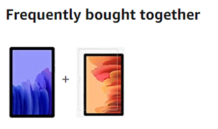
So it throws up this information on the page when you are browsing more about the product. Once you surpass this page without indulging in to these options, they are not prompted or repeated again.
This is how it should be done, ask when customer can reply best not when he doesn’t care about.
Conclusion: Before your store wins you the business it first need to impress you with its sight. This is how things operate on the online world.
You need to make sure that your design covers every element that can smoothen out the way for the customers who are browsing with the intention of buying.
Your customers need to first trust you before they invest in you and your design makes a huge statement in this aspect. In case you are looking for a good Orange county website Design Company to design your online store you can reach out to us. You can also go through our portfolio to check the work we have done for our clients over the years.
Related Posts