
Fintech products are hard to explain. The workflows are layered, the data is dense, and compliance requirements mean you can’t just simplify your way out of it. You need your audience to actually understand what they’re looking at, and you need that understanding to build confidence rather than confusion.
Static visuals don’t solve this. Fintech interactive infographics do, but not as a design novelty. They’re explanation assets. The right one makes a complex fee structure, a multi-step payment flow, or a regulatory framework something a prospect can explore on their own terms and walk away genuinely understanding.
This guide covers what interactive infographics actually are, where they work hardest in fintech, how to design them for trust and compliance, how to optimize them for both classic search and AI-driven discovery, and how to measure whether they’re pulling their commercial weight.
1. What a Fintech Interactive Infographic Actually Is (and What It Isn’t)
A fintech interactive infographic is a web-based visual asset that lets users explore financial data, product workflows, comparisons, or market narratives through actions like scrolling, clicking, filtering, hovering, calculating, or selecting scenarios. Its job is to explain a financial concept clearly while keeping the underlying text, data, and claims accessible to users, search engines, and AI systems.
That definition matters because “infographic” has been stretched to cover everything from a branded bar chart to a full-blown data dashboard. In fintech, the distinctions between formats aren’t academic. They determine whether your asset actually helps someone make a decision or just looks impressive in a stakeholder presentation.
Three formats. Three different jobs.
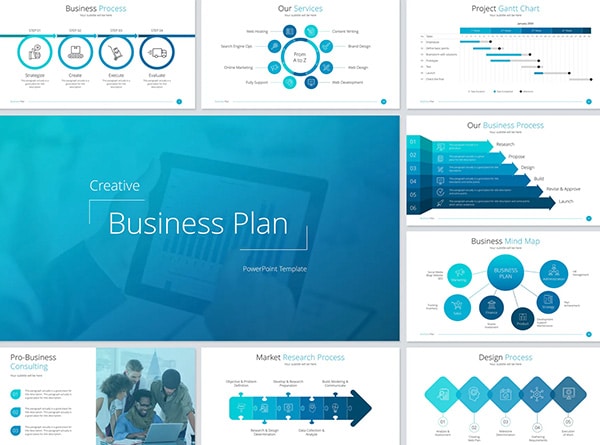
Static infographics work best when you have one clear story to tell with fixed data. A quarterly snapshot, a simple process overview, a single visual narrative. They’re easy to share, embed, and repurpose. If the data doesn’t change and the reader doesn’t need to explore, static is the right call.
Animated infographics earn their place when sequence matters. Launch storytelling, step-by-step explanations, motion-led narratives that guide the eye through a timeline or progression. The audience watches rather than explores. Animation controls the pacing.
Interactive infographics are the format for layered data and user-specific scenarios. Calculators, filterable comparison tables, timelines, maps, product flow explorers, scenario toggles, embedded dashboards. The reader isn’t watching a story unfold. They’re navigating one relevant to their own situation.
What counts as interaction? The range is broader than most teams realize:
- Scroll-triggered storytelling that reveals data as the user moves through the page
- Click-to-reveal layers that let someone drill into a fee structure without overwhelming the first view
- Hover states that surface supporting context
- Filters that let a prospect narrow a comparison to their own use case
- Embedded calculators, interactive maps, scenario toggles, and timeline explorers
One caution worth flagging early: hover-only interactions break on mobile and create accessibility gaps. Every critical insight needs a visible fallback (a tap target, a label, something accessible without a cursor). If the most important data point in your infographic only appears on hover, a significant portion of your audience will never see it.
The strategic test is straightforward. Use interactivity when the reader needs to explore, compare, choose, or understand cause and effect. If a savings rate only makes sense once someone plugs in their own deposit amount, that’s an interactive problem. If a payment flow only clicks once someone can toggle between domestic and cross-border scenarios, interactivity is doing real work.
If the visual is only prettier after interaction, it’s decoration. If it makes the decision clearer, it’s strategy.
2. Choosing the Right Interaction Type for Your Fintech Use Case
The format should follow the user’s question, not the creative team’s favorite animation style. This sounds obvious. It gets ignored constantly.
When a prospect lands on your interactive infographic, they arrive with a specific need: understand something, compare options, calculate an outcome, or figure out what happens next. The interaction model you choose either answers that need quickly or buries it behind a clever interface nobody asked for. In fintech, the wrong interaction type doesn’t just underperform. It makes important information feel hidden, and hidden information in a financial context erodes trust faster than almost anything else.
Here’s how the core interaction types map to fintech use cases, along with where each one breaks down:
| Interaction Type | Best For | Weak When |
|---|---|---|
| Scroll story | Product education, market trend narratives, regulatory explainers | Users need fast side-by-side comparison |
| Calculator or simulator | Lending scenarios, savings projections, retirement planning, ROI modeling, fraud-cost estimates, fee breakdowns | Assumptions are hidden or non-adjustable |
| Filterable data visualization | Market maps, fintech landscape views, provider comparisons, transaction trend analysis | Mobile controls are cramped or unusable |
| Timeline | Onboarding flows, KYC workflows, payment settlement stages, funding rounds, compliance milestones | The story isn’t actually sequential |
| Map or geographic module | Coverage areas, adoption rates, branch/ATM access, payment corridors, regional regulation comparison | Local or geographic intent isn’t central to the question |
| Click-to-reveal explainer | Layered product architecture, embedded finance models, API flows, fraud signal breakdowns, identity verification steps | Critical content is hidden behind the first click by default |
That last column is where most teams get tripped up. A scroll story is a beautiful format for walking someone through how open banking regulation evolved over the last decade. It’s a terrible format for someone trying to compare three payment processors side by side. A timeline makes perfect sense for visualizing a KYC onboarding sequence. It falls apart when the content isn’t genuinely sequential and you’ve forced a linear structure onto non-linear information because timelines look polished.
Decorative vs. Functional Interaction
This distinction is worth isolating because it’s the root cause of most fintech interactive infographic failures.
A functional interaction answers a question, changes the information displayed, or helps a user compare options. Adjusting a loan calculator slider and watching monthly payments recalculate in real time is functional. Filtering a market landscape down to payment processors in Southeast Asia is functional. Clicking to reveal the compliance layer beneath an embedded finance architecture diagram is functional.
A decorative interaction only moves elements around. Parallax effects that float icons as you scroll, hover animations that enlarge a logo without revealing new data, transitions that spin a chart into view. These add visual interest and nothing else. In regulated content, where every design choice signals either transparency or obfuscation, decorative interactions should be minimized. They consume development resources, slow page performance, and can make your asset feel less trustworthy to a financially sophisticated audience that came for substance.
Patterns That Earn Their Place
A calculator-infographic hybrid is one of the most effective formats for fintech. It answers a high-stakes financial question quickly (What would my monthly payment be? How much am I losing to interchange fees?) while the surrounding visual context builds understanding. When the next step is genuinely relevant, a prompt like “See your pre-qualification” feels natural rather than intrusive. The calculator does the trust-building work. The call to action follows it.
On the B2B side, a report-summary animation transforms survey findings or market research into something usable for executives, sales teams, and social distribution simultaneously. The scroll-driven format parcels dense data into digestible segments, each standing alone as a shareable insight while the full narrative builds a compelling case. For audience segments that benefit from guided self-assessment rather than open exploration, Fintech interactive quiz development offers another high-engagement interaction model worth considering.
Selecting Your Format
Before committing to any interaction model, answer one question: What does the user need to do here? Do they need to know something, compare options, calculate an outcome, trust a process, or understand what to do next?
That answer picks your format. Everything else is execution.
3. Interactive Infographic Use Cases Across Fintech Verticals
Fintech is not one product, one audience, or one trust problem. A lending calculator that helps someone visualize repayment scenarios solves a fundamentally different anxiety than a fraud-risk map showing attack vectors to a CISO, or a wealthtech allocation tool helping a 35-year-old understand compounding. Treating “fintech” as a single use case produces generic assets that don’t move anyone closer to a decision.
The table below maps specific fintech verticals to the information worth visualizing, the interaction patterns that work best, and the commercial role the asset plays. Use it as a menu, not a mandate. Start with the vertical where complexity is actively stalling your pipeline.
| Fintech Vertical | What to Visualize | Best Interaction Patterns | Commercial Role |
|---|---|---|---|
| Payments | Settlement flows, chargeback paths, fee comparisons, cross-border corridors | Timelines, Sankey-style flow diagrams, calculators | Education, sales enablement |
| Banking | Account onboarding journeys, savings-rate comparisons, deposit insurance explanations, digital banking paths | Comparison tables, scroll stories, scenario selectors | Acquisition, retention |
| Lending | APR components, approval timelines, repayment scenarios, credit criteria, refinance comparisons | Calculators, side-by-side scenarios, disclosure-aware sliders | Lead generation |
| Identity Verification | KYC steps, fraud signals, account-opening drop-off points, biometric verification flows | Click-to-reveal process maps, risk-layer diagrams | Product education, B2B sales |
| Fraud Prevention | Fraud lifecycle, risk scoring models, attack vectors, chargeback reduction workflows | Interactive threat maps, timelines, scenario modules | Authority building, sales conversations |
| Wealthtech | Portfolio allocation, risk tolerance, compounding, tax-aware investing, retirement scenarios | Sliders, allocation charts, scenario comparisons | Comprehension, advisor-led conversion |
| Insurtech | Claims journeys, coverage gaps, premium drivers, risk pools | Journey maps, calculators, coverage selectors | Quote confidence, user education |
| B2B Fintech | Embedded finance architecture, API workflows, treasury automation, vendor comparison, payments operations | Architecture diagrams, product fit filters, ROI calculators | Sales enablement, buying committee alignment |
The “commercial role” column determines where the asset lives in your funnel and who it’s actually built for.
Matching Assets to Funnel Stages
Not every interactive infographic serves the same moment in a buying decision. The content that explains a market problem to someone who just discovered it looks nothing like the content that helps an internal champion pitch your product to their CFO.
- Awareness assets explain the market or the problem. A scroll story mapping the cross-border payments landscape, or an interactive timeline showing how fraud tactics have evolved, gives someone a reason to care before they evaluate solutions. These build brand authority and organic visibility.
- Consideration assets compare options or approaches. A filterable comparison of embedded finance architectures, or a side-by-side lending scenario builder, helps prospects narrow their thinking. If the tool is genuinely useful even to someone who doesn’t pick you, it earns trust that biased content never will.
- Conversion assets calculate value or reduce perceived risk. A savings projection calculator, a fraud-cost estimator, an ROI tool for treasury automation. These turn understanding into action because they make the outcome personal. The user isn’t reading about hypothetical benefits. They’re seeing their own numbers. Specialized Fintech calculator development ensures these tools are accurate, compliant, and optimized for the user scenarios that drive real decisions.
- Sales assets equip internal champions to explain the product to people who weren’t in the room for the demo. Finance teams, compliance officers, product leads, executive stakeholders. An interactive architecture diagram that a product marketer can walk a buying committee through, layer by layer, is worth more than a dozen static slide decks. These don’t generate leads directly. They close deals that would otherwise stall in committee.
What Every Fintech Use Case Shares
Across every vertical in that table, four requirements apply regardless of topic:
- Data freshness. Financial data ages fast. An APR comparison built on last quarter’s rates or a market map using year-old adoption figures actively misleads. Every interactive asset needs a visible “Last Updated” date and an internal refresh process. Stale financial content isn’t just unhelpful. In a regulated context, it’s a liability.
- Disclosure needs. If the infographic includes rates, projections, or performance data, qualifying disclosures need to live within the same visual field. Not at the bottom of the page. Not behind a secondary click. Adjacent to the claim, readable, and impossible to miss. The proximity principle from compliance design applies to interactive formats just as strictly as static ones.
- Source visibility. Every data point should trace back to a credible origin: central bank publications, regulatory filings, proprietary research with methodology disclosed. An interactive chart without visible source attribution looks like marketing opinion dressed up as market data.
- Mobile readability. More than half your audience will encounter the asset on a phone. Sliders need touch-friendly targets. Tables need to reflow rather than force horizontal scrolling. Click-to-reveal layers need tap areas large enough to hit on the first try. If the mobile experience requires pinching and zooming, the asset isn’t finished.
The best topic for your first (or next) fintech interactive infographic isn’t the flashiest one on this list. It’s the one where complexity is actively blocking someone’s next decision. Find the moment where a prospect stalls, where a sales conversation loops, where a concept gets explained three different ways across three different decks and still doesn’t land. That’s your use case.
4. UX, Accessibility, and Visual Honesty as a Single System
In fintech, an interaction that hides critical information is not clever. It is risk wearing a nice jacket.
Usability, accessibility, and compliance aren’t three separate workstreams you layer on top of a finished infographic. They’re one system. When any piece fails, the whole asset loses credibility. A calculator that breaks on mobile, a chart that’s unreadable to someone with color blindness, a rate claim with no visible date stamp: each one tells the user (and regulators, and AI crawlers) that the details weren’t important enough to get right.
Non-Negotiable UX Requirements
Interactive infographics live or die on how they perform where people actually use them. That means phones on train platforms and aging laptops on hotel Wi-Fi, not a design team’s Retina display.
Responsive behavior comes first. Your asset needs to function cleanly across desktop, tablet, and mobile without requiring pinch, zoom, or horizontal scroll. More than half your audience arrives on a phone. An interactive fee comparison that requires horizontal scrolling on mobile fails the people most likely to need it.
Fast load behavior protects engagement. Every animation, library, and data call adds weight. If a scroll-triggered chart takes four seconds to render, the user has already moved on. Defer non-essential scripts. Compress assets aggressively. Test on throttled connections, not just your office network.
Clear labels eliminate guesswork. Every element the user can click, filter, expand, tap, or calculate with needs a visible label communicating what it does. Not an icon that might mean “filter.” Not a subtle color change on hover. An actual word. Financial decisions carry stakes, and ambiguous controls introduce hesitation at the exact moment you need confidence.
Mobile typography and touch targets need to match the pressure of the moment. Someone calculating a loan repayment on their phone during a lunch break is making a real financial decision in a constrained environment. Body text below 16px becomes a strain. Touch targets smaller than 44×44 pixels invite mis-taps. Tiny hotspots, hover-only meaning, and mystery-meat navigation have no place in financial content.
Accessibility as Practical Checkpoints
If a portion of your audience can’t navigate the asset, the information it contains is functionally hidden from them. In a financial context, that’s both an ethical failure and a commercial one. Work through these before anything goes live:
- Keyboard navigation for all interactive controls. Every slider, filter, toggle, tab, and expandable section must be operable without a mouse. This is the single most common failure point in interactive content.
- Visible focus states. The default browser focus ring is nearly invisible in most designs. Build custom, high-contrast focus indicators that match your brand without sacrificing clarity.
- WCAG AA contrast at minimum. Pay special attention to charts and disclosure text, the two places fintech infographics most frequently fail contrast checks. A data label in light grey on white might look elegant. It’s also invisible to a meaningful percentage of your users.
- Color-independent meaning. If your chart uses only red and green to indicate loss and gain, roughly 8% of male users cannot read it. Pair color with labels, patterns, icons, or directional indicators. This also addresses the cultural dimension: red means “up” in some markets and “down” in others.
- Screen-reader support through semantic structure. Use proper heading hierarchy, descriptive ARIA labels, and meaningful alt text for complex charts (summarize the trend and key takeaway, not just “chart”). Provide a non-interactive fallback so no one hits a dead end.
- Dynamic results announced properly. When a calculator updates or a filter changes displayed data, use ARIA live regions to announce the change. A savings calculator that silently updates its output is usable for sighted users and a black box for everyone else.
Compliance and Visual Honesty
Trust in financial content is built through verifiable precision. Interactive infographics, because they compress complex data into visual formats, face an elevated standard.
Source every claim visibly, near the claim. Every chart, statistic, benchmark, rate, or fraud-reduction figure needs a source citation within the same visual field. Not at the bottom of the page. Not behind a hover tooltip. If your infographic references a “42% reduction in chargebacks,” the reader should see who measured that and when without additional clicks.
Timestamp data that changes. Interest rates shift. Product terms evolve. Competitor comparisons age. Any data point subject to change needs a visible “As of [Date]” stamp. A rate comparison published six months ago without a date looks current. If it isn’t, that’s misleading.
Route claims through compliance or legal review before publishing. Any assertion about returns, rates, fees, approval odds, fraud reduction, or conversion performance needs sign-off from someone qualified to verify it. This applies to interactive content just as strictly as it does to a landing page or ad.
Avoid distorted visuals. Truncated y-axes exaggerate trends. Cherry-picked timeframes hide volatility. 3D perspective effects make accurate comparison impossible. If a visual implies certainty where only estimates exist, it’s doing the opposite of what a trust-building asset should do.
Red Flags That Signal Broken Trust
- Critical insights hidden behind hover states (invisible on mobile, inaccessible to keyboard users)
- Rate claims without visible update dates
- Calculators with hidden assumptions baked into code rather than displayed and adjustable on-screen
- Charts that rely only on red and green to convey meaning
- Disclosure text separated from the claim it qualifies by scrolling distance, a secondary page, or a collapsible section
Any one of these tells a financially literate audience that the details weren’t prioritized. Several together suggest the asset was built for stakeholder approval, not user trust.
The Outcome
A trusted fintech interactive infographic is usable when the animation fails, the JavaScript doesn’t load, or the user is navigating entirely by keyboard. It’s readable on a phone screen in direct sunlight. It’s honest when the compliance team reads it line by line.
When UX, accessibility, and visual honesty function as one integrated system rather than three separate review passes, the result isn’t just a compliant asset. It’s one that earns the kind of trust your audience is actively looking for and rarely finds.
5. Making Interactive Infographics Discoverable by Search Engines and AI Systems
Search engines and AI answer systems cannot reliably cite what they cannot parse. A beautifully crafted interactive infographic that locks every insight inside a canvas element, an opaque iframe, or a flat image file is invisible to the systems that drive discovery. It may impress the person who already found it. It will never surface for the person searching for it.
Discoverability requires three layers working together: a readable text layer, a structured data layer, and a summary layer. Miss any one of the three, and you’re relying entirely on direct traffic and social shares to justify the investment.
Page Structure That Search Engines Can Actually Use
The page hosting your interactive asset needs to function as a well-structured article in its own right, independent of whether the interactive elements load at all.
Start with one clear H1 that includes your primary topic. “Interactive Infographic: How Cross-Border Payment Fees Compare” tells both users and crawlers exactly what this page delivers. Build H2s that answer standalone questions: “What drives cross-border payment costs?” or “How does an interactive infographic help fintech companies explain complex fees?” These subheadings create scannable structure for readers and give search engines discrete passages to index as featured snippets or AI-generated answers.
Above every complex interactive module, write a short summary paragraph that captures the core insight in plain text. This is the passage that gets lifted. If someone asks an AI system “What are the main components of cross-border payment fees?” and your page has a clear, concise answer sitting above the interactive explorer, that text can be extracted and cited without requiring any interaction with the tool itself.
Below charts and modules, add descriptive captions. Not “Figure 3.” Something useful: “Comparison of interchange, FX markup, and network fees across six major payment corridors, Q1 2025.” The caption tells a screen reader, a search crawler, and a skimming human exactly what they’re looking at.
Alt text follows the same principle. Describe the insight, not the object. “Bar chart” is useless. “Interchange fees range from 0.3% in the EU to 2.1% in the US for cross-border consumer transactions” gives the crawler something meaningful to index and the visually impaired user something genuinely informative.
Internal links connect the asset to your broader content ecosystem. Link to your fintech SEO strategy page, content production services, relevant case studies, and design methodology pages. These links distribute authority, signal topical depth, and help search engines understand where this asset sits within a larger body of expertise.
Building for Crawlability, Not Just Interactivity
The implementation decisions your development team makes determine whether your content is indexable or invisible. This is where many fintech interactive infographics quietly fail.
- Prefer DOM-rendered content. Semantic HTML5 elements, inline SVG for charts, server-side rendering or static generation where feasible. Content in the DOM is content Googlebot can read. Content trapped inside a JavaScript-rendered canvas, a PDF embed, or an iframe pointing to a third-party tool with no supporting text is content search engines will likely skip.
- Provide a non-interactive fallback directly below the module. A data table, a transcript, a plain-language summary. This makes the page’s core information available to every crawler, every AI retrieval system, and every user whose browser, connection, or assistive technology doesn’t support the interactive layer.
- Use accessible labels that match the visible graphic. If a chart displays “Average processing time: 2.3 days” on screen, the underlying HTML or ARIA label should contain those same words. Discrepancies between what’s visible and what’s in the code create confusion for assistive technologies and can trigger inconsistency signals for crawlers evaluating content quality.
The interactive experience is the premium version. The fallback ensures the information reaches everyone and everything that matters.
Structured Data That Signals Context
Schema markup helps search engines classify your content and increases eligibility for rich results. For fintech interactive infographics, several types are relevant:
- Article or WebPage for the page itself, connecting it to authorship and publication metadata.
- FAQPage when the page includes question-and-answer blocks. If you’ve structured sections around questions (and you should), this markup gives search engines explicit FAQ signals.
- Dataset when the page presents structured data users can explore. A filterable fee comparison or market adoption table qualifies.
- FinancialProduct only when visible page content accurately supports it. Applying financial product schema to a general educational infographic is a mismatch that undermines trust signals rather than strengthening them.
- Organization and Person where authorship or editorial review matters. In YMYL content, connecting the page to credentialed authors and a recognized organization entity reinforces the E-E-A-T signals search engines weight heavily.
Every schema property must match what’s visible on the page. Mismatches between markup and displayed content invite manual review penalties.
Improving Extractability for AI-Driven Discovery
AI answer engines (Google’s AI Overviews, Perplexity, ChatGPT with browsing) pull from pages differently than traditional crawlers. They favor answer-first sections, explicit entity definitions, source-backed claims, and concise summaries that can be quoted without losing meaning.
- Lead sections with direct answers. If a section asks “What drives cross-border payment costs?” the first sentence should answer plainly. AI systems pull from the top of a section when resolving a query.
- Name entities explicitly. Don’t write “the regulator.” Write “the Consumer Financial Protection Bureau (CFPB).” Don’t write “a major payment network.” Write “Visa’s cross-border interchange schedule.” Specificity makes content quotable and verifiable.
- Place authoritative source notes near data points. A statistic followed by “(Source: Bank for International Settlements, 2024 Triennial Survey)” is more extractable than the same statistic with a generic footnote elsewhere on the page.
- Keep data current and date it visibly. AI systems encountering undated financial data have no way to assess relevance. A visible “Last Updated: May 2025” signal tells both AI and human readers the content reflects current conditions.
- Monitor how AI systems describe your brand. Search your brand name and key asset titles in AI tools periodically. Inaccurate results or missing citations signal a need to strengthen source attribution, clarify ambiguous claims, or improve the structural extractability of key passages.
Honest framing: no optimization guarantees AI citation. These systems are evolving rapidly, and their selection criteria aren’t fully transparent. What you can control is the extractability, clarity, and trustworthiness of your content. That work compounds. It improves traditional search performance, accessibility, and user trust simultaneously.
The Invisible Asset Problem
If the entire insight lives only inside the interactive graphic, with no readable text, no fallback data, no structured markup, and no summary layer, the asset may look impressive to the stakeholder who approved the budget. It will remain invisible to the search engine that could have driven thousands of qualified visitors and the AI system that could have cited your brand as the authoritative source.
The visual layer gets users to stay. The text and data layers get them there in the first place.
6. Anchor the Asset Inside a Content Ecosystem
A fintech interactive infographic that lives on a single page with no supporting content is an expensive island. It might look impressive when someone lands on it directly, but it’s doing a fraction of the work it could. The real return comes when the asset anchors a cluster of content that helps users, sales teams, search engines, and AI systems understand the same idea from multiple angles.
This is where content strategy and interactive design stop being separate conversations.
Mapping the Asset to Everything Around It
Think of the interactive infographic as the visual pillar. The page it lives on is the canonical hub: it introduces the concept, houses the interactive module, links to deeper resources, and earns the authority that search engines reward with rankings. Everything else orbits that hub.
Supporting articles explain the subtopics your infographic surfaces but can’t fully explore within a visual format. If your interactive asset maps cross-border payment corridors, supporting articles might cover regulatory differences between SEPA and SWIFT, break down FX markup structures, or walk through settlement timelines. Each article links back to the infographic as the visual reference point and captures long-tail queries the pillar page alone wouldn’t rank for.
Case studies ground the concept in measurable outcomes. If the infographic explains an embedded finance architecture, a case study showing how that architecture reduced integration time by 40% turns theoretical understanding into commercial proof. Where real implementation data exists, use it. Nothing else carries the same weight with a buying committee.
Sales assets are where the infographic earns revenue directly. Convert key modules into pitch deck slides. Pull individual charts into one-pagers. Extract compelling calculator outputs as demo visuals or leave-behinds. Your sales team should be working from the same visual system, adapted for the meeting room.
Social and email snippets extend reach without requiring new creative from zero. A single data point, a calculator finding, a surprising comparison from a filter view becomes a LinkedIn post, an email header, or a campaign asset. The link back drives traffic to the pillar page, reinforcing its authority over time.
Tying Each Reuse Path to Commercial Intent
Different formats serve different moments in the buying journey. When you map each content type to a funnel stage, the ecosystem stops feeling like a content calendar exercise and starts functioning as a revenue system.
| Funnel Stage | Content Types | What They Do |
|---|---|---|
| Awareness | Market maps, trend explainers, statistics modules | Build visibility and establish authority before the prospect has a shortlist |
| Consideration | Comparison tools, workflow explainers, decision trees | Help prospects evaluate approaches and narrow options |
| Conversion | Calculators, ROI estimators, product-fit modules | Make outcomes personal and reduce perceived risk |
| Retention | Onboarding flows, education modules, customer-success visuals | Reduce churn, support internal champions, accelerate time-to-value |
The interactive infographic itself often spans multiple stages. The surrounding content focuses each reuse on a specific intent.
Internal Linking That Compounds Authority
From the infographic page, link to your fintech SEO strategy content, content marketing services, UX and design production pages, relevant portfolio examples, and fintech case studies where they exist. These links tell search engines (and increasingly, AI retrieval systems) that this page sits within a deep, interconnected body of expertise.
Supporting articles link back to the infographic as the visual pillar. This bidirectional structure concentrates topical authority on the hub page while distributing ranking opportunities across the cluster. It’s the same architectural principle behind pillar-cluster SEO strategies, applied to a visual asset instead of a text-only guide.
Planning Discipline Before Production
One pattern shows up consistently in the strongest competitor assets: production is never step one.
The teams producing interactive content that actually performs start with goals, audience definition, search intent research, competitor gap analysis, data source identification, distribution channels, and an editorial calendar. The infographic comes after that strategic foundation is built.
An interactive infographic created without knowing which search queries it should capture, which sales conversations it should support, or which content it will link to is an asset that looks impressive in isolation and underperforms in context. Content creation is the execution phase. Strategy determines whether the execution is worth the investment. A structured Fintech Content Marketing approach ensures that strategy is defined before any asset enters production.
Where the Value Compounds
The difference between a standalone showpiece and a revenue-generating content system comes down to whether the same strategic, design, development, and marketing thinking carries across every reuse path. When the pillar page, supporting articles, sales assets, and social snippets all reflect a unified understanding of the audience, the data, and the commercial goal, each piece reinforces the others.
That coherence across formats and channels is genuinely rare. It requires a partner fluent in content strategy, visual design, technical development, and fintech marketing, working as a single team rather than a chain of handoffs. When it exists, the interactive infographic stops being a one-time project and becomes the anchor of a system that keeps generating value long after launch.
7. Measuring Whether a Fintech Interactive Infographic Is Actually Working
A high scroll depth and a respectable time-on-page number might mean your interactive infographic is doing its job. They might also mean someone left the tab open during a meeting. Interaction is not the business outcome. It’s an early signal that the asset may be helping users understand and decide. The measurement framework that matters connects those signals to what your leadership team actually cares about: qualified discovery, pipeline influence, shorter sales cycles, and reduced confusion.
Organizing metrics by channel tells you where traffic came from. Organizing them by outcome tells you whether the asset is working.
Metrics Organized by Outcome
- Qualified traffic: organic entrances, ranking keywords (especially long-tail queries signaling commercial intent), and referral traffic from AI answer engines where measurable. Traffic quality by audience segment matters more than volume. Fifty visits from payments operations directors outweigh a thousand from undergraduate finance students.
- Engagement quality: scroll depth tells you whether people reached the interactive modules. Interaction rate tells you whether they used them. Module completion, filter usage, calculator starts versus completions, and return visits all signal whether the asset is earning sustained attention or just a curious glance.
- Conversion support: form fills, demo requests, account starts, quote initiations. Track assisted conversions where the infographic appeared in the path even if it wasn’t the last touch. Influenced pipeline connects the asset to revenue by identifying deals where a contact engaged before entering the sales process. Lead quality scoring tells you whether the asset is attracting the right prospects or just generating volume.
- Authority and distribution: backlinks earned, unlinked brand mentions, media citations, partner shares, newsletter click-through rates when the asset is featured, and social saves. These compound over time and are often the hardest to attribute but the most durable in value.
- Sales enablement: usage in pitch decks and prospect-facing materials. Did the asset help an internal champion explain your product to their CFO or compliance team? Track whether repeated sales questions decrease after launch. Monitor engagement on follow-up emails that include the infographic link. If your sales team starts voluntarily sending the asset to prospects, that’s a signal no dashboard can replicate.
- Trust and comprehension: support-ticket reduction in categories the infographic addresses. Lower onboarding confusion for products the asset explains. Qualitative feedback from prospects, customers, and internal teams. Stakeholder survey results measuring whether the asset made a concept clearer. These are harder to quantify and often the most commercially meaningful indicators.
Setting Up Measurement Before You Build
The most common measurement failure isn’t choosing the wrong metrics. It’s instrumenting the asset after it’s live and realizing the events you need were never configured.
Define the user action before building the interaction. If the calculator’s purpose is to move someone toward a quote request, the “Start Calculator” and “Complete Calculator” events need to exist in your analytics plan before a single line of code is written.
Track meaningful events, not every tiny hover. A scroll-depth milestone at the interactive module’s position is useful. Logging every mouse movement across a data visualization is noise.
Tag CTAs and internal links consistently. Every button, every in-page link, every “Get Started” prompt should carry event labels that let you trace behavior from the infographic to downstream actions. Inconsistent tagging is the silent killer of content attribution.
Use comparison periods where possible. If the infographic addresses a topic your sales team previously explained manually, measure question frequency before launch and three months after. If it targets a query cluster you weren’t ranking for, compare organic visibility across the same window.
Separate vanity engagement from decision-support behavior. A visitor who scrolls the full page and leaves is different from one who completes a calculator, clicks through to a product page, and returns two days later with a colleague. Both register as “engaged.” Only one is on a buying path.
Proving the Asset’s Value
If you have real performance data from a comparable project, a concise proof module on the page strengthens credibility. Analytics screenshots, before-and-after comprehension metrics, measurable reductions in support queries, or documented improvements in sales-cycle velocity all work.
When public case data doesn’t exist yet, process proof fills the gap: accessibility testing documentation, compliance review workflow artifacts, or side-by-side examples showing how the interactive format improved comprehension over a static predecessor. The point isn’t perfection. It’s evidence of rigor.
The Commercial Frame
A fintech interactive infographic earns its investment when it does at least one of four things: shortens explanation, improves trust, attracts qualified discovery, or gives sales a clearer way to make the case. The measurement framework exists to determine which of those four it’s achieving, how strongly, and where the gaps remain. Without that framework, you’re guessing. With it, you’re building a case that compounds every quarter.
8. Choosing Between Internal Teams, Platforms, and Creative Partners
Most fintech teams aren’t just deciding whether to build an interactive infographic. They’re deciding who should be trusted to build it. That question carries more weight than format selection or data sourcing, because the wrong production path creates an asset nobody can maintain, measure, or confidently put in front of a compliance reviewer.
Five production models exist. Each fits specific conditions, and each carries specific risks.
| Production Model | Best When | Primary Risk |
|---|---|---|
| Internal team | Brand, data, compliance, and development capacity already exist under one roof | Bandwidth constraints and blind spots from proximity |
| No-code interactive platform | Faster scrollytelling, hotspot layers, and lighter campaign assets are the goal | Crawlability gaps, accessibility limitations, and template constraints |
| Data visualization tool | Chart-heavy research, dashboards, and data stories drive the narrative | Weak editorial narrative and incomplete SEO fallback |
| Custom web build | High-value evergreen assets, calculators, API-connected tools, and performance-sensitive experiences require full control | Higher coordination overhead and investment |
| Specialist creative partner | Strategy, design, development, SEO, and compliance governance need to move as a single effort | Choosing a partner without fintech fluency |
Tools matter only as enablers. Ceros works well for branded interactive experiences where visual immersion is the priority. Flourish handles data-driven stories and animated charts with minimal engineering lift. Next.js or similar frameworks give you crawlable, performance-conscious custom builds when the asset needs to rank, integrate with your product stack, and scale over time.
Tool choice matters less than whether the final asset is understandable, accessible, measurable, and compliant. A beautifully built experience that search engines can’t index and screen readers can’t parse is a production success and a strategic failure.
Selection Criteria That Clarify the Decision
Before evaluating vendors or allocating internal sprint time, work through these questions. They narrow the field faster than any feature comparison:
- Is the asset evergreen or campaign-specific? Evergreen assets justify custom builds and deeper investment. Campaign pieces with a 90-day shelf life need faster, lighter production paths.
- Does it include regulated claims, rates, returns, or personal data? If yes, compliance review is non-negotiable, and the production model needs to accommodate that workflow without creating bottlenecks.
- Does it need to rank in search? If organic discovery is a primary goal, crawlability and semantic HTML become hard requirements. Content trapped inside opaque iframes or canvas elements is invisible to the systems that drive qualified traffic.
- Does it need lead capture or sales enablement integration? If the asset feeds your pipeline, it needs to connect to your CRM, analytics, and nurture workflows. A standalone creative piece that can’t pass data downstream is a dead end.
- Who owns updates after launch? Financial data ages. Rates change. Compliance requirements evolve. If your team can’t update the asset independently, every refresh becomes a new project with new costs.
Reducing Complexity, Not Adding to It
The right production model should make the team’s life simpler, not create a beautiful asset nobody knows how to maintain or prove is working. The partner, platform, or internal workflow that reduces the distance between strategy and execution while keeping compliance, accessibility, and measurement built into the process is the one that compounds value over time.
That combination of strategic, creative, technical, and regulatory fluency working together is genuinely uncommon. It’s also the difference between an interactive infographic that impresses stakeholders once and one that keeps earning trust, traffic, and pipeline quarter after quarter.
How to Build a Fintech Interactive Infographic: A 10-Step Production Workflow
Interactive fintech assets fail when creative production starts before the fundamentals are locked down. The question the asset answers, the data supporting it, the compliance rules governing it, the SEO structure making it discoverable. When those pieces aren’t defined first, the result is an expensive visual that looks polished in a stakeholder review and underperforms everywhere else.
Use the format guidance from earlier sections to define what you’re building. Use the interaction mapping to choose the right model and use case. Apply the trust, accessibility, compliance, SEO, and measurement frameworks as quality gates throughout.
Step 1: Define the Single Financial Question
Every effective fintech interactive infographic starts with one high-intent question or decision it helps the user resolve. “How do cross-border payment fees compare across corridors?” “What would my monthly repayment look like at different terms?”
If you can’t state the question in one sentence, the scope isn’t tight enough. An infographic that tries to answer three questions answers none of them well.
Step 2: Identify the Audience, Funnel Stage, and Internal Stakeholder
Define who the asset is for, where they sit in the buying journey, and what action you want them to take next. A payments operations director evaluating vendors at the consideration stage needs a different interaction model than a first-time investor exploring compound interest.
Identify the internal stakeholder who will use the asset too. Sales enablement, product marketing, demand generation. Their needs shape distribution and format decisions downstream.
Step 3: Source Data, Document Assumptions, and Set the Update Cadence
Pull data from authoritative, citable sources: central bank publications, regulatory filings, proprietary research with disclosed methodology. Document every assumption baked into calculators or projections. Collect required disclosures from your compliance or legal team before design begins.
Set the refresh schedule upfront. Monthly rate updates? Quarterly regulatory checks? Annual data overhauls? An undated financial asset isn’t just stale. It’s a liability.
Step 4: Build the Narrative Structure First
Map the content architecture before opening any design tool. The summary capturing the core insight in plain text. The modules the user will interact with. Labels and captions making every element self-explanatory. Fallback text ensuring the page works when JavaScript doesn’t load. The CTA path connecting understanding to action.
This text and structure layer is what search engines index, what AI systems extract, and what screen readers parse. Skip it and you’ve built a beautiful asset that’s invisible to the systems driving discovery.
Step 5: Prototype in Low Fidelity and Test
Wireframe the interaction before investing in visual design. Paper prototypes, clickable Figma frames, whiteboard sketches. Then put it in front of three to five people who represent your target audience.
The test is simple: does the user know what to click, compare, or calculate without instruction? If they hesitate, the interaction model needs rethinking. Catching this at the wireframe stage costs hours. Catching it after development costs weeks.
Step 6: Design and Build with Performance Discipline
Build with semantic HTML, inline SVG for charts, and server-side rendering where feasible. Ensure responsive behavior across devices. Meet WCAG AA contrast minimums. Make every interactive control keyboard-navigable with visible focus states. Defer non-essential scripts to keep load times aggressive.
Every interactive module needs a non-interactive fallback directly below it: a data table, a summary paragraph, a transcript. The visual layer earns engagement. The text layer earns discovery.
Step 7: Run Compliance, Accessibility, SEO, and QA Review
This is a gate, not a suggestion. Route the asset through four distinct reviews:
- Compliance or legal: every rate, claim, projection, and disclosure verified for accuracy, proximity, and regulatory alignment.
- Accessibility: keyboard navigation, screen reader behavior, contrast ratios, color-independent meaning, and ARIA labels tested.
- SEO: schema markup validated, heading hierarchy confirmed, alt text reviewed, internal links placed, fallback content indexed.
- QA: cross-browser, cross-device, and throttled-connection testing covering calculator edge cases and broken states.
No asset publishes until all four pass.
Step 8: Publish with Analytics, Schema, and Source Attribution
Configure analytics events before launch. Track calculator starts and completions, filter usage, module scroll depth, CTA clicks. Tag every link and button with consistent event labels connecting behavior to downstream conversions.
Add structured data (Article, FAQPage, Dataset where applicable). Build internal links to supporting articles, service pages, and case studies. Include a visible “Last Updated” date and source notes directly on the page.
Step 9: Repurpose Across Channels
Pull key modules into pitch deck slides. Convert calculator outputs into sales leave-behinds. Write supporting articles exploring subtopics the infographic surfaces but can’t fully cover. Create social snippets from individual data points. Feature the asset in email campaigns.
Every reuse path links back to the original, reinforcing its authority and extending the asset’s reach far beyond a single URL.
Step 10: Review, Refresh, and Document
Monthly or quarterly, depending on how fast the underlying data moves. Compare organic visibility, engagement quality, and conversion support against the goals defined in Step 2. Refresh stale data points. Update disclosures when regulations shift. Document what worked and what the next iteration should improve.
The strongest fintech interactive infographics aren’t static launches. They’re living systems that compound in value with each review cycle.
Governance: Assign Owners
Without named owners, maintenance defaults to nobody. Assign clear responsibility across five functions:
- Content accuracy: verifies that data, claims, and disclosures remain current.
- Design system consistency: ensures visual updates align with brand standards.
- Technical maintenance: handles performance, accessibility, and platform updates.
- Legal and compliance review: signs off on regulatory changes and new claims.
- Analytics reporting: monitors performance and flags when the asset needs attention.
The result is a reusable asset that explains your product or market clearly, registers with search engines and AI systems, and remains safe to maintain as data and regulations change. That’s not a one-time deliverable. It’s infrastructure.
Frequently Asked Questions
How much do fintech audience research services usually cost?
Most credible firms scope custom statements of work rather than publishing fixed rates, because the variables shift the budget dramatically. Directional ranges run from $25,000 for a focused discovery sprint to $150,000 or more for a multi-method program that includes quantitative validation. The biggest price drivers are recruitment difficulty (executive panels and underbanked fieldwork cost significantly more than general consumer panels), geographic spread, method complexity, and whether the scope includes quant survey validation on top of qualitative findings. Those first two variables, recruiting senior B2B stakeholders and reaching underserved populations, tend to move the budget fastest.
How long should a good fintech audience research project take?
A credible engagement typically runs six to twelve weeks, covering stakeholder alignment, screener development, recruitment, fieldwork, synthesis, and a structured readout. A fast discovery sprint (qualitative interviews with a defined segment) can land in six weeks. Fuller programs involving segmentation, quantitative validation, or multi-market recruitment need the longer runway. Compressing below six weeks usually means cutting corners on recruitment quality or synthesis depth, both of which undermine the entire investment.
What deliverables should I expect from a serious partner?
At minimum: validated personas, a segmentation matrix with priority scoring, journey maps tied to real behavioral data, trust and messaging findings, feature or benefit prioritization outputs, raw data or session clips for internal review, and an implementation roadmap connecting each finding to a business metric. The critical test is whether the deliverables help product, marketing, and leadership make specific decisions. If the final output summarizes interviews without telling anyone what to do differently, the research hasn’t finished its job.
Should we do this in-house or work with a specialist partner?
Internal teams win at continuous listening, existing product analytics, and institutional context. A specialist wins where recruitment is hard (senior executives, underbanked populations), where neutral synthesis prevents internal politics from filtering findings, where cross-functional alignment needs an outside voice to hold, and where compliance-sensitive study design requires specific expertise. The best outcomes usually blend both. The right partner feels like an extension of the team rather than a vendor managing a handoff, which is exactly the model Urban Geko brings to research-to-execution engagements.