
Your fintech site gets more mobile traffic than desktop. You already know that. What separates this conversation from the one every other industry is having is the weight behind each tap.
A visitor on a banking app isn’t browsing casually. They’re checking a balance before rent clears, comparing loan rates against a deadline, deciding whether your platform deserves their money. When Fintech Responsive Web Design falls short on a phone, that isn’t a UX annoyance. It’s a trust fracture. And in financial services, trust fractures don’t heal with a follow-up email.
These ten patterns cover the specific decisions that make desktop, tablet, and mobile feel equally trustworthy and usable. Not generic responsive tips. Fintech-specific choices that protect revenue, satisfy regulators, and respect the person on the other end of the screen.
1. Start Mobile-First with a Unified Design Token System
Shrinking a desktop banking experience onto a phone screen doesn’t create a mobile experience. It creates clutter, mistrust, and tap errors. In most industries, that’s an inconvenience. In fintech, it feels like risk. When buttons overlap on a transfer screen or a disclosure gets squeezed into illegibility, users don’t think “bad design.” They think “is my money safe here?”
The fix isn’t starting with desktop and scaling down. It’s identifying the core jobs your mobile users need to accomplish first: checking balances, reviewing transactions, transferring funds, verifying identity, reaching support. Those five tasks should work flawlessly on the smallest screen before anything else gets attention.
Once mobile priorities are locked, build a token-based design system governing spacing, typography, card components, buttons, disclosure blocks, and status states across every breakpoint. Tokens ensure that a “success” state looks and feels identical whether someone sees it on a dashboard, a marketing page, or a support confirmation screen. That consistency across surfaces is a trust signal users feel without consciously registering it.
The implementation layer matters just as much. Fluid grids, clamp()-based typography, and component variants replace the brittle approach of writing one-off fixes for individual pages. A reusable card component that adapts its padding and type scale proportionally is more reliable and more maintainable than a dozen custom layouts pretending to be responsive.
This is where having a partner who aligns brand, UX, and front-end implementation from the start makes a tangible difference. When those three disciplines work in parallel rather than in sequence, the token system reflects real brand decisions instead of developer best guesses. The result is a fintech experience that feels like one product across every screen, not three loosely related versions stitched together at the breakpoints. Dedicated fintech ui ux design services ensure that research, strategy, and visual execution stay aligned from the earliest concept through final deployment.
2. Simplify Navigation and CTA Hierarchy Around User Intent
Most fintech users don’t arrive to browse. They land with a purpose: open an account, continue a verification step, compare plan tiers, complete a transfer. Your navigation needs to reflect that specificity, or you’ll create the one thing that kills both trust and conversion simultaneously: hesitation.
When a screen presents too many competing choices, decision paralysis sets in. In financial services, that paralysis carries an emotional charge. The user isn’t just confused about where to click. They’re questioning whether this platform is organized enough to handle their money.
Group navigation by what users are trying to accomplish, not by how your internal teams are structured. “Products,” “Solutions,” and “Resources” might mirror your org chart, but they tell a first-time visitor nothing about where to finish their loan application. Intent-based grouping (“Open an Account,” “Continue Verification,” “Explore Plans”) meets people where they already are mentally. Getting these groupings right is a core outcome of fintech information architecture design, where every label and navigation path reflects how users actually think about their goals.
Limit each screen to one primary action. Secondary CTAs can exist, but they should support the primary action, never compete with it. A “Compare Plans” page with equal-weight buttons for “Start Free Trial,” “Talk to Sales,” “Download Whitepaper,” and “Watch Demo” isn’t offering choice. It’s creating noise.
On smaller screens, this hierarchy becomes even more critical. Sticky bottom bars and simplified menus work for mobile, but only when they reinforce the same clear priority. A hamburger menu hiding everything behind one tap is fine for secondary navigation. It’s not fine if the primary CTA disappears with it.
Add reassuring microcopy near key actions. “Takes about 3 minutes,” “No credit check required,” or “You’ll review everything before submitting” lowers the emotional barrier at the exact moment it’s highest. These small signals communicate that someone thought carefully about this moment, which is precisely the kind of confidence a financial platform needs to project. Applying these microcopy principles systematically is a hallmark of effective fintech landing page design that converts hesitant visitors into confident customers.
One testing gap trips up even experienced teams: tablet landscape and narrow laptop widths. Phone and desktop get the attention. The in-between breakpoints are where navigation collapses awkwardly, CTAs stack in unintended ways, and the hierarchy you crafted so carefully falls apart. If your QA process jumps from 375px to 1440px, the messiest experience is the one nobody on your team has actually seen.
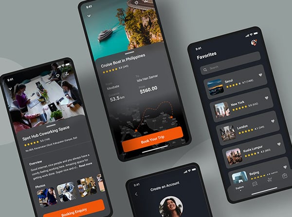
3. Redesign Dense Data Displays for Mobile-First Clarity
Charts, transaction tables, portfolio summaries, and multi-filter views are usually the first things to break on a phone screen. Not because the data itself is complex, but because the desktop layout assumed a horizontal canvas that doesn’t exist at 375px wide.
Generic responsive patterns handle this poorly. A six-column transaction table that collapses into a horizontal scroll on mobile isn’t a solution. It’s a surrender. Dense financial data needs its own mobile patterns, not a shrunken version of the desktop.
Start with tables. Convert multi-column layouts into priority-first list views on mobile, showing only the fields that matter at a glance: date, description, amount, status. The transaction ID, fee breakdown, counterparty metadata, and status history live inside expandable rows or bottom sheets the user opens when they need depth. They get the overview instantly and the detail on demand.
Charts need the same rethinking. Hover-dependent tooltips are invisible on touch devices, which means your carefully annotated performance graph is functionally mute on the screen where most people see it. Replace hover interactions with sparklines for trend snapshots, swipeable KPI cards for comparative data, and tap-to-reveal or scrub interactions for detailed exploration. These aren’t compromises. They’re patterns better suited to how people actually use financial data on a phone.
A practical heuristic worth adopting across your team: tag every dashboard widget as must keep, nice to keep, or hide on phone. This forces a real conversation about information priority before any design work begins. Without it, the default is cramming everything onto mobile and hoping the framework sorts it out. It won’t. Engaging fintech wireframing services early in this process lets your team visualize those priority decisions across breakpoints before committing to production code.
One implementation note that saves significant time: libraries like Tailwind paired with component systems such as Tremor provide responsive, data-dense UI components built for exactly this kind of work. Your team spends energy on information hierarchy decisions rather than reinventing table-to-list transformations.
The testing gap that catches most teams? Realistic data volume. A demo account with five tidy transactions and one chart looks fine on every screen. An actual user’s view with 200 transactions, twelve months of activity, and four a
4. Design Mobile Onboarding and KYC Flows That Earn Trust at Every Step
Onboarding is where everything your brand has promised gets tested against reality. A user who felt confident browsing your marketing pages and tapping “Get Started” can lose that confidence entirely inside a clumsy KYC flow on their phone. Every pattern we’ve covered so far builds credibility that a poorly designed identity verification screen can erase in seconds.
The core principle: one action per screen. Not one section. One action. Each step gets a plain-language explanation of why the information is needed (“Federal regulations require us to verify your identity before opening an account”) and an honest progress indicator that reflects actual steps remaining, not an optimistic fraction designed to keep people moving.
ID verification is where most mobile flows quietly fall apart. Native camera capture should launch directly from the flow, not redirect to a file picker. OCR support that reads document fields and pre-fills form data reduces friction dramatically. But the real trust builder is what happens when something goes wrong: clear retry states (“Image too dark, try again with better lighting”), real-time quality feedback, and a manual-entry fallback for users whose documents won’t scan. These aren’t edge cases. They’re a significant percentage of your onboarding volume.
Before any document capture or sensitive input, add reassurance microcopy. “Your ID is encrypted and never shared with third parties” placed directly above the capture button costs nothing and addresses the anxiety users feel but rarely voice. Privacy signals at the moment of vulnerability are worth more than an entire page of security promises elsewhere on your site.
Cross-device flexibility separates good onboarding from great onboarding. Save-and-resume logic lets a user start on their phone during a commute and finish on a laptop at home without re-entering anything. Secure handoff patterns (a magic link sent to email, a QR code scanned from desktop) acknowledge how people actually behave instead of demanding they complete everything in one session on one device.
This is where coordinated UX, development, analytics, and brand voice make a visible difference. When those disciplines work together, the onboarding flow feels like a natural extension of the brand rather than a compliance gauntlet bolted onto the front door.
5. Make Trust Signals and Disclosures First-Class Interface Elements
Small screens create a constant temptation: hide the “non-essential” stuff. Collapse security badges. Tuck fee disclosures behind a second tap. Shrink compliance language until it’s technically present but functionally invisible. In fintech, that tradeoff backfires fast.
The information teams are most tempted to bury on mobile is precisely the information users need most to feel safe. Security cues, fee explanations, consent details, and transaction confirmations aren’t secondary content competing with the “real” interface. They are the interface.
Authentication Deserves Hero-Level Design Attention
Login screens, 2FA challenges, biometric and WebAuthn prompts, re-authentication gates for sensitive actions, and confirmation states all need prominent placement, clear iconography, and enough breathing room that they never feel crammed into a corner. A biometric prompt half-hidden behind a keyboard isn’t reassuring anyone.
Disclosures Need a Mobile-Native Approach
Concise, plain-language summaries visible by default, with expandable detail one tap away. Place summaries in direct proximity to the claims they qualify. If a card promotes “no monthly fees,” the conditions sit right there, not at the bottom of a scrollable page. Proximity is what makes a disclosure functional rather than decorative.
Microcopy Does the Heaviest Lifting
Transaction feedback (“$500 sent to Alex, arriving by Friday”), permission requests (“We use your location to find nearby ATMs”), and error states (“Transfer declined: daily limit reached. Retry tomorrow or adjust your limit in Settings”) should all use plain language that tells users what happened and what to do next. In financial contexts, vague messages like “Something went wrong” don’t read as glitches. They read as lost money.
Consistency Across Surfaces Reduces Phishing Anxiety
When your marketing site describes a fee structure one way, the product UI displays it differently, and the support email uses a third phrasing, you’ve created the exact pattern users associate with phishing. Consistent terminology, tone, and visual treatment across every touchpoint reinforces legitimacy. The strongest fintech experiences make compliance, UX, and brand voice feel like one unified system rather than three departments that occasionally share a style guide.
6. Set Performance Budgets and Optimize for Real-World Network Conditions
If your dashboard balances lag, transaction lists stutter, or widgets rearrange themselves mid-load, users don’t see a slow page. They see an institution that feels unstable. In fintech, perceived performance and perceived reliability are the same thing.
Speed matters beyond the gut reaction. Core Web Vitals directly influence search rankings, and slow mobile experiences bleed conversion rates at every step of the funnel. Product, marketing, and SEO share identical incentives here.
Set explicit performance budgets for key templates: login, dashboard, transaction history, onboarding. Measure them on throttled mobile connections (slow 4G, spotty 3G), not the office Wi-Fi your QA team uses by default. A dashboard that loads in 1.2 seconds on fibre and 9 seconds on a crowded cell network isn’t performant. It’s performant for you. Hitting those targets consistently across platforms requires disciplined fintech web & mobile development practices that account for real-world constraints from the first sprint.
Long transaction lists are one of the heaviest loads a fintech interface carries. Virtualization libraries like react-window render only the rows visible in the viewport, keeping scroll performance smooth even when the underlying dataset runs into thousands of entries. Pair that with skeleton states that mirror the shape of incoming content, and incremental rendering that prioritises the data users scan first (recent transactions, current balance) before filling in secondary detail.
Live-updating elements (real-time balances, market tickers, notification badges) need careful throttling. Pushing every WebSocket event straight to the DOM creates jank that makes the whole interface feel fragile. Batch updates at sensible intervals. Nobody needs their balance refreshing twelve times per second.
For low-connectivity scenarios, Progressive Web App patterns and intelligent caching through tools like Workbox let users access recent account data even when their connection drops. The critical design detail: always display a visible “last updated” timestamp when showing cached financial data. A balance without a timestamp
7. Build for Accessibility, Continuity, and Context-Aware Resilience
A layout that technically adapts to screen size is solving the easiest part of the problem. Your users move between devices, lighting conditions, network quality, and accessibility needs, sometimes within a single session. The fintech experiences that feel deliberately crafted account for all of it.
Make Financial Data Universally Readable
Charts relying solely on colour or hover states exclude a significant portion of your audience. Pair every visualization with a text summary describing the trend and key takeaway. Provide table fallbacks for complex graphs so screen readers can parse actual values. Use colour-safe palettes tested against deuteranopia and protanopia simulations, and pair colour with shape or pattern so meaning never depends on a single channel. Keyboard navigation through every interactive element and touch targets at 44×44 pixels minimum ensure the experience works regardless of input method. Comprehensive fintech accessibility design services help embed these standards into your workflow so compliance and usability improve together from the start.
Preserve State Across Devices
A user who starts a loan application on their phone during lunch and picks it up on a laptop that evening shouldn’t re-enter a single field. Secure deep links, saved progress, and resume flows make cross-device continuity seamless. Session handling needs to be transparent: show users when they’re resuming a saved session, what data has been retained, and when re-authentication is required. Silence here breeds suspicion.
Instrument What You Can’t See
Device-specific analytics reveal where mobile, tablet, and desktop users fail differently. A form converting at 68% on desktop and 31% on mobile isn’t a “mobile problem” in the abstract. It’s likely a specific field, interaction, or loading condition that instrumentation can surface. Without device-segmented data, your team is optimizing for averages that describe nobody’s actual experience.
This is the difference between a website that merely responds and a platform that feels intentional across every context. The kind of end-to-end continuity spanning accessibility, cross-device state, and granular analytics is exactly where a collaborative partner like Urban Geko earns its keep over time.