
You didn’t have a brand problem at 30 employees. You had a logo, a colour palette, a tone-of-voice doc someone wrote during the seed round, and enough institutional memory that everyone roughly knew what “on brand” meant.
At 300 employees, that memory is gone. Product is making design decisions marketing hasn’t seen. Compliance is approving language that contradicts the positioning your sales team just pitched. Support emails read like they’re from a different company than the app. Every new market, new product line, and new regulatory requirement widens the gap between what your brand should feel like and what it actually does.
That’s fintech brand style guide creation as a scaling problem, not a design problem. A systems problem, where every team makes reasonable decisions in isolation that collectively erode the coherence your customers rely on to trust you with their money.
This framework covers the full territory in seven parts: visual identity, messaging architecture, design systems, trust signals, compliance integration, and the governance model that keeps all of it alive after the PDF hits a shared drive.
It starts where trust starts.
1. Brand Strategy Foundations: The Decision Filters Everything Else Depends On
A fintech brand fractures one reasonable decision at a time.
Nobody sets out to undermine brand coherence. Product names a feature using language marketing would never approve. A regional team adjusts the value proposition to fit a local campaign. Compliance signs off on disclaimer copy that contradicts the confidence your homepage projects. Each call makes sense in isolation. In aggregate, your audience encounters a brand that can’t quite make up its mind, and in financial services, indecision reads as unreliability.
This section of the style guide is where you stop that drift before it starts. Not with colour codes or font files, but with the strategic scaffolding that tells every team how to make coherent decisions without requiring a brand committee meeting for every deliverable.
What to Lock Down First
Your brand strategy foundation needs to codify several things most style guides skip entirely:
- Audience segments and their hierarchy. Which users matter most? Where do institutional clients end and retail consumers begin? The answer shapes everything from visual tone to risk language.
- Market position and value proposition. Not the elevator pitch. The internal articulation of why you exist, who you serve better than alternatives, and what you deliberately choose not to be.
- Mission, values, and the innovation/stability balance. Fintech lives in the tension between moving fast and appearing solid. Your guide needs to state explicitly where your brand sits on that spectrum, because product teams and compliance teams will interpret it differently if you don’t.
- Personality keywords and approved descriptors. The adjectives your brand owns (“transparent,” “precise,” “approachable”) and the ones it avoids (“disruptive,” “aggressive,” “guaranteed”).
- Excluded terms and promises. Language your brand will never use regardless of context. In financial services, this list does real compliance work.
Why This Section Does the Heavy Lifting
Every dimension that follows in this guide inherits its logic from these foundations. When a designer asks whether a campaign illustration should feel playful or institutional, the personality keywords answer that. When a product writer debates whether to say “instant” or “fast,” the excluded terms list settles it.
Aligning strategy, design, product language, and marketing output under one coherent system requires a partner fluent across all of those disciplines simultaneously. That cross-functional alignment is where the real value of a brand strategy foundation compounds over time.
Get this right, and the rest of the guide becomes a series of logical extensions. Skip it, and you’re decorating a house with no foundation. These foundations are equally critical for fintech marketing, where brand positioning must remain consistent across every channel and campaign.
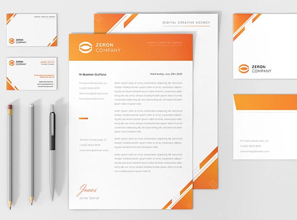
2. Visual Identity System: Logo, Colour, Typography, and Imagery Rules That Build Trust
A visual identity system that only addresses aesthetics is solving the wrong problem.
In fintech, every visual decision carries a second layer of meaning users process before they’re consciously aware of it. A colour choice isn’t just “on brand.” It’s the difference between a user reading a number as profit or loss. A font isn’t just modern or traditional. It’s the difference between an account number that’s legible and one that’s a security incident waiting to happen. Getting the foundational mark right is where fintech logo design & brandmark systems become a strategic decision rather than a purely aesthetic one.
Logo Rules With Fintech Context
Standard logo guidelines (clear space, minimum sizes, misuse examples) are table stakes. Your fintech guide needs to extend them into the environments your brand actually lives in:
- App icon specifications. Your logo at 1024px and at 29px are different design challenges. Define both, with pixel-hinted versions for small sizes where detail collapses.
- Card placement and co-branding. If your brand appears on physical or virtual cards alongside network logos (Visa, Mastercard), define the exact lockup, spacing, and hierarchy.
- Dark mode versions. Define light-on-dark and dark-on-light variants explicitly, with clear rules for when each applies. A single logo that “works on any background” almost certainly doesn’t.
- Wordmark versus symbol. When the full wordmark is required (marketing, co-branded materials) versus when the symbol alone is acceptable (app icon, favicon, notification badges). Getting this wrong at scale creates the visual inconsistency that, in financial services, users associate with phishing.
Colour System With Semantic Separation
Most brand guides fail fintech teams here. They define brand colours but ignore that colour in a financial product carries functional meaning overriding brand expression. Your guide needs two distinct palettes:
Brand colours handle identity: primary, secondary, accent. These appear in marketing, onboarding, and brand moments within the product.
Semantic UI colours handle meaning: green for gain, red for loss, amber for warning, blue or grey for pending. These must be defined separately, because if your brand’s primary colour is green and your “gain” indicator is also green, every screen looks like good news.
Beyond the palettes themselves, document specific contrast pairings and their WCAG 2.1 AA ratios (4.5:1 for text, 3:1 for large text and UI components) rather than leaving teams to check ad hoc. Define exact dark-mode colour variants, since colours don’t simply invert. And require non-colour cues (directional arrows, plus/minus symbols, text labels) for every red/green gain/loss indicator. Roughly 8% of men have some form of colour blindness. This isn’t an accessibility nicety. It’s a data readability requirement.
Typography That Handles Financial Data
- Font families and hierarchy. Primary typeface, secondary (if any), and the rationale. A humanist sans-serif for marketing paired with a monospaced face for transaction data is common and effective.
- Tabular figures. Proportional figures cause number columns to misalign. Tabular figures are monospaced so decimals stack vertically. For statements, dashboards, and comparison tables, this is mandatory. Specify which OpenType features to enable.
- Line height and spacing. Financial tables are information-dense. Specify line height (typically 1.4 to 1.6 for body, tighter for table rows) and letter-spacing adjustments at smaller sizes so digits remain individually distinguishable.
Imagery, Iconography, and Illustration
- Photography direction. Authentic over aspirational. Diverse representation reflecting your actual user base, not stock-photo scenarios signalling inauthenticity.
- Iconography system. Consistent style (outlined or filled, pick one), with size and stroke-weight standards. Icons alongside financial data need instant recognition at small sizes.
- Illustration boundaries. Playful enough to feel modern and human. Restrained enough to feel trustworthy with someone’s mortgage data. Overly whimsical illustration in financial contexts reads as trivialising the stakes.
3. Copy Standards, Tone of Voice, and Regulated Language
Your visual identity can be pixel-perfect across every touchpoint and still lose a customer in the space between two words.
“No hidden fees” versus “No account fees” is not a copywriting preference. One is a defensible claim. The other invites a UDAAP inquiry the moment a user encounters a wire transfer charge. In fintech, language choices are simultaneously trust signals and compliance risks, and most style guides treat copy as an afterthought. That’s where the fractures start.
Setting the Tone-of-Voice Framework
Your brand voice is the constant. Tone is how that voice flexes depending on context. “We sound friendly and professional” means something different to every writer who reads it, which is why you need both defined explicitly.
Four anchors work well as a framework: authoritative, clear, human, and specific. Those aren’t decorative adjectives. They’re decision filters. When a writer is choosing between two ways to phrase a fee explanation, “authoritative and clear” eliminates the version that hedges. “Human and specific” eliminates the version that sounds like it was drafted by outside counsel.
Tone shifts by channel, but should never feel like a different brand. Website copy is confident and benefit-led. Lifecycle email is warmer, slightly more conversational. Support copy is calm, direct, solution-oriented. Product microcopy is precise and economical. The personality is recognisable across all four. What changes is the register, not the character.
Building the Regulated Language Section
This is where a fintech style guide earns its keep. Define approved claim patterns for the terms that carry the most regulatory weight:
- APY and APR. Always qualified with the conditions that apply. “Earn up to 4.50% APY” requires the qualifying criteria (minimum balance, variable rate disclosure) within the same visual field.
- Fee language. “No monthly fees” is defensible if true. “Free” requires scrutiny of every possible charge a user could encounter. If there’s an ATM fee or wire fee anywhere in the product, “free” without qualification is a problem.
- Partner-bank wording. “Banking services provided by [Partner Bank], Member FDIC.” Exact wording, exact placement, every time.
- Terms like “instant.” Define what your brand means, with required qualifiers. “Instant transfers” needs “(typically within minutes, may vary by bank)” or its equivalent.
Document correct versus risky phrasing so writers can pattern-match without guessing:
| Risky | Approved |
|---|---|
| Free checking account | No monthly account fees (other fees may apply) |
| Guaranteed 4.50% APY | Earn up to 4.50% APY with qualifying deposits. Variable rate, subject to change. |
| Instant access to your money | Funds typically available within minutes. Timing may vary. |
Disclosure proximity rules apply: qualifying language must appear adjacent to the claim it modifies, in the same font size as body copy at minimum. Not below the fold. Not behind a link. Within the same visual field.
The Microcopy Layer
Microcopy is where brand trust is built or broken at the most granular level. Onboarding consent screens, failed payment notifications, session timeout messages, fee explanations. These are the moments a user is most attentive and most anxious.
A session timeout message that says “Session expired. Please log in again.” is functional. One that says “For your security, we’ve logged you out after 10 minutes of inactivity. Your data is safe.” is human, specific, and reinforces trust at a moment of mild frustration. Failed payment copy that reads “Transaction failed” tells the user nothing. “This payment didn’t go through. Your card wasn’t charged. Here’s what to try.” tells them everything they need.
This is the layer where a full-service creative partner earns trust by translating brand strategy into copy that product, support, and marketing teams can actually ship consistently across every surface where your words meet your users.
4. Design Tokens, Component Libraries, and Living Documentation
A brand style guide that lives as a PDF is a historical document the moment it’s exported.
Consider the reality: your product team is shipping weekly. Designers are iterating in Figma. Engineers are building in React or Swift. A 47-page PDF sitting in a shared drive cannot govern decisions at that velocity. It gets referenced once, bookmarked optimistically, and quietly ignored the moment someone needs an answer faster than “let me find the page.”
The guide itself has to be a usable system. That means two additional layers beyond visual and verbal standards: a design token layer encoding decisions as variables, and a component library translating those variables into production-ready patterns with fintech-specific logic baked in.
The Design Token Layer
Design tokens are the atomic values expressing your brand decisions in a format designers and engineers consume directly. They sit between “the brand guide says our primary colour is #1A2B3C” and the actual code rendering it on screen.
Your token system needs two tiers:
- Base tokens define raw values.
color-blue-600,spacing-16,radius-8. The palette before any meaning is assigned. - Semantic tokens map those values to purpose.
color-text-primary,color-surface-error,spacing-card-padding,shadow-elevation-modal. Semantic tokens are what designers and developers actually reference, and they make the system resilient to brand evolution. Change the base value once; the semantic mapping propagates everywhere.
Cover the full surface area: colour, spacing, typography (size, weight, line-height), border radius, shadows, and motion (duration, easing curves). Naming conventions should be consistent and self-documenting. color-feedback-success is clearer than color-green-2 when someone is building a transaction confirmation screen at midnight.
Export formats matter. Tokens need to ship as Figma variables, CSS custom properties, and JSON for native platforms. Versioning expectations should be explicit: semantic versioning (major.minor.patch) prevents the silent drift that breaks interfaces without anyone noticing until a user reports their balance display looks wrong.
The Component Library Layer
Tokens define raw materials. Components define how those materials assemble into patterns your product actually uses. For fintech, the component library requires specificity generic design systems can’t provide.
Document spec sheets for UI elements unique to financial products:
- Balance displays with states for positive, negative, pending, and hidden (the “eye” toggle for public viewing).
- Transaction rows covering successful, pending, failed, and disputed states, each with distinct visual treatment.
- Card components for physical and virtual cards, including frozen states and replacement flows.
- Financial tables with sortable columns, tabular figures enforced, and responsive behaviours for mobile.
- Receipt and confirmation screens with post-transaction summaries and disclosure placement rules.
- Onboarding forms with KYC-specific patterns: document upload states, real-time validation, save-and-resume logic.
- Payment confirmation dialogs with positive friction built in (summary screen, biometric gate, explicit “confirm” action).
- Dispute flow components covering initiation, status tracking, and resolution notification.
Each spec should include every relevant state, the interaction behaviour, and explicit usage rules. A transaction row component repurposed for a balance summary creates subtle confusion. Usage rules prevent that.
Making It Live
The documentation has to behave like a product. Storybook (or an equivalent) lets engineers inspect components in isolation, view all states, and copy implementation code. Pair that with acceptance notes defining what “done” looks like for each component, and a changelog tracking what changed, when, and why.
Designers pull tokens into Figma. Engineers pull tokens into code. Both reference the same living source. When the brand evolves, tokens update, components inherit, and documentation reflects it automatically.
Building and maintaining this kind of system requires fluency across brand strategy, design tooling, and front-end engineering simultaneously. That cross-disciplinary depth is the difference between a style guide that gets admired once and a design system that actually ships.
5. Accessibility, Data Visualisation, and Localisation Standards
Most fintech style guides treat these three areas as separate appendices. In practice, they’re deeply entangled. A chart that isn’t accessible fails two audiences simultaneously: the user who can’t interpret it and the regulator who notices you didn’t try. A number format that works in New York breaks the moment it hits Frankfurt. A touch target sized for a desktop cursor fails every user banking on their phone during a commute.
This section bundles the standards that determine whether your brand system actually functions across users, devices, and markets.
Accessibility as Financial Infrastructure
Accessibility in financial services isn’t a compliance annex. It’s a condition of serving your full addressable market, and the legal exposure for getting it wrong is accelerating under both the ADA and the European Accessibility Act.
Every tappable element needs a minimum 44×44 pixel touch target. That’s the threshold below which “fat-finger” errors on financial actions become your liability. Full keyboard navigability is required for every flow, from account opening to dispute filing. If a screen reader encounters an unlabelled button inside a payment confirmation, you’ve built an exclusion into your most sensitive moment.
Charts and tables demand particular care. Alt text for a financial chart shouldn’t read “Q3 performance chart.” It should summarise the trend: “Revenue grew 14% quarter over quarter, reaching $8.2M in Q3.” Data tables need proper semantic markup (header tags, scope attributes) so assistive technology can parse rows and columns.
Colour independence is the rule your design team will push back on hardest. Red/green gain/loss indicators are invisible to roughly 8% of men with colour vision deficiency. Every financial state (positive, negative, pending, failed) needs a redundant cue: directional arrows, plus/minus symbols, or explicit text labels. This isn’t a palette refinement. It’s a data-integrity requirement.
Financial Data Visualisation Standards
Your style guide needs to specify which chart types are approved for which use cases and the rules governing how they behave. Define the approved set:
- Line charts for trends over time (portfolio performance, rate history).
- Bar charts for comparison (fee structures, product tiers, peer benchmarks).
- Stacked bars for composition breakdowns where precision matters more than proportion.
- Pie and donut charts restricted to five or fewer segments with no close-value comparisons.
- Dual-axis charts prohibited or flagged for senior review. They imply false correlations too easily.
Beyond chart type, lock down the details that prevent visual dishonesty. Y-axes start at zero for bar and area charts, with exceptions requiring a visible axis break and documented justification. X-axis intervals must be uniform. Every axis carries a clear label, and every data point traces to a source cited beneath the chart.
Decimal precision follows the data type: currency at two decimal places, percentages at one in marketing materials, basis points as integers in institutional reporting. Rounding rules (round half up, for instance) must be explicit and consistent across statements, dashboards, and reports. Negative values use a minus sign prefix in consumer contexts, with parentheses reserved for accounting-audience reports where the convention is expected.
Localisation and Multi-Currency Rules
Scaling into new markets exposes every assumption baked into your brand system. The style guide needs to anticipate this before your first international launch.
Currency symbol placement varies by locale. USD uses a leading symbol ($100.00), while many European formats place it after the value (100,00 €). Thousand separators and decimal markers flip between markets: $1,000.00 in the US becomes 1.000,00 in Germany. Your token system should support locale-aware formatting variables that adapt automatically.
Date and time formats follow the same principle. MM/DD/YYYY is US-only. Most of the world reads DD/MM/YYYY, and ISO 8601 (YYYY-MM-DD) is safest where ambiguity could affect a transaction. Specify the approved format per locale and require 24-hour notation for anything transactional.
Text expansion is a structural concern. German and Finnish text routinely runs 30% longer than English. If your buttons and chart annotations are designed to English character counts, they’ll truncate the moment you localise. Build 30% expansion tolerance into every component, and test with pseudo-localised strings before real translation begins.
Right-to-left language support (Arabic, Hebrew) requires full interface mirroring: layout direction, icon orientation, progress indicator direction. This isn’t a CSS toggle. It’s a design system consideration touching every component in your library.
The most frequently skipped step: test your entire brand system in each target locale, end to end. A brand that feels cohesive in English can feel fragmented when currency formats shift, layouts stretch, and reading direction reverses. Regional QA is where you verify that your system actually scales.
6. Security Language, Trust Signals, and Crisis Communication Standards
Your brand’s most important moments are the ones nobody plans for.
A user gets a fraud alert at 11pm. A transfer fails with no explanation. A suspicious login prompt appears on a device they don’t recognise. In those seconds, your brand isn’t defined by the marketing site or the onboarding flow. It’s defined by the exact words on that screen and whether they sound like the same company the user trusted enough to deposit their paycheck.
This is where most fintech brand systems have a gap wide enough to drive regulatory action through. Marketing owns the voice guide. Product writes its own microcopy. Support drafts templates independently. And when something goes wrong, someone improvises language under pressure that contradicts everything the brand has spent months building.
Defining Security Within the Brand System
Security messaging needs the same level of codification as your colour palette or typography hierarchy. That means documenting specific patterns for your highest-stakes touchpoints:
- Partner-bank wording. The exact phrasing, the exact placement, every time. “Banking services provided by [Partner Bank], Member FDIC” is not a suggestion to paraphrase. It’s a compliance artifact with a fixed form.
- Certification and encryption references. How your brand communicates technical security without sounding like a spec sheet. “Your data is encrypted using the same security standard as major banks” outperforms “256-bit AES encryption enabled” for most audiences.
- Verification language. “We need to verify it’s really you” reads differently from “Identity verification required.” The first is human. The second sounds like a system error. Specify which register your brand uses and hold the line.
- Trust signal placement. Where security badges, FDIC logos, and encryption indicators appear in your UI and marketing materials. A lock icon beside a sensitive input field builds confidence. Plastering every screen with security badges makes users wonder what you’re worried about.
The High-Stakes Communication Playbook
When things go wrong, your style guide needs to have already answered the question “what do we say?” Document communication templates for the moments that test your brand hardest:
- Fraud alerts. Clear identification of what happened, what’s been done, and what the user needs to do next. Calm, direct, action-oriented. Never accusatory toward the user.
- Failed transfers. “Your funds haven’t left your account” should appear before any technical explanation.
- Suspicious login prompts. Enough context to be useful (“Someone attempted to log in from a new device in [City]”) without revealing information that creates a secondary security risk.
- Outage notices. “We’re experiencing a service disruption affecting [feature]. We’re working to restore it and will update you by [time].” Honest scope, specific timeline, proactive updates.
- Breach communications. Pre-draft the structure: what happened, what data was affected, what you’ve done, what the user should do. Legal refines specifics per incident, but the tone and brand voice should already be settled.
- Escalation language. The user should never feel like they’re being “transferred.” They should feel like additional expertise is being brought in on their behalf.
The Operating Principle
Security messaging isn’t a product responsibility or a marketing responsibility. It’s a brand responsibility. Consistent. Transparent. Calm.
When your fraud alert email sounds like it was written by a different company than your onboarding sequence, users notice. The dissonance between “Welcome! Let’s get you started 🎉” and “ALERT: Unauthorized activity detected on your account” creates exactly the kind of tonal whiplash that makes people question whether that email is even legitimate. They’ve been trained to treat inconsistency as a phishing signal.
The fix isn’t making fraud alerts cheerful. It’s ensuring every communication shares a recognisable voice. Warm enough to feel human. Direct enough to feel competent. Specific enough to feel trustworthy. Your brand’s personality doesn’t disappear when stakes rise. It steadies.
7. Governance, Ownership, and Measuring Long-Term Brand ROI
A style guide without named owners becomes creative debt within a quarter.
You can build the most comprehensive brand system in your sector. Codify every token, document every component state, define every disclosure pattern. None of it holds if nobody is accountable for enforcing it, updating it, or measuring whether it’s actually working.
This is where the guide becomes an operating model.
Assigning Ownership
Every dimension of your brand system needs a named steward, not a department, a person:
- Brand lead owns visual identity, voice, and overall coherence. Final call on whether something is “on brand.”
- Product or design owner governs the component library, design tokens, and accessibility standards.
- Engineering lead maintains token exports, versioning, and integration between the design system and production code.
- Legal or compliance stakeholder reviews regulated language, disclosure patterns, and crisis communication templates.
When a designer finds a component behaving differently across platforms, who files the change request? When compliance updates fee disclosure language, who propagates it through every template? If those questions don’t have immediate answers, your system is already drifting.
The Maintenance System
Governance requires infrastructure, not just intention:
- Single source of truth. One canonical location where the current version lives. Everything else is a mirror or a cache.
- Asset permissions. Role-based access controlling who can edit versus who can view.
- Archive rules. Retired assets get moved, not deleted. Old logo versions and superseded disclosure language stay retrievable for audit purposes.
- Change request process. A lightweight but formal workflow. Informal Slack requests generate undocumented changes that compound into inconsistency.
- Quarterly audits. A scheduled review touching visual assets in circulation, active component versions, compliance language currency, and partner materials. The regulatory landscape moves too fast for anything less frequent.
- Partner and vendor access. External agencies and co-brand partners need a controlled portal with current assets and clear usage rules. Distributing a brand kit via email attachment is how outdated logos end up on partner sites.
- Semantic versioning. Major.minor.patch for every update. A colour token change is a minor bump. A new disclosure framework is a major version. Teams consuming your tokens need to know when something changed and whether it’s breaking.
The Measurement Layer
Governance without metrics is maintenance without justification. The right metrics make the case to leadership clearly:
- Design rework reduction. Track revision cycles per campaign. A functioning brand system should compress rounds between first draft and final approval.
- Approval velocity. Measure time from creative submission to compliance sign-off. Pre-approved disclosure components should accelerate this measurably.
- Compliance revision frequency. Fewer post-launch corrections signals the system is doing its preventive work.
- Launch consistency scores. Audit new campaigns against the brand system. A simple pass/fail rubric across visual, verbal, and compliance dimensions creates accountability.
- Campaign and product KPIs. Conversion rates, user trust metrics, and NPS trends tied to collateral quality. These connect brand governance to revenue in language a CFO respects.
These numbers justify the investment. They also reveal where the system is weakest, giving you a data-backed roadmap for the next iteration.
The brands that sustain coherence at scale aren’t the ones with the most comprehensive initial document. They’re the ones where a partner stays involved beyond the build, refining the system as the brand evolves, new products launch, and new markets introduce requirements nobody anticipated in version 1.0. That ongoing relationship is where the real value compounds.
How to Implement Your Fintech Brand Style Guide Across Every Touchpoint
A 70-page brand system living in a buried PDF is a style guide in theory only. Under deadline pressure, with three campaigns shipping simultaneously and a product release next Tuesday, your team will reach for whatever asset is closest. If the closest asset is an outdated template on someone’s desktop, that’s what goes live.
Nobody goes off-brand on purpose. Systems fail when the right asset is harder to use than the wrong one.
The sections above give you the substance. This is how you make it stick.
Before You Begin
Complete the foundation, visual, messaging, system, trust, and governance sections first. Then audit your existing assets, templates, live screens, and regulated copy before rollout. Gaps you haven’t catalogued will resurface the moment teams start adopting the new system.
Publish Where Your Teams Already Work
Place the guide inside the tools people have open all day. Load Figma libraries with linked tokens, tag and index assets in your DAM, and embed component documentation in your engineering wiki. If accessing the correct logo requires more clicks than Googling “our logo,” Google wins every time.
By the end of this step, every designer, engineer, writer, and external partner should find the current approved asset faster than any alternative.
Prioritise Your Highest-Risk Touchpoints First
Start where inconsistency costs the most. Audit and align these surfaces first:
- Website and landing pages
- Onboarding and KYC flows
- Lifecycle email and push notifications
- App screens and product UI
- Support templates and crisis communications
- Partner and co-brand assets
Score each touchpoint against the guide. Fix the failures before expanding scope. Extending this audit to fintech marketing collateral design ensures that brochures, pitch decks, and presentations reinforce the same trust signals as your digital surfaces.
Lock What Should Be Locked, Train What Can Flex
Lock elements that carry compliance or identity risk: FDIC wording, disclosure components, logo usage, semantic colour tokens. Your DAM or component library should enforce that structurally through read-only assets, required metadata, and pre-approved modules.
For the flexible layer (campaign illustration style, social copy tone, regional imagery), run focused training sessions. Show teams the boundaries and let them move within them. Define approval paths clearly: brand review for visual identity changes, legal review for regulated language, and a documented escalation route for anything in between. Physical brand expressions like fintech trade show booth design benefit especially from these approval paths, since environmental assets are costly to correct once produced.
Version, Release, and Audit Quarterly
Treat the guide like a product. Every update gets a semantic version number, release notes explaining what changed and why, and a communication push to every consuming team. Silent updates breed the exact inconsistency you built the guide to prevent.
Run quarterly audits comparing live campaigns, live product screens, and partner materials against the current version. Use governance metrics (rework cycles, approval velocity, launch consistency scores) to measure whether the system is compressing timelines or adding bureaucracy.
The outcome is straightforward. The right asset becomes the easiest asset to use. Review cycles shrink because pre-approved components eliminate redundant compliance rounds. And as you scale into new products, new markets, and new regulatory environments, the brand holds together because the system was built to travel with your teams, not wait for them to come looking. Physical touchpoints such as card carriers and welcome kits make fintech product packaging design another surface where this systematic approach prevents brand drift.
How to Implement Your Fintech Brand Style Guide Across Every Touchpoint
A 70-page brand system living in a buried PDF is a style guide in theory only. Under deadline pressure, with three campaigns shipping simultaneously and a product release next Tuesday, your team will reach for whatever asset is closest. If the closest asset is an outdated template on someone’s desktop, that’s what goes live.
Nobody goes off-brand on purpose. Systems fail when the right asset is harder to use than the wrong one.
The sections above give you the substance. This is how you make it stick.
Before You Begin
Complete the foundation, visual, messaging, system, trust, and governance sections first. Then audit your existing assets, templates, live screens, and regulated copy before rollout. Gaps you haven’t catalogued will resurface the moment teams start adopting the new system.
Publish Where Your Teams Already Work
Place the guide inside the tools people have open all day. Load Figma libraries with linked tokens, tag and index assets in your DAM, and embed component documentation in your engineering wiki. If accessing the correct logo requires more clicks than Googling “our logo,” Google wins every time.
By the end of this step, every designer, engineer, writer, and external partner should find the current approved asset faster than any alternative.
Prioritise Your Highest-Risk Touchpoints First
Start where inconsistency costs the most. Audit and align these surfaces first:
- Website and landing pages
- Onboarding and KYC flows
- Lifecycle email and push notifications
- App screens and product UI
- Support templates and crisis communications
- Partner and co-brand assets
Score each touchpoint against the guide. Fix the failures before expanding scope.
Lock What Should Be Locked, Train What Can Flex
Lock elements that carry compliance or identity risk: FDIC wording, disclosure components, logo usage, semantic colour tokens. Your DAM or component library should enforce that structurally through read-only assets, required metadata, and pre-approved modules.
For the flexible layer (campaign illustration style, social copy tone, regional imagery), run focused training sessions. Show teams the boundaries and let them move within them. Define approval paths clearly: brand review for visual identity changes, legal review for regulated language, and a documented escalation route for anything in between.
Version, Release, and Audit Quarterly
Treat the guide like a product. Every update gets a semantic version number, release notes explaining what changed and why, and a communication push to every consuming team. Silent updates breed the exact inconsistency you built the guide to prevent.
Run quarterly audits comparing live campaigns, live product screens, and partner materials against the current version. Use governance metrics (rework cycles, approval velocity, launch consistency scores) to measure whether the system is compressing timelines or adding bureaucracy.
The outcome is straightforward. The right asset becomes the easiest asset to use. Review cycles shrink because pre-approved components eliminate redundant compliance rounds. And as you scale into new products, new markets, and new regulatory environments, the brand holds together because the system was built to travel with your teams, not wait for them to come looking.