Your logo has about two seconds to do what your sales team needs an hour to accomplish. Reassure a skeptical user. Signal credibility to a potential partner. Tell an investor the brand is professionally run.
In fintech, your mark isn’t decoration. It’s trust infrastructure. A fintech logo design and brandmark system that falls apart at 16 pixels in an app icon, looks off on a partner’s integration page, or feels wrong in a compliance document compounds damage silently across every touchpoint. These seven practical rules will help you build one that holds up where it matters: onboarding flows, co-branded partner materials, and the dozen other contexts most design briefs forget to account for.
1. Start With Business Posture, Not a Design Mood Board
The strongest fintech marks don’t start with color palettes or typeface exploration. They start with a harder question: what trust signal does your company actually need to send?
That sounds obvious. It rarely gets done properly. Most logo projects kick off with visual inspiration, competitors’ marks pinned to a board, aesthetic preferences traded back and forth. The result is a logo that looks like a fintech brand without communicating what this fintech brand needs its audience to believe.
Before anyone opens a design tool, diagnose three things.
First, your business model and buyer type. A consumer savings app and a B2B payments infrastructure company occupy entirely different trust registers. A lending platform needs to project different signals than a compliance analytics tool. The visual vocabulary shifts depending on whether your audience is a first-time retail investor or a bank’s integration team evaluating your API documentation.
Second, your maturity stage. A pre-launch startup raising its seed round has different identity needs than an established platform rebranding for expansion into regulated European markets. The mark that works for a pitch deck audience won’t necessarily survive the scrutiny of a banking partnership review.
Third, your trust priorities. Security, transparency, speed, innovation, approachability, institutional credibility. These aren’t all compatible at full volume. You have to choose which ones lead.
The contrast is instructive. Infrastructure brands (payment rails, banking-as-a-service, compliance tooling) almost always benefit from restraint and clarity. Their buyers are evaluating technical maturity, and the logo needs to reflect that seriousness without overreaching. Consumer-facing brands can carry more warmth and personality, but only when the underlying system stays disciplined. Warmth without structure reads as amateur in financial services.
A serious creative partner pressure-tests this positioning before sketching a single concept, ensuring the identity works across your site, product UI, pitch materials, and partner conversations. Not just on the homepage hero. Extending this same rigor to fintech marketing collateral design ensures that brochures, presentations, and sales materials reinforce the trust signals your mark was built to convey.
2. Choose the Right Mark Architecture for Your Product Reality
Fintech brands rarely need a single logo. They need the right mark architecture: a system of related forms that maintain clarity across legal documents, compressed app icons, and everything in between.
The decision between a wordmark, monogram, symbol, or combination system gets treated as a style preference when it’s actually a structural one. The right choice depends on product realities, not personal taste.
Wordmark: your best option when the company name needs to do the heavy lifting. If pronunciation matters (common when building enterprise credibility in cross-border markets), a clean typographic mark ensures people can say your name after seeing it once. Stripe is the textbook case. The name is short, distinctive, and memorable on its own. A symbol would add nothing.
Monogram or micro-mark: essential when the logo must survive extreme compression. App icons at 16 pixels, favicons, card faces, dashboard shells, avatar circles on partner platforms. If your company name runs longer than six or seven characters, you need a compressed variant that works at these sizes without becoming an illegible smear. Revolut’s “R” mark functions independently of the full wordmark because the product lives primarily on a phone screen.
Combination system: the strongest architecture when your brand needs both recognition and flexibility across different touchpoints. A symbol paired with a wordmark gives you a full-dress version for pitch decks and collateral, plus a standalone icon for tight spaces. Mastercard’s evolution toward interlocking circles that work with or without the wordmark illustrates why some brands eventually need both.
The decision criteria worth applying: How long and distinctive is the company name? Does the mark need to function at 16 pixels, embossed on a physical card, or nested inside a partner’s dashboard? How much symbolic meaning can your market absorb without confusion? A consumer audience might connect with an abstract symbol over time. A B2B buyer evaluating your API docs wants to read your name, not decode a glyph.
One guardrail worth holding firmly: avoid defaulting to shields, locks, or coin imagery. These symbols are so overused in financial services that they’ve become visual noise. Unless the icon carries genuine strategic meaning specific to your positioning, it signals a lack of thought. The mark should earn its complexity. If a wordmark alone communicates everything you need, that restraint is the stronger choice.
3. Build a Responsive Brandmark System, Not a Single Logo File
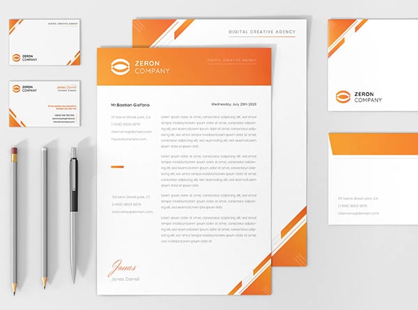
A fintech doesn’t need a logo. It needs a brandmark system that behaves predictably across every environment where your company shows up. In financial services, that list is longer than most teams realize when the design brief is written.
The difference matters commercially. A single logo file will break. It’ll get squashed into an email header, dropped onto a dark background it was never designed for, exported as a one-color version by a partner who needed it for a co-branded document five minutes ago. Without a system governing those moments, every adaptation becomes an improvisation. Improvisations drift. Drift erodes trust.
Here’s the minimum deliverable set that covers real-world fintech use cases:
- Primary lockups: horizontal and stacked configurations, giving layout flexibility across wide headers and square containers.
- Standalone app icon or logomark: the compressed variant that lives at 16 pixels and still needs to be unmistakably yours.
- Dark mode and light mode versions: a significant portion of your users browse, bank, and evaluate partners in dark mode. A mark designed only for light backgrounds will look broken or invisible on dark ones.
- One-color versions: for card printing, legal documents, compliance filings, embossed materials, and every edge case where full color isn’t available. These get requested at inconvenient moments. Having them ready signals operational maturity.
- Favicon sizes and micro variants: the smallest expressions of your brand still need intentional design, not an automated resize that turns your mark into a blur.
Assets alone aren’t enough without operating rules that make them usable by anyone who touches the brand:
- Clearspace and minimum-size rules preventing the mark from getting crowded or shrunk past legibility.
- Approved backgrounds and contrast logic specifying exactly which color combinations are permitted.
- Documented misuse examples: stretching, cropping, recoloring, adding effects. Show what’s off-limits so people stop guessing.
Then test the system where it actually lives. Website header. Mobile nav bar. App store tile. Dashboard shell. Onboarding email sequence. Investor deck. Transaction receipt. Printed card. Compliance document. If the mark survives all of those looking intentional and consistent, the system works. If it doesn’t, you’ve found exactly where to refine.
This is where a full-service creative partner earns their keep. The same mark has to hold across brand, product, web, and collateral without drifting, and maintaining that coherence requires someone who sees the entire ecosystem, not just the design file.
4. Balance Typography, Color, and Symbol to Stand Out Without Losing Trust
Most fintech logos fail in one of two directions. They’re so restrained they dissolve into a sea of identical blue wordmarks, or they swing so far toward expressiveness that nobody trusts them with a bank transfer. The space between those failure modes is where the real design work happens.
Typography That Works at Every Scale
Your typeface is doing more heavy lifting than any other element in the mark. Favor digital-native type families with clear character separation. The “I,” “l,” and “1” test applies here just as it does in account numbers and transaction data. Clean apertures, generous x-heights, and open letterforms all contribute to a mark that reads clearly at 48 pixels on a dashboard header or 12 pixels in a footer.
Beyond legibility, match the type personality to where the brand actually sits. A geometric sans-serif might feel right for a neobank targeting younger consumers. A humanist sans-serif carries warmth without sacrificing professionalism, useful for lending platforms that need approachability. A sharper, more structured typeface signals the precision enterprise clients expect. The mistake is choosing type based on what looks contemporary this quarter rather than what aligns with your audience’s trust expectations for the next several years.
A Color System, Not Just a Palette
Start with a reliable base. Blues, deep teals, and desaturated navies persist across financial services not because designers lack imagination, but because they reliably activate trust associations across cultures and contexts. The question is what you do on top of it.
Introduce one restrained accent to signal energy or innovation. A single violet, teal-green, or warm amber, deployed selectively, can differentiate a brand without undermining stability. Two or three accent colors competing for attention in a fintech context reads as chaotic, not creative.
The test most teams skip: verify the palette works inside the environments where it actually lives. Dashboards with dense data tables. Email templates with system font fallbacks. Compliance documents printed in grayscale. A blue-to-purple digital palette can feel sophisticated on a marketing page while still providing enough contrast to function inside a transaction interface. If it doesn’t work in both places, it doesn’t work.
Geometry That Earns Its Place
If the mark includes a symbol, that shape needs strategic weight. Simple geometry can suggest stability (squares, grids), motion (angled forms), connection (interlocking shapes), or intelligence (nodes, networks) without reaching for the literal security clichés that litter financial services.
A square-based mark carries inherent associations with solidity and structure. Tilted slightly or paired with a rounded corner, it retains that stability while suggesting forward momentum. A literal padlock says “we’re safe.” A well-proportioned geometric mark feels safe, which is a more durable signal.
The discipline is knowing when to stop. Every element in the symbol should be there for a reason you can articulate in one sentence. If a shape is decorative rather than communicative, it’s adding visual noise to a context where clarity is currency.
5. Build Trust Marks and Partner Logos Into Your Brand System
Your logo isn’t the only mark on the page. In most fintech contexts, it’s sharing space with acceptance badges, powered-by logos, verification seals, and partner marks that collectively do something your own brand can’t accomplish alone: borrow trust from institutions your users already believe in.
This happens long before anyone reads a disclosure. A Visa acceptance mark on a checkout screen, a banking partner’s logo during onboarding, an encryption badge in a transaction confirmation. These cues are doing heavy credibility work in the background, and most teams treat them as an afterthought. Someone grabs a PNG from the partner’s website, drops it in at whatever size fits, and moves on.
That approach creates problems that compound quietly.
What the System Needs to Define
Third-party marks without governance become visual clutter. Clutter in a financial context doesn’t just look messy. It actively erodes the trust those marks were supposed to build. A checkout screen crammed with six badges at inconsistent sizes and no clear hierarchy feels like a carnival ticket booth, not a secure payment environment.
Your brand guidelines need to address these marks as a formal identity layer:
- Which marks appear, and where. An acquiring bank’s badge matters on a checkout page. It’s irrelevant in your API docs. Acceptance marks (Visa, Mastercard, Apple Pay) belong at the point of transaction. Compliance certifications (SOC 2, PCI DSS) belong where users evaluate security, like onboarding flows or trust pages.
- Sizing, spacing, and visual precedence. Define minimum clearspace between marks. Specify whether your logo leads or follows in co-branded contexts. Set size ranges so a partner badge never overpowers your mark or shrinks to illegibility.
- Contrast and background rules. Partner marks often arrive optimized for white backgrounds. Your product has dark mode, colored headers, gradient cards. Without documented rules, third-party marks appear broken exactly where they matter most.
- Where verification leads. A trust mark that links nowhere feels decorative. One that opens a partner validation page or regulatory registration lookup feels real. Define the destination for every mark.
Key Surfaces
Checkout and payment pages are the obvious priority, where transaction anxiety peaks. But onboarding flows also benefit from banking partner logos and regulatory badges during the identity verification steps where drop-off spikes. Receipts and confirmation screens reinforce legitimacy after the commitment is made. Partner landing pages, SDK docs, and sales materials all present co-branding scenarios needing clear visual rules.
A Necessary Caution
Never imply regulatory approval that doesn’t exist. Placing a regulator’s seal on marketing material when you hold a different registration type (or none) isn’t a branding shortcut. It’s a compliance violation. And resist stacking badges as a proxy for trust. Past a certain threshold, users start wondering why a legitimate platform needs this many stamps of approval.
The best outcomes come when design, product, and compliance align on trustmark governance from the start. A creative partner who understands both brand systems and regulatory context can build this layer properly, so every third-party mark strengthens credibility instead of quietly undermining it.
6. Stress-Test the Mark Across Real Fintech Environments
If your logo only looks good inside a brand presentation deck, it’s not finished. It’s been approved prematurely.
A style guide PDF or a Figma artboard is the most forgiving context your mark will ever encounter. Everything from that point forward gets harder: smaller, darker, lower resolution, less predictable. The fintech brands that avoid painful mid-launch identity fixes are the ones that test aggressively before sign-off, not after.
Where Marks Actually Break
Most logo failures aren’t dramatic. They’re quiet degradations that accumulate across touchpoints until the brand feels slightly off everywhere without anyone being able to pinpoint why.
Start with the smallest expressions. A favicon at 16 pixels and an app icon at minimum render size will expose every line that’s too thin, every counter that closes up, every detail that made sense at presentation scale but turns to mud in practice. The micro-mark variant from your brandmark system is exactly where this gets validated or reworked.
Dark environments are the next failure point. Fintech dashboards, portfolio trackers, and trading platforms frequently default to dark themes. Dark-mode marketing pages and email clients add more territory. A mark designed on a white artboard can lose contrast, shift in visual weight, or disappear entirely against a dark surface. If you only tested on light backgrounds, you’ve tested half the reality.
Low-resolution outputs catch teams off guard. Transaction receipts, printed loan applications, mailed statements. These contexts strip away the crisp rendering your screen provides. A mark with subtle gradients or hairline details becomes an unpredictable blur on a thermal printer. Your one-color versions need to carry the full identity when everything else is gone. These same physical production constraints apply to fintech product packaging design, where card kits, welcome mailers, and branded hardware must reproduce your mark with equal fidelity.
Then test for conditions your users actually experience. Approximately 8% of men have some form of color vision deficiency. Run the mark through a color blindness simulator. Check it in reduced-contrast mode. If recognition depends on distinguishing between two specific hues, a meaningful portion of your audience is seeing something different from what you designed.
Global Deployment Checks
Fintech products cross borders faster than most brand teams plan for. Before your mark enters a new market, verify three things.
Does the symbol read clearly independent of any specific alphabet? A mark that only works paired with English letterforms limits your options in markets using Cyrillic, Arabic, CJK, or Devanagari scripts. The standalone icon variant needs to carry recognition on its own.
Are there cultural color or icon associations that could create friction? Colors carry different connotations across regions. Red as danger versus prosperity. Green as positive versus religious association. What reads as abstract geometry in one market might carry unintended symbolism in another.
Is the mark still identifiable without the company name? On a partner’s co-branded page, inside an app integration, on a payment terminal. These contexts where the full wordmark won’t appear are more common than most teams anticipate.
The Practical Rule of Thumb
If it breaks at 16 pixels, muddies in dark mode, or depends on one exact color combination, the system needs another round. This isn’t perfectionism. It’s the same rigor accessibility-first UI teams apply: design for the hardest conditions first, and the easy ones take care of themselves. The WCAG contrast ratios and redundant-coding principles that govern good fintech product design apply just as directly to the brand identity living inside that product.
7. Ship a Complete Identity System With Motion Rules, Developer Assets, and Governance
A fintech brandmark system that lives only in a design file is a system that hasn’t shipped yet.
The final mile of identity work is the one most projects skip. Everything covered in the previous six rules produces a brand identity that looks right. This step makes it usable. Product teams, marketing, partner managers, and external collaborators all need to deploy the identity without guessing, without improvising, and without resurrecting last quarter’s logo from someone’s Downloads folder.
Motion With Restraint
Logo animation has a place in fintech. Loading states, success confirmations, and app launch screens are natural moments where subtle motion reinforces brand presence. The operating word is subtle. Flashy transitions trigger the wrong instincts in financial services. Calm, deliberate movement (a mark that resolves cleanly into place, a brief confirmation pulse after a transaction) preserves the trust signal the static mark already established.
Specify exactly which contexts allow animation and keep the motion language consistent. If it moves differently on the marketing site than inside the product, you’ve introduced the kind of inconsistency that makes users uneasy.
Developer-Ready Handoff
Your engineers shouldn’t need to reverse-engineer brand decisions from a PDF. The asset package needs to be implementation-ready:
- SVG for web and app interfaces, PNG for rasterized contexts, ICO for favicons, and print-ready vectors for physical collateral.
- Tokenized design values: colours as named variables, typography scales, spacing units. These tokens feed directly into component libraries and ensure consistency across codebases without manual translation.
- Naming conventions and version control. A single, enforced naming structure for every asset file, stored in a versioned repository. When assets update, old versions get deprecated explicitly. “Final_v3_REAL” file chaos is a brand consistency problem disguised as a file management one.
Governance and Ownership
Without clear governance, brand drift starts the week after launch.
Define who owns the identity system, who can approve modifications, and what the review workflow looks like when a new sub-brand, market expansion, or partner integration requires adaptation. Document usage rights so internal teams and external partners understand exactly what they can and cannot do with the mark. Trademark review for both the wordmark and symbol should happen before wide deployment, not after someone flags a conflict.
Build in an update policy: a scheduled review cadence that accounts for new products, new markets, and evolving regulatory requirements without requiring a full rebrand each time. This governance infrastructure becomes even more effective when formalized through fintech brand style guide creation that documents every rule, asset, and usage standard in one authoritative reference.
This is precisely why strong fintech identity work compounds over time. When the same creative partner who crafted the original system also stewards its rollout, expansion, and future iterations, the brand stays coherent through growth instead of fragmenting because of it.
How to Brief a Fintech Logo Project That Delivers a Scalable Brand System
Most fintech teams walk into a logo project asking for a mark and walk out with exactly that: a single asset with nowhere to go. A logomark without a responsive system, without governance, without the environmental testing covered earlier in this guide, is a dead-end deliverable. It looks fine in the deck where it was presented and starts breaking the moment it hits production.
The gap isn’t usually talent. It’s the brief. A vague brief produces a pretty logo. A precise brief produces an identity system that holds up across onboarding flows, partner integrations, compliance documents, and every context the previous sections exist to address.
Step 1: Define the Strategic Foundation Before Any Creative Work Begins
Before visual exploration starts, document your business model, primary audience, product surfaces, and growth stage. A B2B infrastructure platform selling to bank integration teams requires fundamentally different trust signals than a consumer savings app targeting first-time investors. Spell out your trust posture (security-forward? transparency-led? innovation-first?) and confirm the brief reflects a deliberate choice, not a default.
Clarify your mark architecture preferences, system deliverables, accessibility requirements, and any partner-mark relationships. If you skipped that diagnostic work, every design decision downstream is a guess. This strategic clarity is foundational to effective fintech marketing, where every brand asset must reinforce a positioning that resonates with your specific audience.
Step 2: Map Every Environment Where the Mark Must Work
List every surface. Not just the obvious ones.
- App icon, favicon, and dashboard shell
- Website header, footer, and onboarding sequence
- Pitch deck and investor materials
- Payment page, transaction receipt, and confirmation screens
- Physical or virtual card face
- Partner co-branded pages, SDK documentation, and integration directories
- Compliance filings and legal documents
- Email signatures and notification templates
This inventory drives mark architecture and responsive system requirements. Hand it to your creative partner before they sketch anything. Surfaces you forget to list become surfaces where the identity improvises. Physical environments like fintech trade show booth design present unique scale and lighting challenges that deserve the same systematic treatment as digital touchpoints.
Step 3: Document Constraints Before They Become Surprises
Constraints caught early are design parameters. Constraints caught late are redesign costs.
- Which trust badges, acceptance marks, or partner logos share space with your brand?
- Are there legal naming restrictions, pending trademark filings, or jurisdictional naming considerations?
- Does the mark need to function across multiple alphabets or in right-to-left language environments?
- What accessibility standards govern your product? WCAG contrast ratios and colour-independence requirements belong in the brief, not discovered during QA.
Step 4: Require Concept Testing in Real Conditions
This is where most approval processes fail. Concepts get evaluated on a clean white artboard at comfortable scale. Demand testing at micro sizes, in dark mode, inside actual product interfaces, on grayscale outputs, and through colour blindness simulators. If the concept only survives the presentation environment, it hasn’t survived at all.
Rollout and Governance
The final handoff should include full asset packages (SVG, PNG, ICO, print vectors), motion guidance for loading states and confirmations, tokenised design values for engineering, documented usage rules, and a governance framework defining who owns updates and approvals.
Before full deployment, run a pilot. Test across your homepage, app tile, onboarding flow, and at least one partner-facing surface. Fix what breaks in controlled conditions rather than discovering drift three months into a live rollout.
The fintech brands that get the most from their identity investment aren’t the ones with the biggest design budgets. They’re the ones who briefed the project as a system from the start and chose a creative partner whose work spans strategy, design, web, and implementation. That continuity is what keeps an identity coherent through growth, not just at launch.