When it comes to creating a successful website, color is one of the most important elements of the design. The website color scheme you choose will have a huge impact on the overall look and feel of your website, as well as how it’s perceived by visitors. That’s why it’s so important to understand the basics of website color schemes and how to create the perfect color palette for your website.
What is a website color scheme?
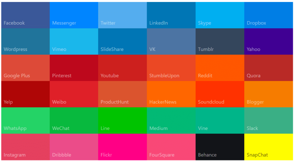
A website color scheme is a combination of colors used to create a visually appealing and cohesive design. Color schemes are an important component of any website design and are used to create contrast, set a mood, or convey a certain message. They can also be used to draw attention to certain elements of the website, such as calls-to-action or important information.
When choosing a website color scheme, it’s important to consider the overall look and feel of the website, as well as the message you’re trying to convey. The right color scheme can make a huge difference in the success of your website, so it’s important to take the time to get it right.
Types of color schemes
When it comes to website color schemes, there are a few different types that you can choose from. The most common are monochromatic, analogous, and complementary color schemes.
Monochromatic color schemes use different shades, tints, and tones of a single color, creating a unified and subtle website color scheme. Analogous color schemes use colors that are next to each other on the color wheel, creating a harmonious and balanced look. Complementary color schemes use colors that are opposite each other on the color wheel, creating a high contrast look that is sure to stand out.
The importance of website color schemes
When it comes to website design, color is an incredibly powerful tool. It can be used to create a certain mood or convey a certain message. It can also be used to draw attention to certain elements of the website, such as calls-to-action or important information.
Color can also be used to enhance the user experience. For example, using contrasting colors can make it easier for users to find the information they’re looking for. Colors can also be used to create a sense of flow, making it easier for users to navigate the website.
In addition to enhancing the user experience, color can also be used to create a sense of trust and brand recognition. Using consistent color schemes throughout your website and other marketing materials can help create a recognizable brand identity.
Best colors for websites
When it comes to choosing the best colors for websites, there are no hard and fast rules. The best colors for your website will depend on the type of website you’re creating, the message you’re trying to convey, and the overall look and feel you’re going for.
That being said, there are certain colors that tend to be more successful than others. For example, certain shades of blue are known to be calming and soothing, while shades of yellow and orange can be used to create a sense of energy and excitement.
It’s also important to consider the context of the website. For example, if you’re creating a website for a legal firm, you might want to use more muted colors such as gray or navy blue. If you’re creating a website for an online retailer, you might want to use brighter colors such as red or yellow.
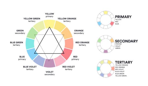
Principles of color theory
When it comes to creating a successful website color scheme, it’s important to understand the principles of color theory. Color theory is the study of how colors interact with each other and how they can be used to create a certain effect.
The most important principle of color theory is contrast. Contrast is the difference between two colors, and it can be used to create visual interest and draw attention to certain elements of the website.
Harmony is another important principle of color theory. Harmony is the use of colors that are similar to each other, creating a unified and balanced look.
How to create a website color scheme
Creating the perfect website color scheme isn’t always easy, but it’s not impossible either. The first step is to choose a base color. This should be a color that is in line with the overall look and feel of the website.
Once you’ve chosen a base color, you can start to add in accent colors. Accent colors should be used sparingly, as too many colors can make the website look cluttered and overwhelming.
When choosing accent colors, it’s important to consider the principles of color theory.
For example, you might want to use contrasting colors to draw attention to certain elements of the website, or you might want to use harmonious colors to create a unified look.
Tips for creating the perfect website color scheme
Creating the perfect website color scheme doesn’t have to be complicated. Here are a few tips to help you create the perfect website color scheme:
1. Start with a base color and add accent colors
When it comes to creating a color scheme for your website, a good place to start is with a base color. This can be any color that you feel represents your brand well. From there, you can add accent colors to give your site some more personality. These accent colors should be used sparingly, as too much of them can make your site look busy and cluttered. A few ideas for accent colors are black, white, grey, or a pop of color that complements your base color.
2. Consider the overall look and feel of the website.
When it comes to the overall look and feel of your website, color is one of the most important factors to consider. The right color scheme can make your site look professional, trustworthy, and easy to navigate. On the other hand, the wrong colors can make your site look cluttered, unprofessional, and difficult to read.
So how do you choose the perfect color scheme for your website? Here are a few tips:
1. Use a limited color palette. Too many colors will make your site look busy and overwhelming. Stick to 2-3 main colors and 1-2 accent colors.
2. Make sure your colors complement each other. Use a color wheel to find combinations that work well together.
3. Use light and dark shades of each color to add depth and interest. For example, if your main color is blue, use light blue for headlines and buttons and dark blue for body text.
4. Use white space to break up your colors and make them easier on the eyes. Too much of one color can be visually jarring, so make sure to leave plenty of room for white space between sections of text or images.
5. Test out your color scheme on different devices before finalizing it. What looks good on a desktop computer might not look as good on a mobile phone or tablet. So it’s important to test out how your site looks across different platforms before you launch it publicly
3. Consider the message you’re trying to convey.
When it comes to choosing a color scheme for your website, you need to consider the message you’re trying to convey. Different colors can evoke different emotions, so it’s important to choose a scheme that matches the tone of your site. For example, if you’re running a website for a business, you’ll want to use colors that are professional and inviting. On the other hand, if you’re running a personal blog, you might want to use brighter, more vibrant colors.
Think about what kind of feeling you want your website to convey, and then choose a color scheme that reflects that. You can also look at other websites in your industry to see what sort of colors they’re using. Just make sure you don’t end up with something that’s too busy or overwhelming – simplicity is key when it comes to web design.
4. Consider the principles of color theory.
Color theory is the study of how colors interact with one another. The three primary colors are red, yellow, and blue. The three secondary colors are orange, green, and purple. All other colors are created by mixing these six colors together in various combinations.
There are a few things to keep in mind when choosing a color scheme for your website. First, consider the purpose of your website. Is it meant to be educational? Informational? Entertaining? The tone of your website should be reflected in its color scheme.
Second, take into account the demographics of your target audience. What colors do they respond to best? Keep in mind that certain colors can evoke certain emotions in people. For example, red is often associated with passion or anger, while blue is associated with tranquility or sadness.
Third, consider the color schemes of other websites in your industry. You want your website to stand out from the rest, but you don’t want it to be so different that it’s off-putting to potential customers or clients. Find a happy medium between unique and familiar.
Finally, don’t be afraid to experiment! Play around with different color combinations until you find something that you like. And remember, you can always change it up later if you need to.
5. Use contrasting colors to draw attention to certain elements.
When choosing colors for your website, it is important to consider how they will work together. Contrasting colors can be used to draw attention to certain elements on your page. For example, you may want to use a light color for your background and a dark color for your text. This will make your text stand out and make it easier for visitors to read.
You can also use contrasting colors to highlight Call-to-Action buttons or other important links. This will help ensure that visitors don’t miss these important elements on your page.
When using contrasting colors, it is important to consider the overall tone of your website. You don’t want to create a scheme that is too jarring or overwhelming. Instead, try to find a balance that will allow your colors to complement each other and create an aesthetically pleasing design.
6. Use harmonious colors to create a unified look.
In color theory, harmony refers to the pleasing combination of colors. This can be achieved by using colors that are similar in hue or by using colors that are complementary to one another. To create a unified look, it is best to use harmonious colors throughout your website design.
7. Don’t use too many colors.
It can be tempting to use a lot of colors when creating a website, but too many colors can be overwhelming. Stick to a maximum of three colors, with one being used for the majority of the site and the other two being used sparingly. If you need more color variation, consider using different shades or tones of the same color.
Examples of successful website color schemes
There are countless examples of successful website color schemes. Here are a few examples to help inspire you:
1. Airbnb – The website color scheme for Airbnb uses a range of blues and grays, creating a calming and inviting feel.
2. Nike – The website color scheme for Nike is bold and vibrant, creating a sense of energy and excitement.
3. Starbucks – The website color scheme for Starbucks uses a range of browns and greens, creating a cozy and inviting atmosphere.
4. Apple – The website color scheme for Apple is modern and minimalistic, creating a sleek and sophisticated look.
Tools and resources for creating website color schemes
There are a number of tools and resources available to help you create the perfect website color scheme. Here are a few of the most popular:
1. Adobe Color – Adobe Color is a free online tool that helps you create color palettes using the principles of color theory.
2. Coolors – Coolors is a free online tool that helps you create color palettes using the Pantone color system.
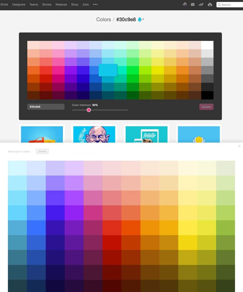
3. Color Hunter – Color Hunter is a free online tool that helps you create color palettes using images.
4. Color Palette Generator – The Color Palette Generator is a free online tool that helps you create color palettes using the hexadecimal color system.
Conclusion
Creating the perfect website color scheme isn’t always easy, but it’s worth the effort. By understanding the basics of website color schemes and the principles of color theory, you can create a website color scheme that is sure to make your website stand out from the crowd.
When it comes to choosing colors for your website, it’s important to consider the overall look and feel of the website, the message you’re trying to convey, and the principles of color theory. You should also use tools and resources such as Adobe Color, Coolors, Color Hunter, and the Color Palette Generator to help you create the perfect color palette.
If you take the time to get your website color scheme right, you’ll be sure to create a website that is sure to make an impact.
Related Posts