INTRODUCTION
Design is not just about how your website looks. It’s also about how your design helps your website be more effective. Do you have a design that’s less than inspiring? No need to worry! This article will walk you step by step through 5 ways to make your design stand out.
• Sketch First
The most overlooked factor when in the design process. A hand with pen and paper is way faster than a hand with a mouse. Explore your ideas on paper no matter the sketching skills rather than starting directly starting on Designing Software. After exploring when you know where to go, then start designing on software, it will save you an ample amount of time and multiple design rejections.
Let’s have a look at top brands whose logos were made by sketching:
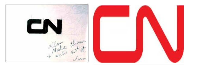
1. Canadian National Rail Logo (1960)
Allan Fleming, while on a flight, drew this design on a napkin, keeping the simplicity and future in mind and the rest is history.
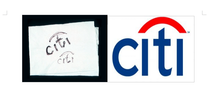
2. Citibank (1998)
When Citicorp merged with a travelers group to form Citibank, a firm known as Pentagram was brought in to do the logo. After meeting with the team and officials, Paula Scher made the logo while speaking to the officials.
• Custom Handmade Illustrations
Customized handmade illustrations can do wonders to your design and make it a masterstroke if used well. Handmade illustrations make the brand seem friendly, approachable, and unique. They enable complex ideas to be made simple and easy to understand. Overall, illustrations often make the user/reader remember the main idea of the brand.
Let us have a look at top brands that use custom handmade illustrations.
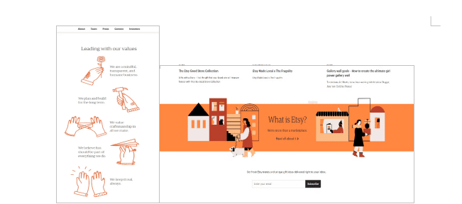
1. Etsy
Do you know?? Color improves readership by 40%, comprehension by 73%, and learning by up to 78%, according to color com.
Etsy uses its brand color soothing orange to reflect the handmade nature of the products, be it an independent artist or small business, using various shapes, objects, and characters makes the brand more emphasizing and trustworthy.
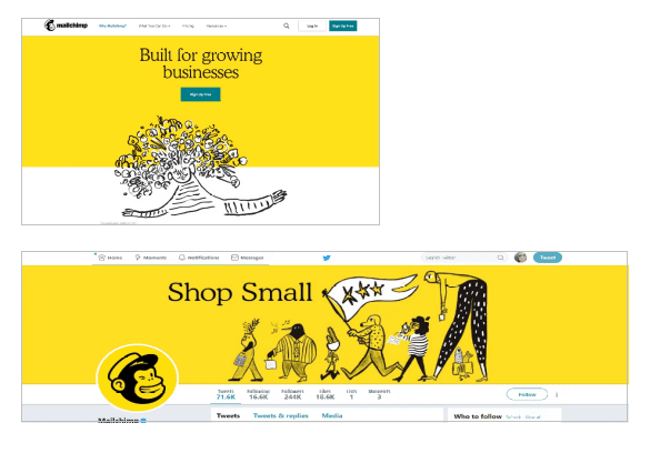
2. MailChimp
Hand-drawn illustrations of Mailchimp over different platforms make the brand voice consistent and engaging. Its vibrant and illustrative style encloses the impression of speed, which goes hand in hand with the brand messaging of quick and easy email marketing.
• Take Inspiration From History/Culture
The most enriching source of design with distinctive looks and characteristics can be taken from history/ culture.
Let us have a look at top brands which are inspired by history/culture.
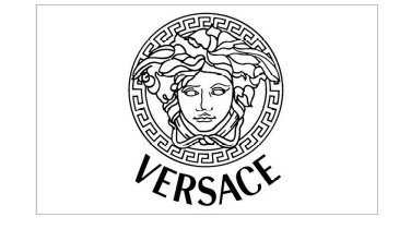
1. The Mythic Beauty of Versace Logo
The famous fashion brand Versace, its logo is inspired by Greek Mythology, head of Medusa. Medusa was a Gorgon and a creature with hundreds of deadly snakes in her hair.
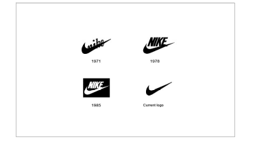
2. The Powerful Nike Logo
Everyone’s favorite Nike has its root in Greek Mythology. Nike was the Greek goddess who personifies victory.
• Make Objects Go Well Together
Okay, Fancy visuals aren’t required for outstanding design. However, terrible visuals will undoubtedly detract from a design. Graphics supplement the visual message. Two of the images are a non-intrusive backdrop picture and a stylish crown. They are not visually spectacular, but they all contribute to the overall appearance and feel of the website, and none are out of place.
Let us have a look at brands that make objects go well together.
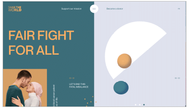
1. Swab the World
The design and experience of Swab the World’s website are shaped by parallax, strong colors, and negative space, with each thing, positioned with the utmost attention and care. Technically, the design makes scrolling down the page seem natural, ensuring users’ access to every point of content and every CTA on the homepage.
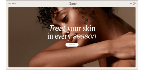
2. Garoa Skincare
Garoa Skincare perfectly balances the picture and typography.
High-quality graphics, complementary typefaces, and a balance of negative space with helpful language may give your website a simple beauty.
• Use Typography Well
Typography can take it or make it. Make sure your typography goes well with the brand messaging to make designs look the best they can. Overuse of novelty fonts may not go well together, so switch to something classic, elegant and timeless.
Let us have a look at brands that use the best typography.
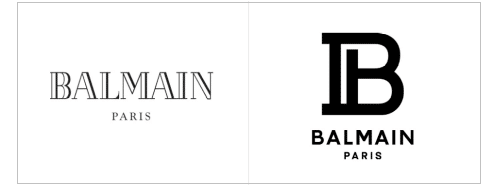
1. Balmain Paris
Combining B and P into a monogram with maintaining the color, which simplifies the complex design. The brand simplified the typeface of the logo and added a tinge of flourish.
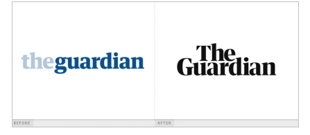
2. The Guardian
The Guardian rebranded its logo for a more modern feel. Rather than complicating the logo, The Guardian bought it down to basics, which is more appealing for the overall brand.
Conclusion
It takes time to achieve greatness! Don’t berate yourself if you can’t come up with anything brilliant straight away. Be patient and create several variants. Change the shapes around, and use overly dramatic strokes. Using the methods listed above will enhance your design in a variety of ways.