User experience is paramount to any user today and must be considered when building and designing a new website. People are now filled with so many options as to how to utilize their time – and the digital landscape can provide so many different avenues for users to explore. Therefore, web and app design, as well as user experience, needs to make the customer feel powerful and most good Orange County Web Design Companies do that .
It has the customers’ best interest in mind, and is not deceptive in nature. These experiences are either created after studying various design practices, learning more about the user or, it can be used to manipulate the user and trick them into making decisions that aren’t necessarily good for them but eventually benefit the company. The former approach can make a product stand out and provide good results for the businesses. However, it is the latter that is ultimately going to lead to huge business growth. It is called creating ‘Dark Patterns’.
“A dark pattern is an element of a manipulative interface designed to trick the user into taking actions that they might not have done freely.”
UI design gets dark sometimes. Particularly when companies exploit their user interface to trick users into doing something they wouldn’t consciously do, usually for profit, Dark patterns are used in some web pages, popups and programs that include malware, freeware, shareware, freemium offerings and even fully paid software.
Companies are often looking for short-term results, and increases in numbers rather than qualitative stats like, maybe, user happiness. And dark patterns work. They successfully trick people, so companies keep using them.
“When you use the web, you don’t read every word on every page — you skim read and make assumptions. If a company wants to trick you into doing something, they can take advantage of it by making a page look like it is saying one thing when in fact it is saying another. You can defend yourself against dark patterns on this site.” – HARRY BRIGNULL
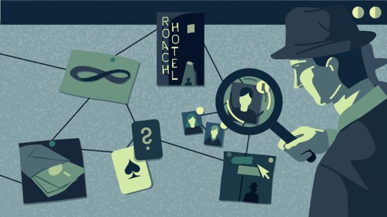
Some of the common dark patterns to watch out for are Bait and Switch, disguised ads , forced continuity, friend spam, hidden costs, misdirection, roach motel, sneak into basket, making it difficult to cancel a subscription, and tricking users to share information they did not intend to etc. the 12 main types of dark patterns are attached in an image below.
Tech companies use so-called dark patterns to do everything – from making it difficult for you to close your account to tricking you into clicking online ads. A typical example of this is the inclusion of additional programs along with a program a user is installing. During the installation, these programs may be presented to the user as options in a more- or-less visible check box. Typically the additional programs are pre-selected for download.
To make it even more likely that the user won’t successfully prevent the download of these programs, the developers make the forms complicated for the users to fill completely and have them set to reselect “optional” programs in the event of an error. Or the user selects between typical and advanced installations and the “typical” option includes unspecified third-party programs. Should the user continue through installation by simply clicking “next” in the series of windows, they end up with unwanted programs.
” When Dark Patterns are employed, agency is taken away from users by nudging them toward making certain choices. In our Opinion, this means that the idea of giving consumers better control of their personal data is circumvented”
Dark patterns are used almost as often by established companies as shady enterprises. In a report called ‘Deceived By Design’, the Norwegian Consumer Council has accused Facebook and Google of manipulating its users with dark patterns. For example, Facebook is criticized for wording the strongly nudged users in a certain direction. If they selected ‘Manage Data Settings’ rather than simply leaving facial recognition on, users looking to opt-out of a facial recognition feature are met with a prompt warning telling them that they “won’t be able to use this technology if a stranger uses your photo to impersonate you.”
In this instance, Facebook has carefully formulated its wording to provide a negative result to your data privacy choice instead of giving their users even a neutral proposition. Also, Facebook is pushing users into sharing their bio to the News Feed. It’s doing this by implying that by clicking ‘Cancel’, you are cancelling changes made to your bio. In reality, ‘Cancel’ means ‘No’. Again, it’s the type of practice that can trick even the most privacy-conscious. Facebook and Google are also accused of providing nothing more than the “illusion of control” through various methods such as hiding away privacy-friendly choices, take-it-or-leave-it choices, and choice architectures where choosing the privacy friendly option requires more effort for the users.
“It is a practice of misleading consumers into making certain choices, which may put their privacy at risk.” Similarly, Amazon’s website makes closing an account almost impossible and the company continues to send promotional emails after users have unsubscribed. While Amazon targets the pockets of vulnerable consumers, Facebook is more interested in the user sharing as much information about them as possible—even if they are not intending to do so.
Google responded to the above mentioned accusation and released the following statement: “We build privacy and security into our products from the very earliest stages. Over the last 18 months, in preparation for the implementation of the EU’s new data protection regulation, we have taken steps to update our products, policies and processes to provide all our users with meaningful data transparency and straightforward controls across all our services. We’re constantly evolving these controls based on user experience tests – in the last month alone, we’ve made further improvements to our Ad Settings and Google Account information and controls.”
Conclusion
For the most vulnerable, such as elderly, those less proficient with the language used, or users with a disability, these types of practices can make things near impossible to use or understand. They may not be able to find that hidden unsubscribe link. They may not notice that something has been added to their basket during checkout. And they may get disillusioned with privacy settings, disguised ads and friend spam which may provide a great deal of confusion and distress. Even as a designer who is aware of these tricks, it’s still incredibly easy to fall victim to them. These practices create distrust between the company and the consumer.
The internet is a place where you have to always remain on your toes. The bigger the companies, the bigger the scams, Designers and teams need to be aware of their responsibility to ensure that the vulnerable, who are hit the hardest, are safeguarded against all these issues.
Honestly, if a business’s UI creates a shady, suspicious experience that leaves the user feeling defrauded or patronized, that business will lose out in the long term. It’s always better to win over customers through delightful UX design and not through dark patterns.